
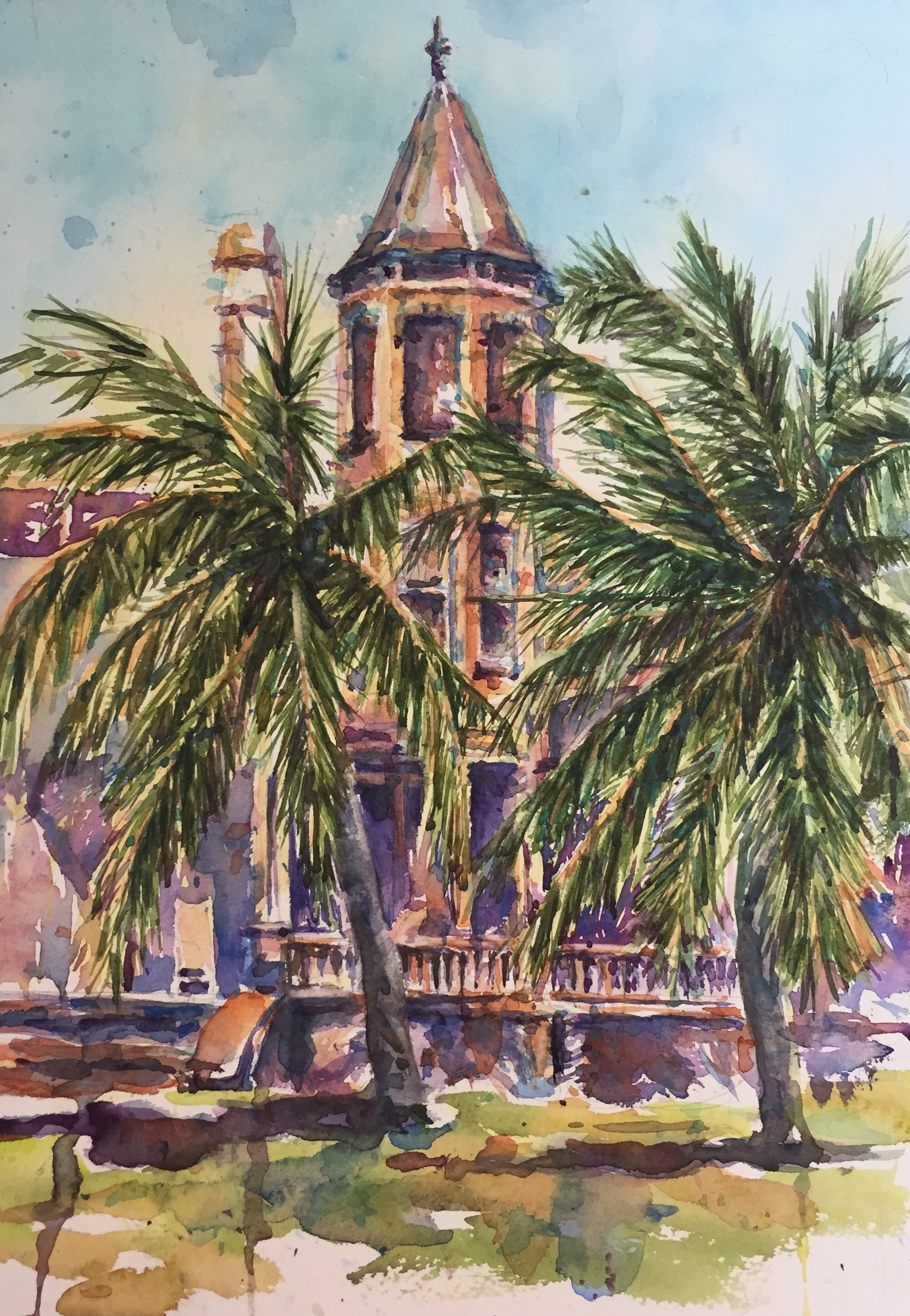
I repainted it. This one is larger than the first one. 12×18
I am much happier with this painting than the last. If I could change anything it would to have used a light hand on the porch across the house. I would have liked to have done it more like the next picture. Maybe one more go round?! Probably not.
This was mostly painted with my Isabey mops. Next time I am putting up all my paint brushes but the mops so the small ones don’t call me. You paint a lot looser with the mops. Try them. You will love them.

Really like this glow. I should have taken a break and thought a while before I painted the bottom half of the painting.
Colors used : cad orange and Aureolin yellow, cerulean, mineral Violet, cobalt, every green I have, Inathridone, burnt umber and vermilion to make the grey on the Palm trunks. Some Quin red.
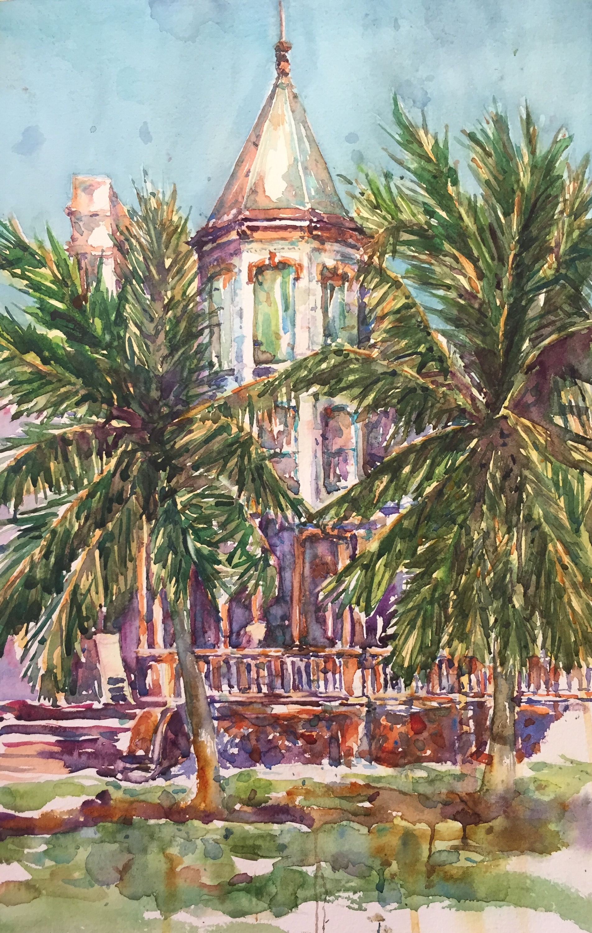
Here’s version 1 of Island Dreaming. I actually do like it just wish I had not gotten the tower as dark as it is. Which one do u like best??
Thanks for reading.
Margaret ️xxx

Yes, the eye is attracted to the lighter tower! And the palms are brighter, less dense. Ask me for advice at any time, Margaret.
LikeLike
Lol thanks Dave. Always liked free advise!! Chime in any time.
LikeLike