
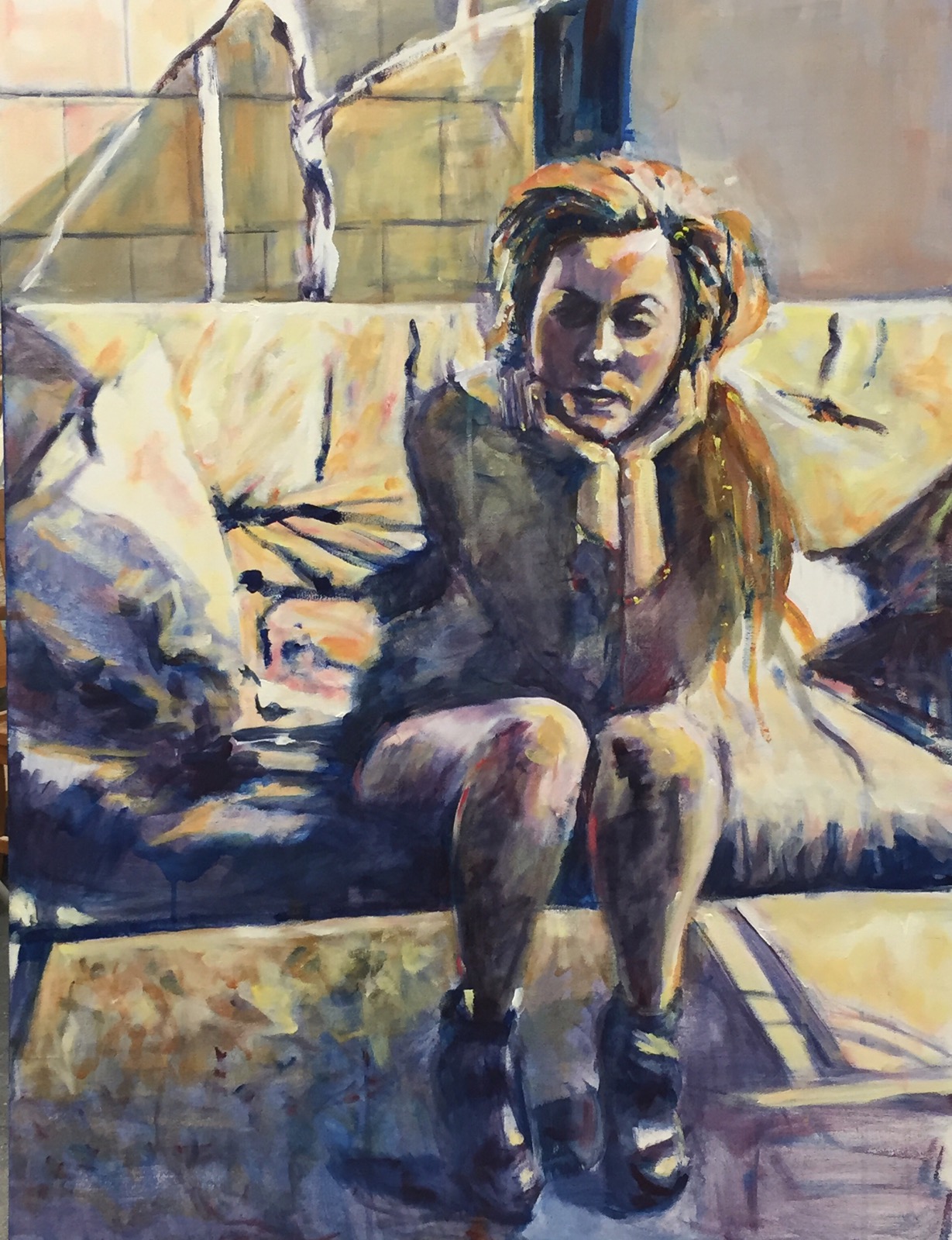
She was too pretty 30×40″ ??? acrylic
At critique today the class loved the way she looked but the boss aka professor said she was too pretty so I spent today trying to make her less pretty. It’s hard to make a pretty girl not pretty. This is what she looks like now. I should have known better than to use any pink. .
I decided to use contrasting colors adding a lot of orange with cad yellow light for highlights. I also added some pure phtalo blue for darks. And bits of cad yellow light for sparkles.
I also like the area of carpet under the sofa. All the busy stuff. Fun!
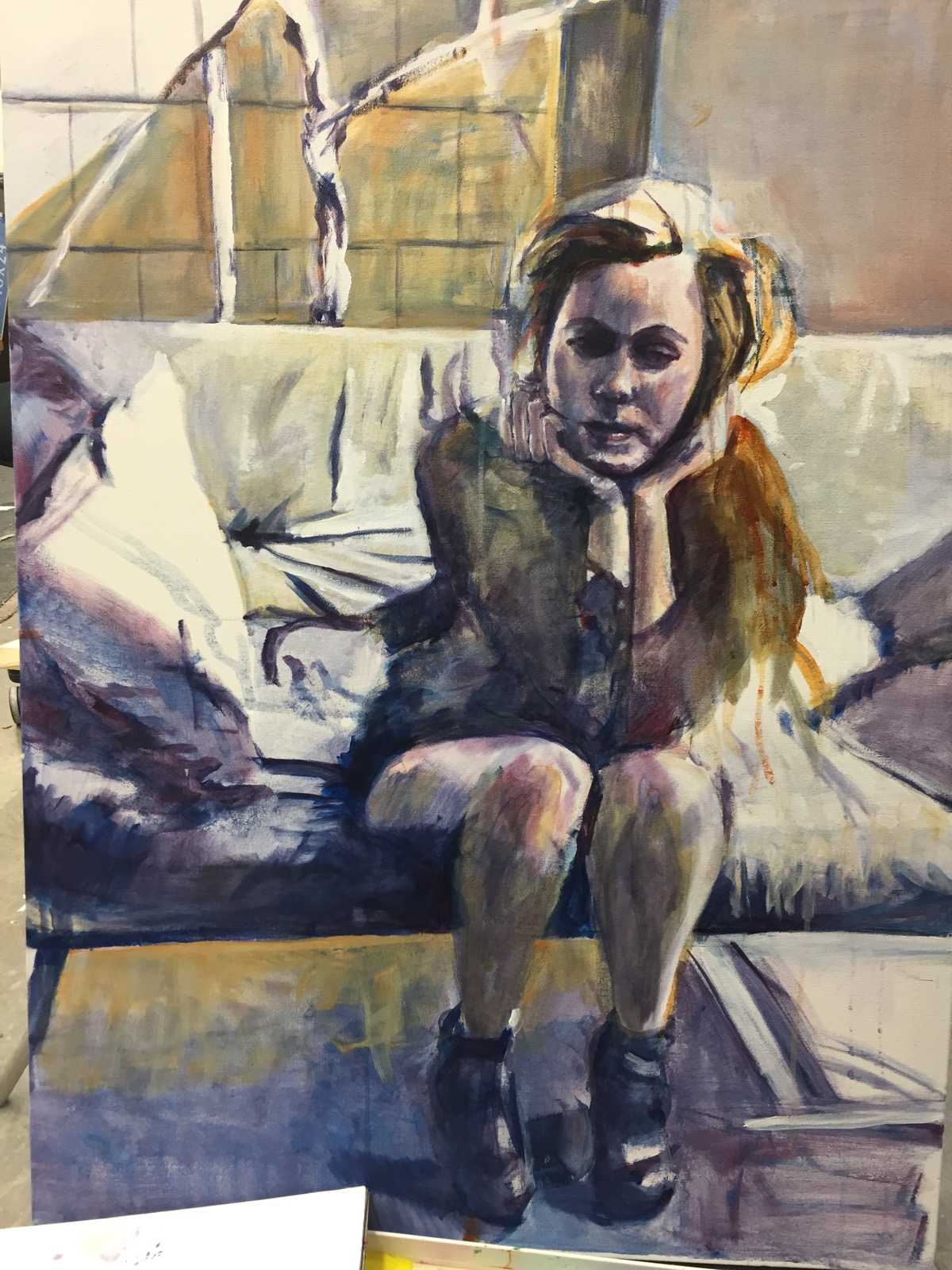
This is what she looked like earlier today. A lot of white on the sofa. I do like the sofa with more cad yellow light on it. The yellow in this photo is nickel Azo gold a rusty gold.
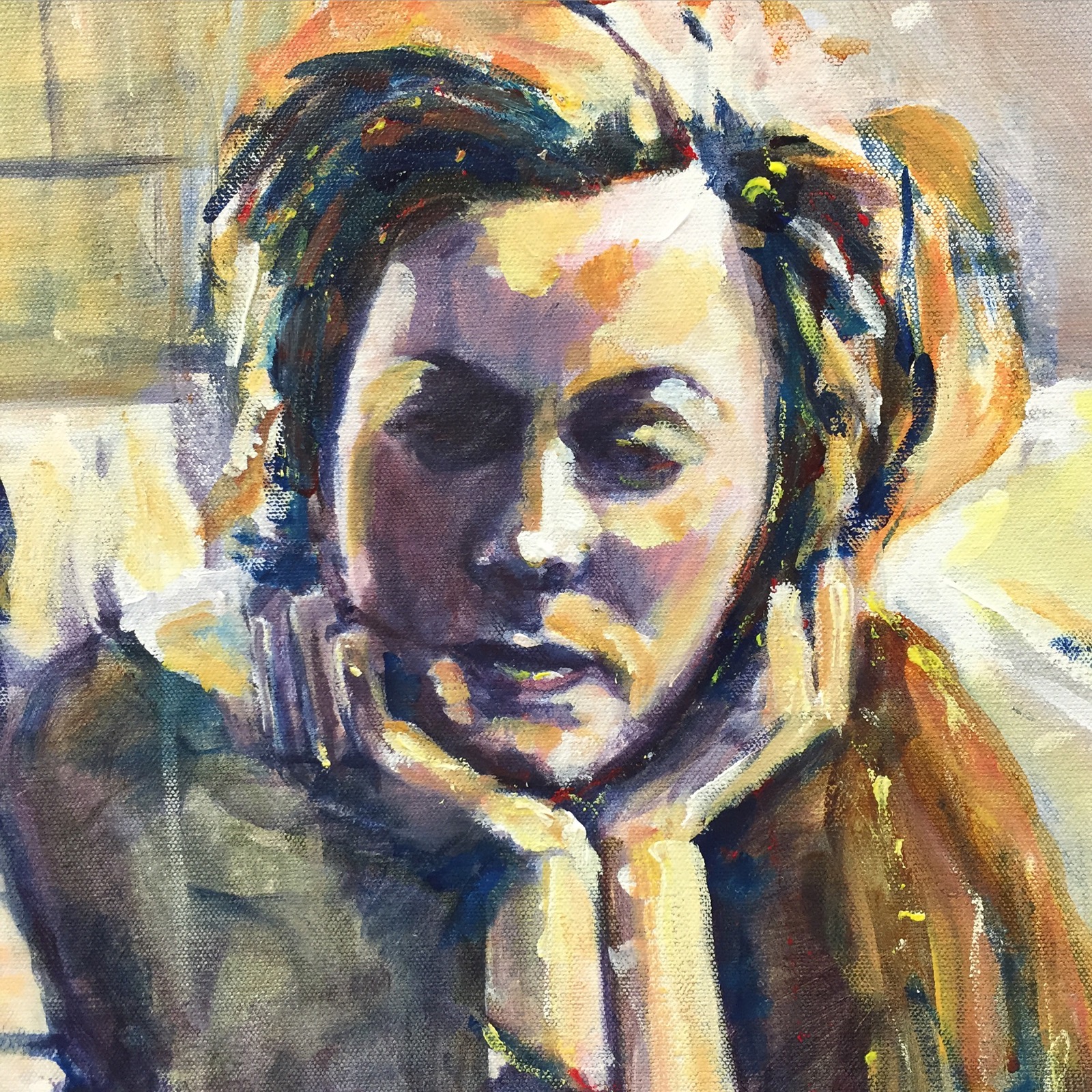
 Thought u might want to see her pretty face that wuz up close. I do actually like her better now. Now to get her a little wilder and crazier.
Thanks for reading.
Margaret xxx

So good. The colors, shading .. Good looking woman! Great work!
LikeLike
Thanks Carmel!! She’s been a trial but then they always seem to be !!😄
LikeLike