Day 250 – A Painted Collage  

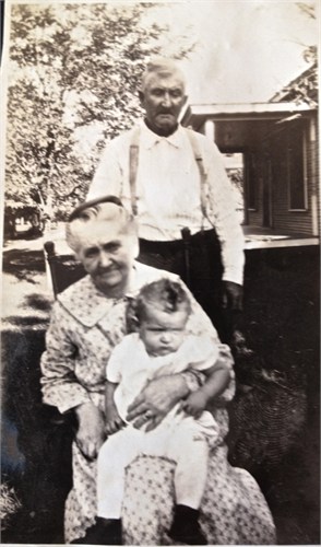
Our art group took a paper collage class from the very talented Virginia Bojanowski. I painted one of my favorite subjects my sweet dog Zoe. 


Zoe 
5″x7″

Made from painted scraps of paper and old book paper. 

The following is a short version of how it was made. Of course Ginnie had bags of already painted stamped paper pieces that we could use to collage with or we would have been there for days!!  You could substitute any appropriately colored paper for the painted paper we used. 


First we drew our subject on the canvas. Usually a piece of 1/2″ or 3/4″ plywood is used for this but for expediency sake we used a canvas. 

Next we painted the background color.   After it was dry we stamped over it with a stamp. I used a marble texture stamp. 


Then we painted our subject in blocky colors. 


Last using  gel medium  we glued down many pieces of paper starting with the bottom layer to the top aka from her chest to scarf to ears, to dark side of head, to eyes, eyebrows, nose trying to get a 3 d effect.  Difficult to do on such a tiny piece of canvas ripping even tinier bits of paper. 

In Art 130 at UGA we had to copy an Old Master print assigned to us by our teacher. I got an A+ but my rooms floor  was littered with piles of pieces of Life magazine photos trying to match the exact colors. My poor roommate. 

Art 130 was a Josef Albers color theory class, a fascinating class and my favorite that year. 

Let us know if you want your favorite animal done!!

Anyway thanks for looking!!!


Day 249 -More birds


This is a leftover bit of Sketchbookskool homework I just finished up. One of Cathy Johnson’s assignments was bird drawing. I seem to have gotten stuck there. This is done with caran d’ache watercolor crayons in my Stillman and Birn zeta.

The Stillman and Birn Zeta rivals Strathmore 500 Mixed Media art journals for great paper to work on. It’s much whiter and about the same price. Only problem. I have to get them in Atlanta. Sigh. Nowhere to be bought in Augusta Ga. I can get the Strathmore at Michaels and Hobby Lobby. 

Cardinals frequent my feeder and are a big favorite of mine and most other backyard birders. The males that visit my feeder are more salmon colored than red.

Background cerulean, pen is a Noodler flex pen loaded with de Atremis brown document. I love that color!  Double lines done with my sepia brown Pitt pen. And for once no mistake to cover up with the ledger paper. I just thought it would be a nice addition. I did want to add Washi take but couldn’t find any the right size or color so NO Washi tape. 

Thanks for looking!!

Thanks for looking. 

Day 248 – Another flock of gulls  

The gulls were in the Target Evans parking lot when I drew them. I did paint them at home.

Thinking about writting 50 shades of grey on this one because I have made that many shades of grey today.  No matter how light it was the gouache always dried darker. 

Hmm. Grey is made from schminke indigo Quin Violet and English red a sort of burnt sienna. I did use some cad yellow and white. A lot of white!!!  Background is cad yellow and turquoise. 

There’s only one bird I don’t like after two plus hours of painting. his bill is kind of yellow green. I still have one more page of gulls to draw. 


I think he’s my favorite. 


But it could be him OR 


These two!! 

Thanks for looking. Check back tomorrow. Hopefully time to make progress on them. 

Day 247 – A Little Breakfast

I think this should be called brunch because it never gets eaten at breakfast time. 

Made up for not not writing on the chicken.  I wrote all over this one. I used a B and a F sepia pitt pen. Also used schminke gouache my new way to fix my myriad mistakes. It does so well covering them up. The cup was drawn so far to the right in ink that I had to move it over to get the handle on it. It has such a nice pulled handle. Both the cup and bowl were made by my favorite local potter Dave Stewart of Wild Hare pottery. 

I also had to paint the whole background. Boring  to me with just the white paper. 

Remember when doing stripes on the tablecloth they are darker closer and lighten up as the recede. It also gets a little greyer. 

TIP: To get really white gouache highlights load the SIDE of a rigger brush and touch it sideways to the painting. 

Thanks for looking!!

 Gouache colors used white turquoise, Quin Violet, pyrrole red, Azo yellow, and indigo. 

Day 246 Life Drawing

IMG_8866

Today we drew the lovely Amy.  I was using Caran d’arch on 140# Kilimanjaro.  Today was her fortieth birthday So HAPPY Birthday Amy.  

I started by drawing her first in with a yellow ochre caran d’ache crayon. I had actually brought my watercolor pencils to give them a go starting the picture but instead I grabbed the crayon and off I went.

After I blocked in her head and measured her shoulders I just started adding colors.  Most of her face was in heavy shadow.I probably should lighten the shadow under her nose and chin…looks like a goatee lol…BUT OH well..its a sketch and its DONE!  I should have followed Charles Reid Iconic Rule NEVER use anything darker than burnt sienna on a younger face…I used Burnt Umber…DUH!!

It would be easy enough to fix.  Just wet it down and wipe it off with a piece of bounty paper towel and recolor it with burnt sienna.  MAYBE tomorrow or MAYBE NOT!! Thinking NOT!!

She has beautiful red hair. A darkish auburn.  I didnt have anything remotely resembling her hair color so I added some dark pink to the burnt sienna…even if it wasnt the right color it was fun!!  A girl needs her pink!

IMG_8841
This is Amy after the first half an hour of drawing.  Notice NO burnt umber under her lip.

amy1

SO I guilted myself into getting up and lightening up the shadow on her face.  I do have to say that its MUCH easier to lift color off the Fabriano coldpress than off the Kilimanjaro.  I scurbbed it a little with my hogbristle brush and then added some flesh color to lighten it up. The caran d’ache are really like a cross between pastels and watercolor.They tend to be a little more opaque than the watercolors I usually use which can be a good thing or a bad thing depending on what you are doing.  I also added more highlights to her face. Now I really am calling her done.

IMG_8867

I finished Amy about half way thru the second half hour session so I turned the board over and started playing with color on the other side. I sprayed it alot with water and had fun letting her drip.  Added pinks to the ultramarine blues I was using.  

amybelly

This is my favorite part of this sketch…arent the colors just gorgeous?? This is her tummy and her belly button in case you didnt know!!

The model Amy actually bought this one from me…THANKS AMY!!!

ANYWAY, Caran d’ache are ALOT of fun…go get a small box and have fun drawing.  They keep you from getting too tight.  Add in a spray bottle and it will produce some of the most delicious drips you have ever seen.

Thanks for looking!

Day 244 – Those Squirrels


At times I get bored drawing the birds on the back porch and I draw the squirrels.  Actually they are easier to draw than the birds because the hold still sometimes for quite a while. The squirrels are drawn with Noodler Lexington Gray ink and are painted with watercolor. A combo of Quin Sienna and cerulean. I don’t understand why the Lexington Graybis waterproof while the supposedly Bulletproof black and the eelskin so not. So strange. 

Like a stupid head I drew one squirrel right in the center! A disaster!! I decided to paint over it with some of the Schminke gouache and yes it covered the squirrel completely!! Hurrah. 

Next came the trial of trying to write the words on it. Finally I got the Kuratake brush to write on the gouache zip zip it was done.

Thanks for looking!! 

Day 243 – The Chicken or All Roz’s Fault!!


This was the first chicken that posed for me when we went to Key West. I bought a box of Schminke gouache from Wet Paint last week and Roz said use them for two weeks. Painted on Strathmore 500 Mixed Media Paper. 

Till I did the chicken all I had done was paint backgrounds to cover up boo boos like yesterday. I meant to paint my house or a church downtown that I have always loved as the last assignment for the last teacher in the last week of Sketchbookskool

I ran across this chicken pic. He cocked his head at me and said paint me. I succumbed. What can I say?! Maybe that’s why I have been doing all the bird drawings. Practicing for this rooster. 

First I drew him quickly on a scrap of paper laying on the table. 


That did it. He hooked me. I got the sketchbook out. 


And the lovely new box of Schminke gouache.


 It came in this great wooden box. Almost too pretty to be touched!  But I managed. 

I used all the colors and tubes of  M.Graham Azo yellow and pyrole red that I already had. It was much like painting with acrylics without the shiny plastic look they have.  The colors covered well. Easy to mix. I did have to get out my acrylic brushes. The long watercolor brights were not stuff enough. 

Tip: I used my monarch Winsor & Newton filberts and an escoda Prado filbert. After I switched to these the paint behaved so well. Went on easily and smoothly. Yesterday I discovered the stiffer hog bristle brushes leave ridges in the paint. Not a good look. 

Thanks for looking. 

Day 242 – A Trial

I make some spectacular screw ups to fix. I was trying to capture the birds doing something besides a profile view. Upside down, looking over their shoulder, diving in,etc. For some reason while I was drawing this I decided to use a pilot varsity to do the lettering like I don’t have five other pens loaded with permanent inks in three colors. DUH what was I thinking?!

Fast forward to I thought watercolor wash for the background. White is so boring. It needed a little umph, don’t you think?!

The pilot began to run. See the top left corner?! Nasty. Had such nice writing. All done with that Pilot. I liked this spread and I wanted to save it. What to do?!

The Pilots come in seven great colors.  NONE of them permanent. BEWARE if you want to watercolor over them. And yes I have all seven of them. 


So what all did I try to fix the mess?! Read on!!

Got the bright idea to wet the pilot own words down and wipe some of the ink off. Maybe that would help when I painted over it?! Nope!!! 

Then I painted over it with white gouache after all Roz said it would cover anything. Make that anything besides a non permanent pilot pen. More Grey. Sigh. 

Next I got out some acrylic paint. Since its plastic I didn’t think the ink could bleed thru. I was right EXCEPT the paint was semitransparent. You could still see the lettering and the grey gouache mess. 

OnWaRd!! At this point I thought why not paint over it with gouache. I was right the ink would not leak they the yellow green acrylic paint aka plastic layer. But since I didn’t feel the greatest I couldn’t find a tube of bright clear yellow to mix with the turquoise for a great yellow green. BUT even though I knew it would make a muddy green – think pea colored-I persisted and lo and behold a massive pile of pea green. I used it.  Didn’t want to waste it. Did NOT like that layer. A sock pea color. 

I finally found a tube of Azo yellow gouache I had accidently bought at Sam Flaxs. A deep turquoise will over power a light yellow. I knew that. Did I hold back on the blue?! NOPE. Most of a tube of yellow later I finally got a light enough color. And painted it for the third time if you count the coat of white gouache. 

Success finally. How many hours and a whole tube of paint. Here’s how it looks now. 


TIP: Gotta make it worth your reading. 

I had tried my Noodler Creaper Ahab on gouache yesterday. It really HATED the gouache. 

No problem. I have a lot of felt tip pens. Pitt pens Staedler pens Micron and Kuratake pens including a nylon brush Kuratake pen similar to the Pentel Brush pen. 

I didn’t try the Staedler or the Micron after the gouache gummed up my Pitt pens. The Kuratake brush pen was super with the gouache. 

The fiber tip Kuratakes not so much. Started clogging up. I may have a lot of pens but I treasure them all and DONT want to ruin their tips. 

Bytw you can buy a Kuratake on amazon. Very Japanese looking pen. Even has a loop on it. 

Thanks for looking. 

Day 241 – Mary Ann’s Cup

MaryAnnscup

One of the assignments for sketchbookskool is to paint a teacup.  I have my great great grandmother’s coffee cup.  I had already painted her husband’s coffee cup earlier and had meant to paint Mary Ann’s but not quite gotten around to it.   So it was a great opportunity to do it.  

maryannpurcelljohnson

Mary Ann and her sister Sarah Purcell Robinson

I really don’t know alot about Mary Ann other than she raised my grandmother and when my great grandmother decided to ride a horse astride in a horse race she would NOT have it.  She told my great grandmother she would NOT be riding on a horse like a man.  She also had a great collection of family photos of her and her Purcell family. And thats about all I know about her. She died a year after her husband of many years.  Strange that I would have her coffee cup and not know more about her.

Back to that coffee cup.  I drew it with my Noodler Flex pen with De Artremis Brown Document ink. I meant to do the whole spread with that pen but OPPS picked up the other Noodler that had Lexington Grey ink in it.  I am glad at least it was not black. Of course I did not realize it till I was well along with the grey writing and drawing the map of Oklahoma.

I can’t say I really enjoyed painting this cup. I wanted to draw more birds and squirrels but since I signed up for SBS I wanted to see it thru.

I think the cup is slightly out of round but so would you be if you were a hundred years old!! LOL..

I drew it first with a yellow ochre watercolor pencil…probably should have used a grey one.  Colors used Cad yellow light, cerulean, yellow ochre, quinacridone sienna, burnt sienna, yellow ochre, quin rose and cobalt.

AP's Coffee Cup

AP’s Coffee Cup

This is her husband, A P Johnson’s cup.  If you see paper glued on a journal page you can be SURE that I messed up the lettering and fixed it with another piece of paper!!

maryannandap

Mary Ann and AP Johnson with Dad, 1923

BYTW I thought perhaps her cup was not old. It just doesn’t look as old as AP’s except the pattern on them is very similar-same feathery odd looking leaves and pink flowers.  I never would have noticed that had I not painted them both.

Thanks for looking!

Day 24o – The End of Downton Season 5

I meant to draw more of the players but somehow it did not record. So I drew Lady Violet Crawley Dowager Countess of Grantham. What a name?! I hope I got it right. Nobody is better than Maggie Smith in her part. 


My favorite character Lady Violet always has some smart answer. 

I drew her with my Noodler Creaper Ahab loaded with Carbon Black Ink. I love that pen. Makes such great lines because of its flex nib and so cheap. 

I drew the face and hat. Added a lot of crosshatching shading with the Creaper. A bit at a time.  Hard to go back once these too much.  

I originally had her name and the quote below Lady Violet who was in an oval.  Originally I intended to paint the “mat” area. 

 I ran out of room for the quote so I got the bright idea of making an oval mat out of old ledger paper. I use it because the pen does well on it. Some paper the pen feathers on. Not a good look. 

How did I get that oval? I might add it was perfect on the first attempt. I cut a piece of paper the same size as the sketchbook page. The I clipped it over the page, held it up to a sunny window and drew the oval. I then carefully cut it out from the inside out. I really was amazed that it fit exactly. 

She was colored with caran d’ache and  some Watercolor markers I got at Michaels. A lot of fun. No idea if they are lightfast but there are 24 of them. Cheaper than the nonlightfast Tombows. 


Here’s the whole double page spread with more Lady Violet quotes. She’s so funny to me. All lettering down with the Noodler Creaper Ahab on Strathmore 500 Mixed Media paper. 

Thanks for looking!!