Looked at this one and thought that hubcap in the middle is TOO yellow. I have to knock it back.
So I did. Now the focus is on tractor not it’s tire. Woohoo. Progress.
FinallyI know thatIhavelearnedsomething taking the paint alongs with Vlad and that I can do it ON MY OWN. Hallelujah
Because the focal point is the point of highest contrast. Anything else should be greyed out. The focal point should be on a third point. And this one is done. See how your eye goes right to the white boat on the left top?! FOCAL POINT!!!
Today I spent some time emphasizing it.
Before. The boat did stand out but now it really goes boing LOOK AT ME! It was killer trying to straighten out the wash not he right side. Was not sure of the mix!!!
NEVER EVER stop a wash w a HARD LINE. What was I thinking?!!!
Ok so I like to draw vehicles. If I had my big sketchbook and fav juicy Derwent sketching pencil I probably would have drawn the cars at Costco or Chic Fil A drive through today.
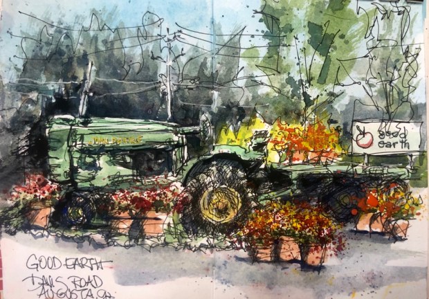
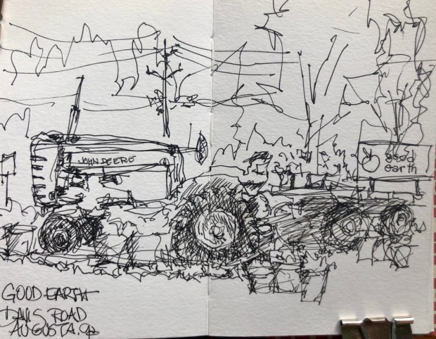
BUT NOPE so I drew the tractor at Good Earth a local store that sells local produce. Great tomatoes green beans corn peaches apples and some locally produced items like my favorite popsicles King of Pops.
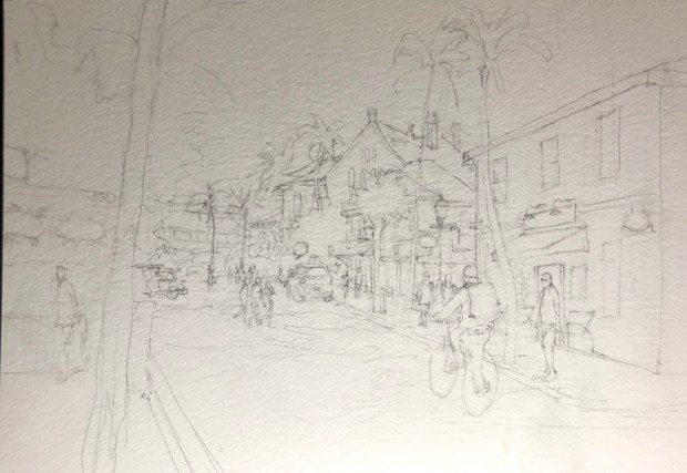
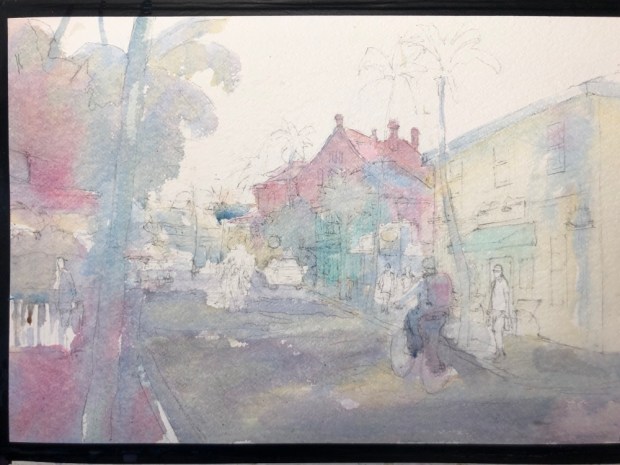
Today o realized there was a convenient place to draw the tractor and it’s trailer. I added some of the plants and moved some around for a more interesting arrangement a la Vlad recommends. Why take the class if u don’t give it a try?! If I had a pencil I would have done a value sketch.
Pilot micro pen Fabriano Venezia sketchbook. Tiny thing postcard sized. Sooner or later paint when I get around to it. It would love some paint. Maybe when I finish this one tomorrow.
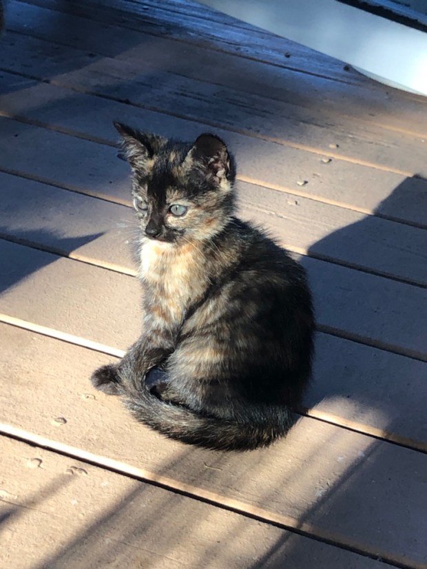
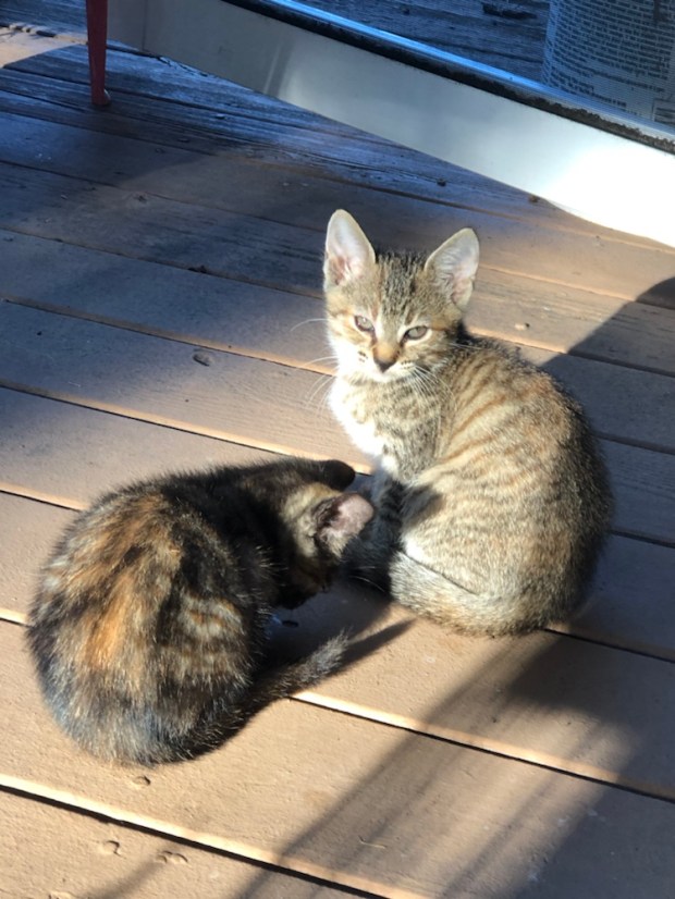
Kitty taming coming up tomorrow. Aren’t they adorable?
Top-Bottom
Tiger 1 or 2 (twins), Blackie and Halley short for Halloween kitty. Her twin sister is Weenie. 🤣
Xoxoxoxo Margaret Tahred from shopping hauling groceries upstairs and then washing them all. Endless washing washing washing.
Today I took another fascinating Zoom online class with Vlad Yesilesev in Value Sketching today. He always does one before he paints a scene or a photo.
These value sketches will be used for this months paint alongs on Sunday afternoons.
He says a value sketch determines your Composition and Value which are the most important things in any painting.
After you determine your Composition you do Value with the highest contrast in your focal point with lightest and darkest. There will also be more detail in this area. NEVER copy a photo.
It does not have to be pretty.
So here’s what we did today. The photo. Kind of Ho hum boring.
Cortez Fl Cottage cropped. changed a lot hasn’t it??!
The value sketch. The Adirondack chair is the focal point. I think these things are really cool. That chair just really pops when you see it in person.
Venice
Cropped.
You can highlight what you want to like that great arches bridge.
Provence
This one was not cropped.
My value sketch. Now to try to do this on my own before I forget how. So little time and so much to do.
Fifty miles from Sarasota lies the small fishing town of Cortez. Paint along with Vladislav Yesileyev.
15×22″ of well behaved Cheap Joes Kilimanjaro cold press. LOVED painting on it esp when I consider the price of $54 for ten sheets. What a deal. I also used ALOT of Cheap Joes American Journey paints like yesterday’s cobalt of the paper tests. Why you ask?? Good bright colors. HUGE 37 ml tubes for the price of 15 ml tubes. When you paint with Vlad you go through a ton of paint so the American Journey never gets a chance to dry out. Once it’s dry it won’t rewet easily like my favorites Holbein and M Graham.
Ok Needs some more work like why did I stop the water on the right side. Hmmmm and a few more darks.
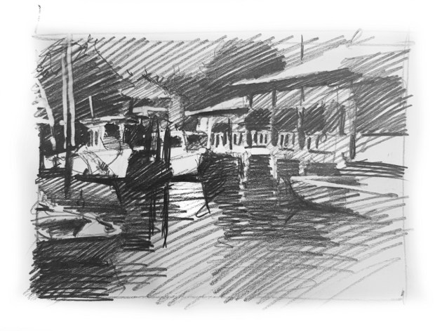
The photo
Vlads value study.
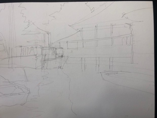
Getting sketch started .
Finishing that up.
First wash. Always interesting how the little grey marks that are so pale in the water show up in the last washes.
Lots of greys yellow ochre gold cobalt and some Andrews turquoise on the left boat. In the end that turquoise looks white.
Interesting I think.
Sky done. Andrews turquoise cobalt and some neutral tint on the blue side. Then last minute indigo on the left.
Trees done and boats starting to appear. Trees are cad yellow cobalt neutral tint and yellow ochre oh and burnt umber. All mixed to the green side.
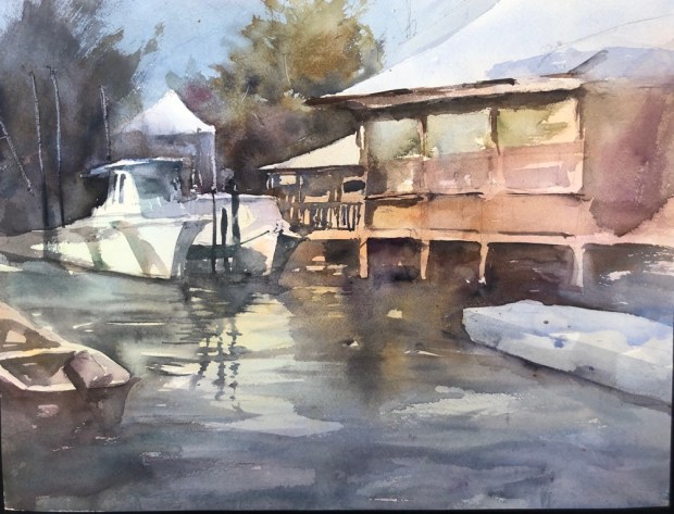
And now they are really showing up. Why did I forget to paint the back end of the left boat. Duh. The things you do when madly painting. And how did I twitch the one piling on the building to make it crooked?! A real duh. Hate things like that.
The boat has a nice glow doesn’t it?! Who knew.
Scratched some poles and masts into the left tree and a few branches on the right tree.
Suddenly most of it’s done. Time for details.
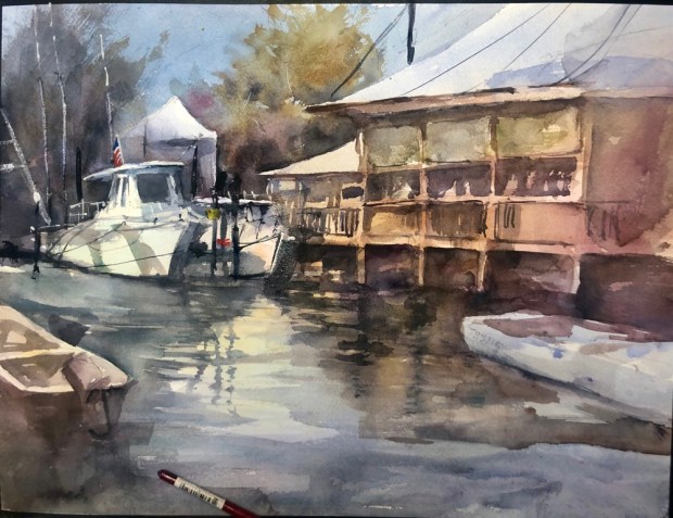
Wires and lines dark darks. People in the restaurant. And there’s that wash I didn’t Finish. That hard line is going to be difficult to fix.
And here it is now. I did work at fixing the piling. I am going to put a dark dark over the wonky one. See if it will knock it back.
Quitting for tonite. More manana.
Tv time. Been watching the Rob Lowe cop show on Brit Box. He’s the police chief in a Lincolnshire town called Boston. Good show full of strange quirky people.
I was so annoyed with my nasty streaky sky wash Sunday that I went thru all my paper today to see which ones would run a nice nonstreaky wash.
Expensive watercolor paper should NOT streak in a wash.
Annoying because basically I like this painting a lot.
Evidently there was not one piece of the three – not rough not the 280# arches I have.
I was also annoyed at my rough but expensive Fabriano 300 seeming to suck up all the paint color leaving a pale image forcing repaints. Not a good thing to do when you are trying to paint alla prima aka first strike of the brush painting.
So here’s what I learned.
140# cold press fluid. Not bad. I actually changed the brown when I ran this wash. More red at top and blue at the bottom.
Cheap Joes Kilimanjaro 300 cold press on left did a fabulous job and the color was bright. The arches 280 streaky once again and not so bright. Exactly the same paint mix.
Both did scratch well though. Something I can’t do with the Fabriano rough. The tree on the right on the arches 280 is completely scratched in.
My Cheap Joes American Journey cobalt mix I used for today’s tests on all the types of paper.
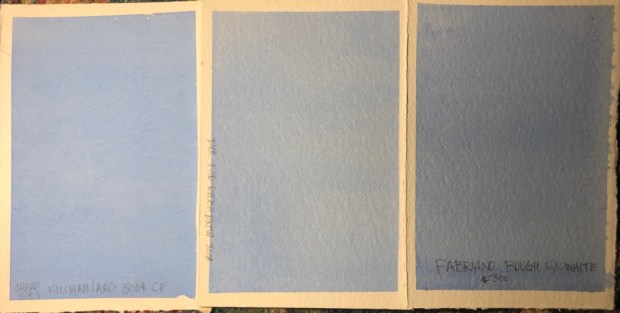
Cheap Joes Kilimanjaro 300 cold press on left. Fabriano 300# rough on right. Though the Fabriano ran a nice wash it was noticeably lighter using the same wash mix of cobalt blue.
The Kilimanjaro is noticeably brighter but costs only $54 for ten sheets. The Fabriano is $137 for ten. 🤮🤮🤮 Don’t ask me how much Fabriano I have. Even Cheap Joes catalog Rates Fabriano with fewer stars than Arches and Arches is hideous.
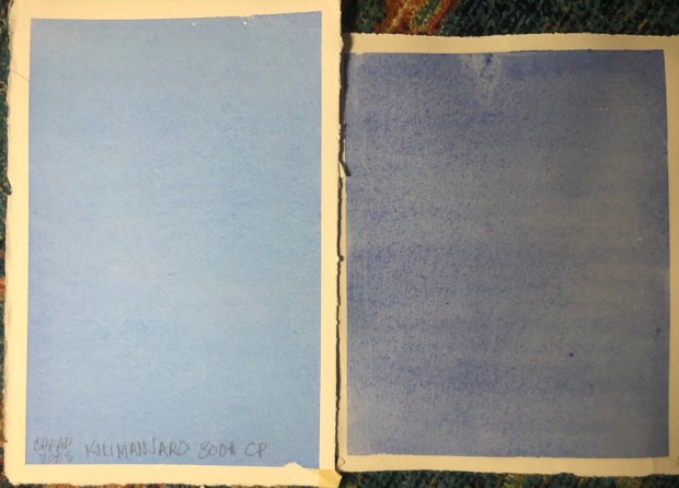
Next the back of the Cheap Joes Kilimanjaro 300 cold press on left. Fabriano 300# rough on right. The Fabriano on the front is about the same color as the Kilimanjaro on the back. Hmmm
Kilimajaro 140 cold press compared to the Fabriano rough. The 140 ran a great wash and is a little lighter but the cost 25 sheets for $45 compared to 10 sheets of Fabriano for $134.68 😳. I don’t think that the Fabriano is that much better.
Kilimanjaro 300 left back of Fabriano rough 300 in middle and front of Fabriano rough 300. The back of the Fabriano is noticeably lighter. Don’t bother painting on the back of it please. You will be disappointed.
Kilimanjaro 300 left and Kilimanjaro 140 on right. The 140 ran a great wash the color only slightly lighter.
Kilimanjaro 300 cp left Arches 280 cold press right. Arches noticeably streaky and the colors weird. Kind of grey. Can I say grey. It’s a problem with the Arches sizing. All the real Cheap Joes paints on is the Kilimajaro so you know he wants the quality maintained. Sometimes it pays to be the boss.
Cheap Joes Kilimanjaro 300 on left and 140 Aquabee 140 on right. The Aquabee is a little streaky in the photo but not to the naked eye. HMMM.
Aquabee a little lighter and a much smoother surface to paint on. I love my Aquabee sketchbooks so I had to have some of their paper when I found it.
Strathmore 500. What a champ. 100% cotton paper. Runs a great wash and scratches well. Loves color aka doesn’t suck it up. I don’t know if you can buy big sheets. This one is 5×7″. I buy packs of them now and then. I don’t remember seeing them in large sizes. It doesn’t have a lot of tooth like The Kilimanjaro Fabriano and Arches do but still a great paper. Look at that scratching WOW!!
DO NOT CONFUSE THE STRATHMORE 500 WATERCOLOR PAPER WITH THE STRATHMORE 400. THEY AREN’T THE SAME PAPER AND DO NOT ACT THE SAME WAY. The 400 is not 100% cotton. It makes a difference.
I hope I posted the right pic with the right name. I have to say the Kilimajaro was the hands down winner. Too bad they don’t make rough. The price is unbeatable.
Tomorrow I intend to paint a real painting on the Kilimajaro. Get back to you soon on the results of that.
Please don’t let me buy anymore paper. I don’t need another scrap. Hmm well I only have 3 sheets of Kilimanjaro 300 left. Hmmmm.
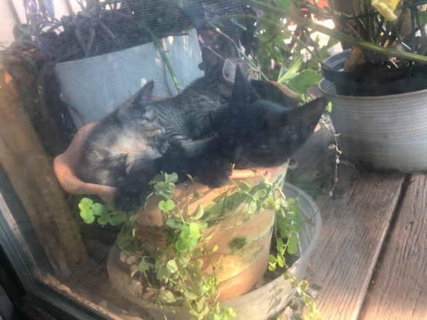
Kitty cuteness. Tortie let me pet her. Maybe tomorrow I can pick her up hmmm.
Today’s pot kitty pics. I need to wash the windows but can’t because it scares the kitties. Good excuse right?! Lol
Margaret ready for bed but maybe a few episodes of Schitts Creek first. Xoxoxo
So relaxing after that abomination yesterday. This is on some Arches 280# cold press.Paint along with Vladislav Yesileyev
the photo
the Value sketch.
No of the drawing. But this is mostly the first washes. Was not thrilled with the sky wash which went streaky. Though I have had this arches for a while I don’t know that I have ever run a wash on it.
Adding bushes on the right which I swear looks like a huge pothos aka philodendron plant.
Lots of splattering on this one. I love to splatter.
Wires were fun to do too.
Painting the bougainvillea was way too much fun. Splattering the wet greenery with alizarin then cad red. Love to splatter. I think I like watching the colors interact when they are splattered. I might be a latent pointillist like Seurat.
Cad red added to the bougainvillea. FUN!!
Love the lush purpley dark of the alizarin under the cad red splatters. Wet on wet. Yum
I darkened the sky w cobalt Andrews turquoise and dioxzine purple.
And done for now. Have already started a fix it list like
What’s up with the guys pants hanging so low.
Touch up the upper lantern.
And somehow get the light on one of the rear buildings back.
OH Cobblestones on the Calle aka street.
And I am sure there will be more. I know take the tape off. Hahahahaha and
Try some washes on scrap arches 280.
Dark down the hill. Will make the top of the street pop.
Everything I don’t want. I painted on the back of the last and it took so long to draw I didn’t want to start over drawing on the right side. Think I should have. This back of the Fabriano rough 300 just sucked up paint. No matter how dark it looked going on it always dried lighter.
I did end up drawing another on my old reliable Fluid. Only it’s not rough. More about that later.
The sketch and the photo
This one done in Waterlogue would have been better than mine.
First wash oops forgot abt the sunlit street. Sigh
Do you know what’s wrong with mine?? Too many hard edges nowhere near enough soft ones.
Sky wash done.
Coming along.
And now. The palms and the biker are too dominate too. Just an awful painting. What was I thinking of painting those palms on the right so dead black?! 😵😵😵
But I have started another. It already looks better than this one. Painting faster this time.
Margaret who might do something easy like sew or clean tomorrow. Xoxoxox
Finally. And I like it. Made me nervous darkening the sky and the foreground. But I like it. Very dramaticPaint along with Vladislav Yesileyev.
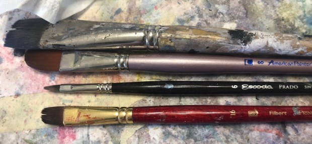
I painted a lot of the foreground with these brushes. That was fun. My acrylic paint brushes.
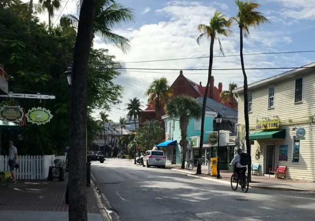
Green St, Key West 15×22″ Fabriano Rough
And started this one in an online class with Vlad Yesilesev all about how to pic photos. I know I learned a lot but right now too tired to tell you what I learned. The paper was out in the middle of the day for several hours so i have been behind all day.
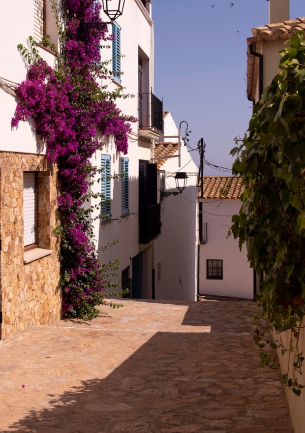
The photo
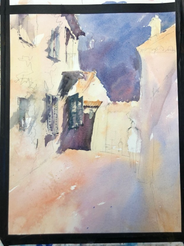
Mind you this is suppose to be painted. Sigh. I think it took two hours to draw. Ridiculous. And I haven’t had time to do the value study.
The painting so far. Still a lot more to do like add the darks in the sky that I lost. Paint alongs with Vladislav Yesileyev
Cadaques finished. Almost forgot I finished this one.
More tomorrow. One should not deep clean the downstairs before a paint along. Do tomorrow I will clean some more and finish the painting. The finishing shouldn’t too take long. Just darken the sky in places and maybe the street.
#2 Derwent Sketching Pencil small Stillman and Birn Alpha.
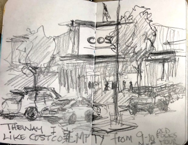
EMPTY. A couple of times a week I drive to Costco on the hunt for that elusive tp and sundries like Chlorox wipes and alcohol.
I drew this one to show the empty parking lot. Today when I went there were five cars there before me. Loving the early hours M-F for people over 60. They actually card us. This one old guy in front of me quipped can’t they tell my white hair and wrinkles mean I am really old. They need a card. But card they do anyway.
Got to say I feel safe in there. Sanitizing stations everywhere. The carts are sanitized too. And more wipes available if u want to do your own wipe. Hand sanitizer abounds. And miles to walk in the cool air conditioning. Just leave your debit card AT HOME. Wait they only take plastic. Touchless check out. LONG Sheets of plastic between you and the clerk. Just think most of the stock is never touched by human hands. They unload the palettes and stack them high.
Anyway pay a visit to your Costco. You will be happy. They go the extra mile!!
Margaret who can clock two miles in a Costco visit. Xoxoxo


 And this one is done. See how your eye goes right to the white boat on the left top?! FOCAL POINT!!!


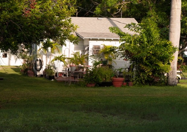 The photo. Kind of Ho hum boring.

 Venice
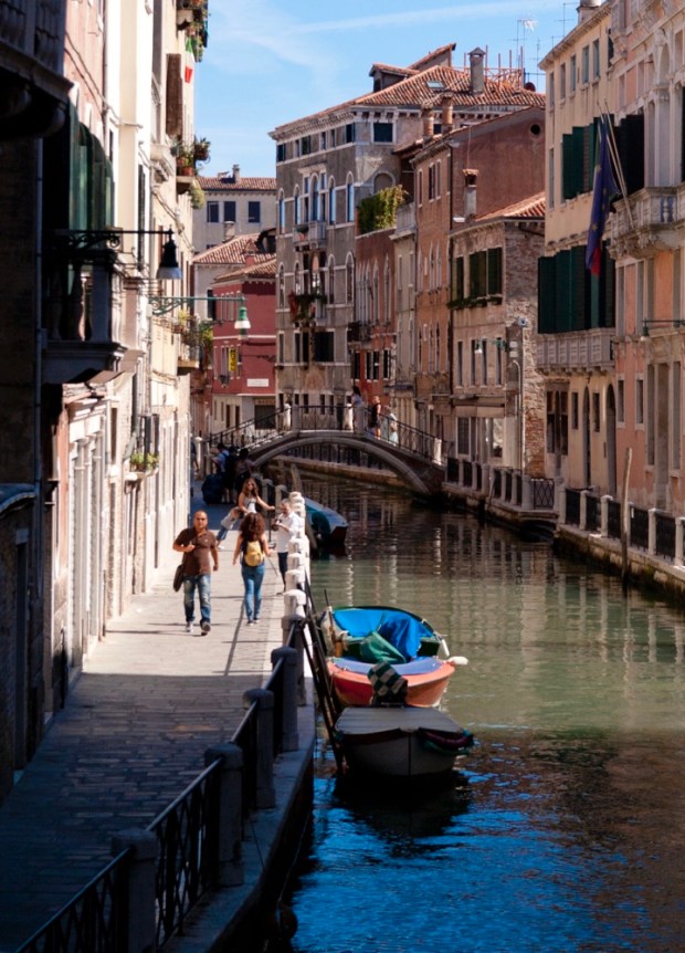
 You can highlight what you want to like that great arches bridge.
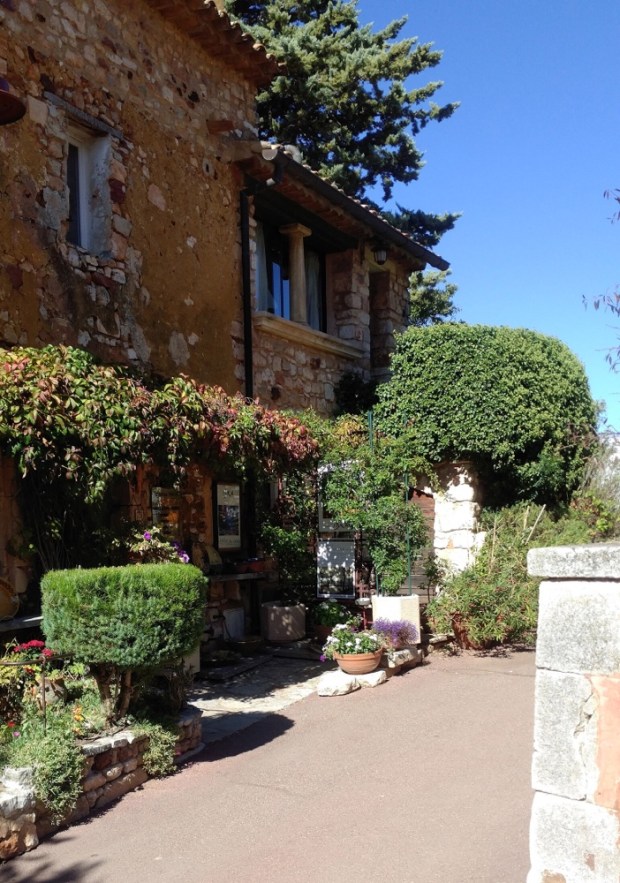


 And here it is now. I did work at fixing the piling. I am going to put a dark dark over the wonky one. See if it will knock it back.
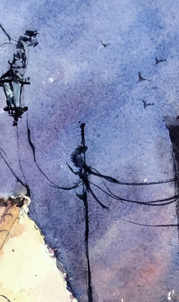 arches #280
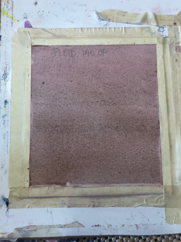


 the photo


 The sketch and the photo


 Green St, Key West 15×22″ Fabriano Rough