 arches #280
I was so annoyed with my nasty streaky sky wash Sunday that I went thru all my paper today to see which ones would run a nice nonstreaky wash.
Expensive watercolor paper should NOT streak in a wash.
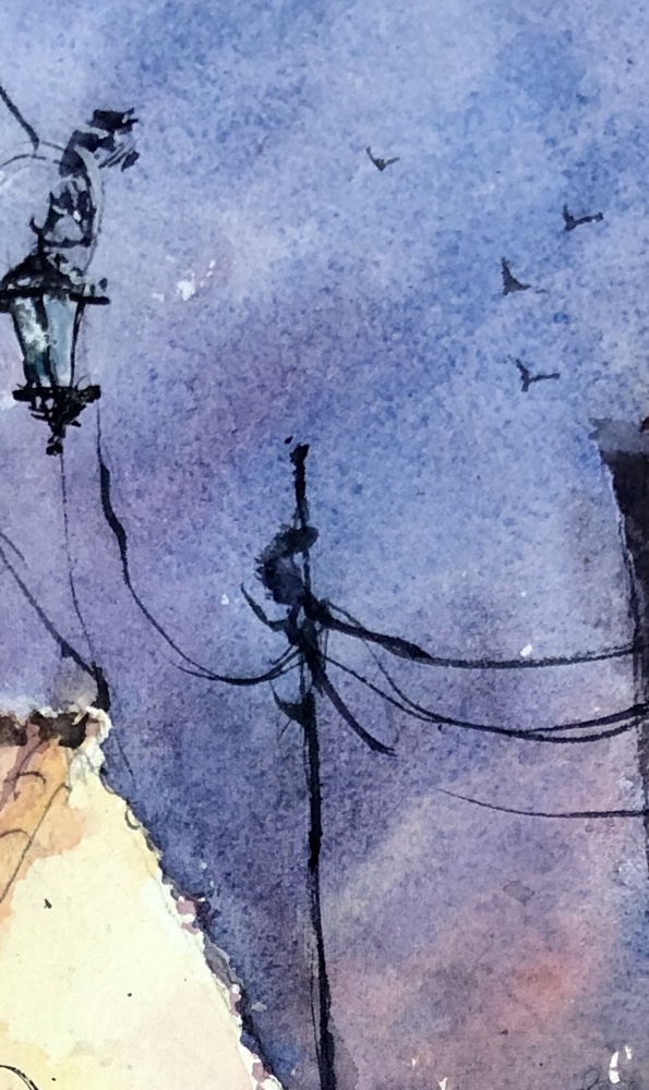
Annoying because basically I like this painting a lot.
Evidently there was not one piece of the three – not rough not the 280# arches I have.
I was also annoyed at my rough but expensive Fabriano 300 seeming to suck up all the paint color leaving a pale image forcing repaints. Not a good thing to do when you are trying to paint alla prima aka first strike of the brush painting.
So here’s what I learned.
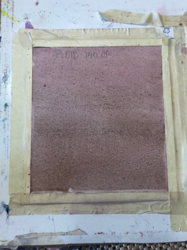
140# cold press fluid. Not bad. I actually changed the brown when I ran this wash. More red at top and blue at the bottom.

Cheap Joes Kilimanjaro 300 cold press on left did a fabulous job and the color was bright. The arches 280 streaky once again and not so bright. Exactly the same paint mix.
Both did scratch well though. Something I can’t do with the Fabriano rough. The tree on the right on the arches 280 is completely scratched in.

My Cheap Joes American Journey cobalt mix I used for today’s tests on all the types of paper.

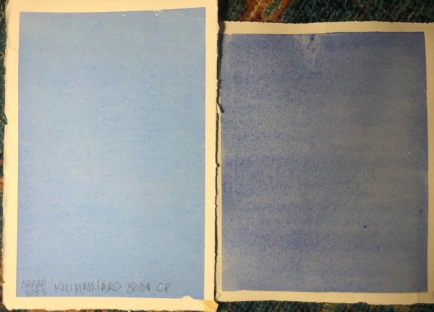
Cheap Joes Kilimanjaro 300 cold press on left. Fabriano 300# rough on right. Though the Fabriano ran a nice wash it was noticeably lighter using the same wash mix of cobalt blue.
The Kilimanjaro is noticeably brighter but costs only $54 for ten sheets. The Fabriano is $137 for ten. 🤮🤮🤮 Don’t ask me how much Fabriano I have. Even Cheap Joes catalog Rates Fabriano with fewer stars than Arches and Arches is hideous.

Next the back of the Cheap Joes Kilimanjaro 300 cold press on left. Fabriano 300# rough on right. The Fabriano on the front is about the same color as the Kilimanjaro on the back. Hmmm
Kilimajaro 140 cold press compared to the Fabriano rough. The 140 ran a great wash and is a little lighter but the cost 25 sheets for $45 compared to 10 sheets of Fabriano for $134.68 😳. I don’t think that the Fabriano is that much better.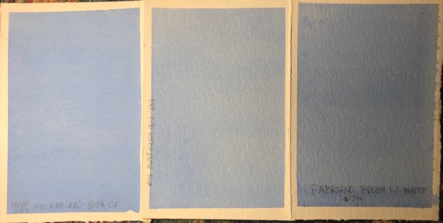
Kilimanjaro 300 left back of Fabriano rough 300 in middle and front of Fabriano rough 300. The back of the Fabriano is noticeably lighter. Don’t bother painting on the back of it please. You will be disappointed.

Kilimanjaro 300 left and Kilimanjaro 140 on right. The 140 ran a great wash the color only slightly lighter.
Kilimanjaro 300 cp left Arches 280 cold press right. Arches noticeably streaky and the colors weird. Kind of grey. Can I say grey. It’s a problem with the Arches sizing. All the real Cheap Joes paints on is the Kilimajaro so you know he wants the quality maintained. Sometimes it pays to be the boss.
Cheap Joes Kilimanjaro 300 on left and 140 Aquabee 140 on right. The Aquabee is a little streaky in the photo but not to the naked eye. HMMM.
Aquabee a little lighter and a much smoother surface to paint on. I love my Aquabee sketchbooks so I had to have some of their paper when I found it.

Strathmore 500. What a champ. 100% cotton paper. Runs a great wash and scratches well. Loves color aka doesn’t suck it up. I don’t know if you can buy big sheets. This one is 5×7″. I buy packs of them now and then. I don’t remember seeing them in large sizes. It doesn’t have a lot of tooth like The Kilimanjaro Fabriano and Arches do but still a great paper. Look at that scratching WOW!!
DO NOT CONFUSE THE STRATHMORE 500 WATERCOLOR PAPER WITH THE STRATHMORE 400. THEY AREN’T THE SAME PAPER AND DO NOT ACT THE SAME WAY. The 400 is not 100% cotton. It makes a difference.
I hope I posted the right pic with the right name. I have to say the Kilimajaro was the hands down winner. Too bad they don’t make rough. The price is unbeatable.
Tomorrow I intend to paint a real painting on the Kilimajaro. Get back to you soon on the results of that.
Please don’t let me buy anymore paper. I don’t need another scrap. Hmm well I only have 3 sheets of Kilimanjaro 300 left. Hmmmm.
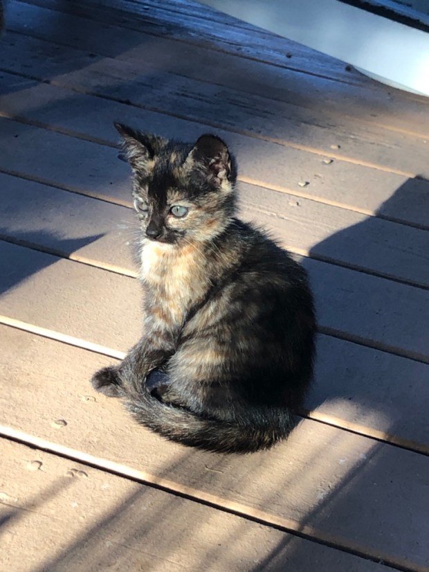

Kitty cuteness. Tortie let me pet her. Maybe tomorrow I can pick her up hmmm.
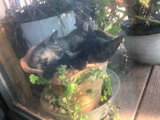
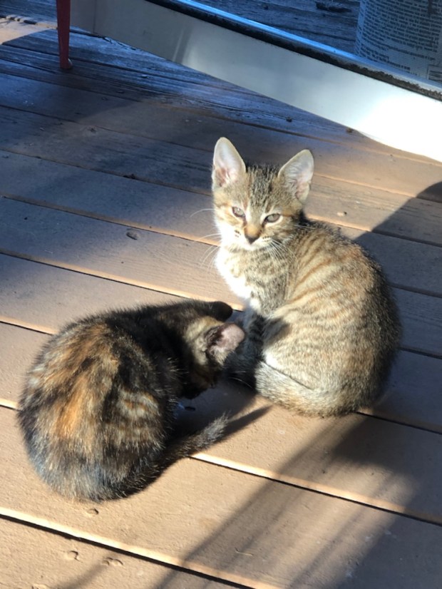
Today’s pot kitty pics. I need to wash the windows but can’t because it scares the kitties. Good excuse right?! Lol
Margaret ready for bed but maybe a few episodes of Schitts Creek first. Xoxoxo

Gre
LikeLiked by 1 person
It’s ok. We all do these things especially on our phones. 😂
LikeLike
👍💕
LikeLike
Great experiments. Sorry about previous reply, hit the wrong key. I can only get hold of Cotman paper or Windsor and Newton (don’t know the Weights) so haven’t noticed problems. Very informative.
LikeLiked by 1 person
Interesting you haven’t noticed w Winsor and Newton paper. Think I will do a few more with the blue before I toss it.
LikeLike
I mainly do acrylics to be honest but I do like playing with water colour occasionally
LikeLiked by 1 person
I used to do acrylics all the time but was always fascinated with watercolor. Now I do acrylics now and then. Better do some before my paint dries out right?!
LikeLike
Yes, nothing more irritating than a tube of ultramarine that’s turned into a lump of plastic basically!
LikeLiked by 1 person
Lol so true unless it’s one of those favorite expensive golden colors.
LikeLiked by 1 person
Oh I know, I love metallics
LikeLiked by 1 person
Oh me too. Delicious. I go thru phases which one is my fav.
LikeLike
Same! I like peacock blue though!
LikeLiked by 1 person
Well of course you do. Who doesn’t?!🤗 I rarely meet a blue I don’t love. 🤣
LikeLike
😊
LikeLike