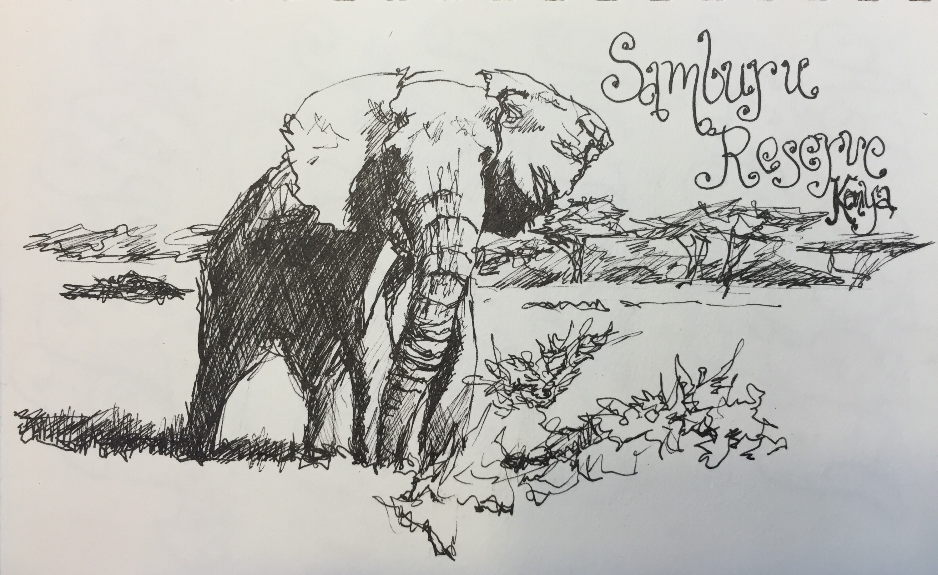
Rommel 6×9″
Decided to give it a work out last nite while watching the Secret Life of Elephants on GPTV last nite. This was the last sketchbI drew off tv the big bull elephant Rommel.
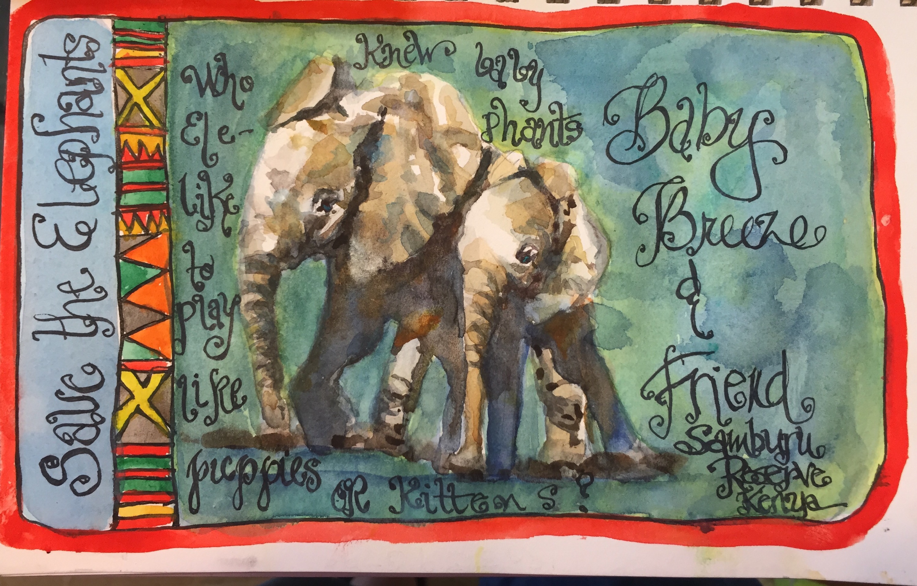
Most of Rommel was painted wet on wet to loose the edges. I downloaded several of Thomas Schallers videos from Northlight. Good deal for $13. Though he does not paint animals I thought why not try out his techniques on this elephant. He’s big on transparent colors, letting the colors blend on the paper and loosing edges by keeping the paint wet. I do wish II had thought to add in some blips of others colors like orange and purple but I can use my handy fine spray bottle and do that later.
This was a very wet painting. The Super Deluxe did not wrinkle anymore than a 140# paper would. I lifted some of the shadows off the left back leg and as usual it was easy to do with this super sketchbook.
Colors used Elephant and dirt – yellow ochre, burnt sienna, and Inathradone blue. Sky cerulean trees green Apatite and Inathridone.
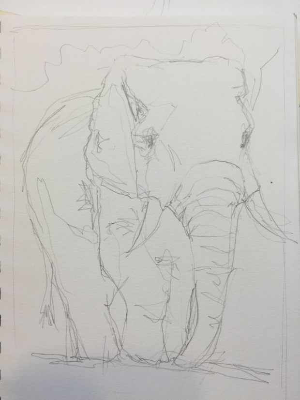
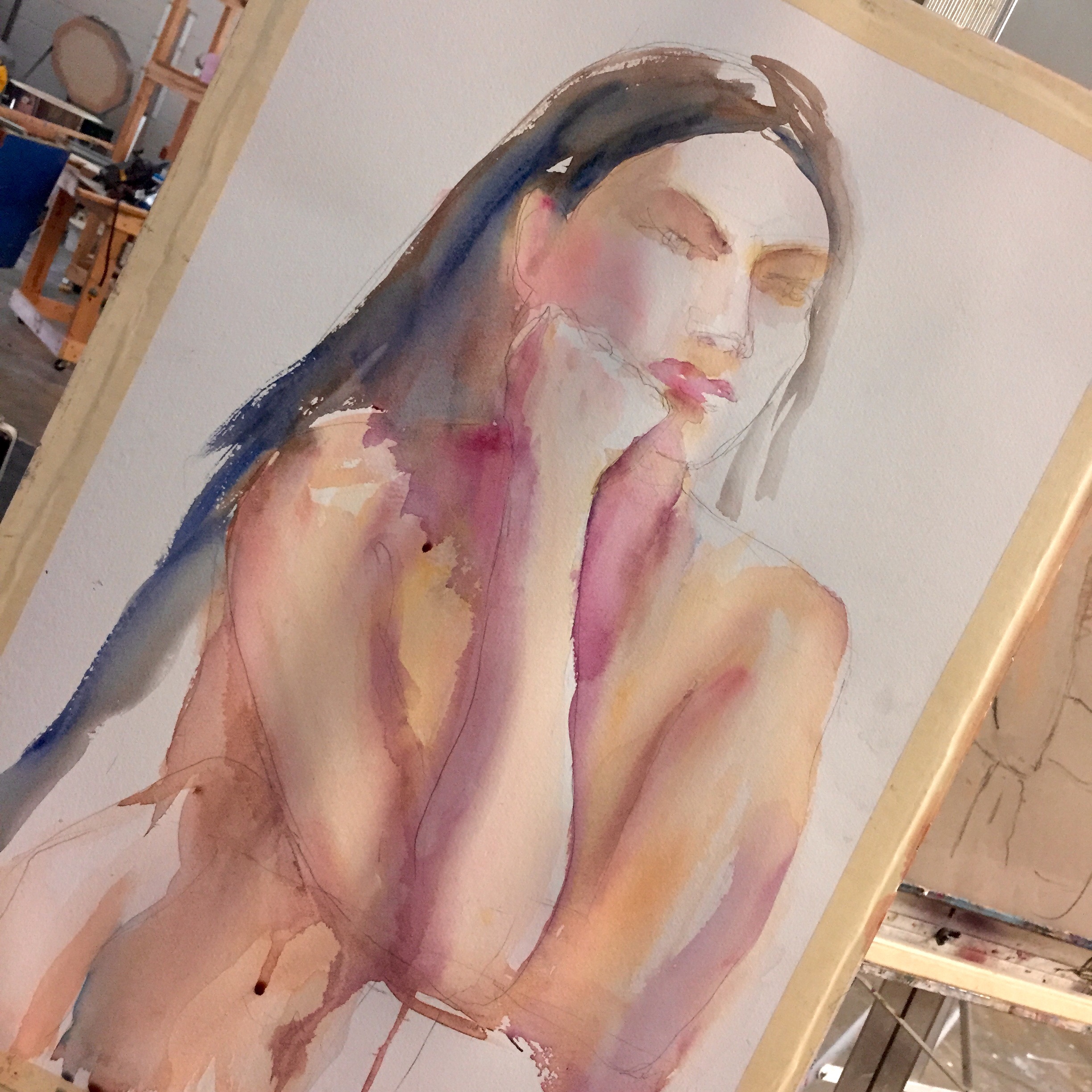
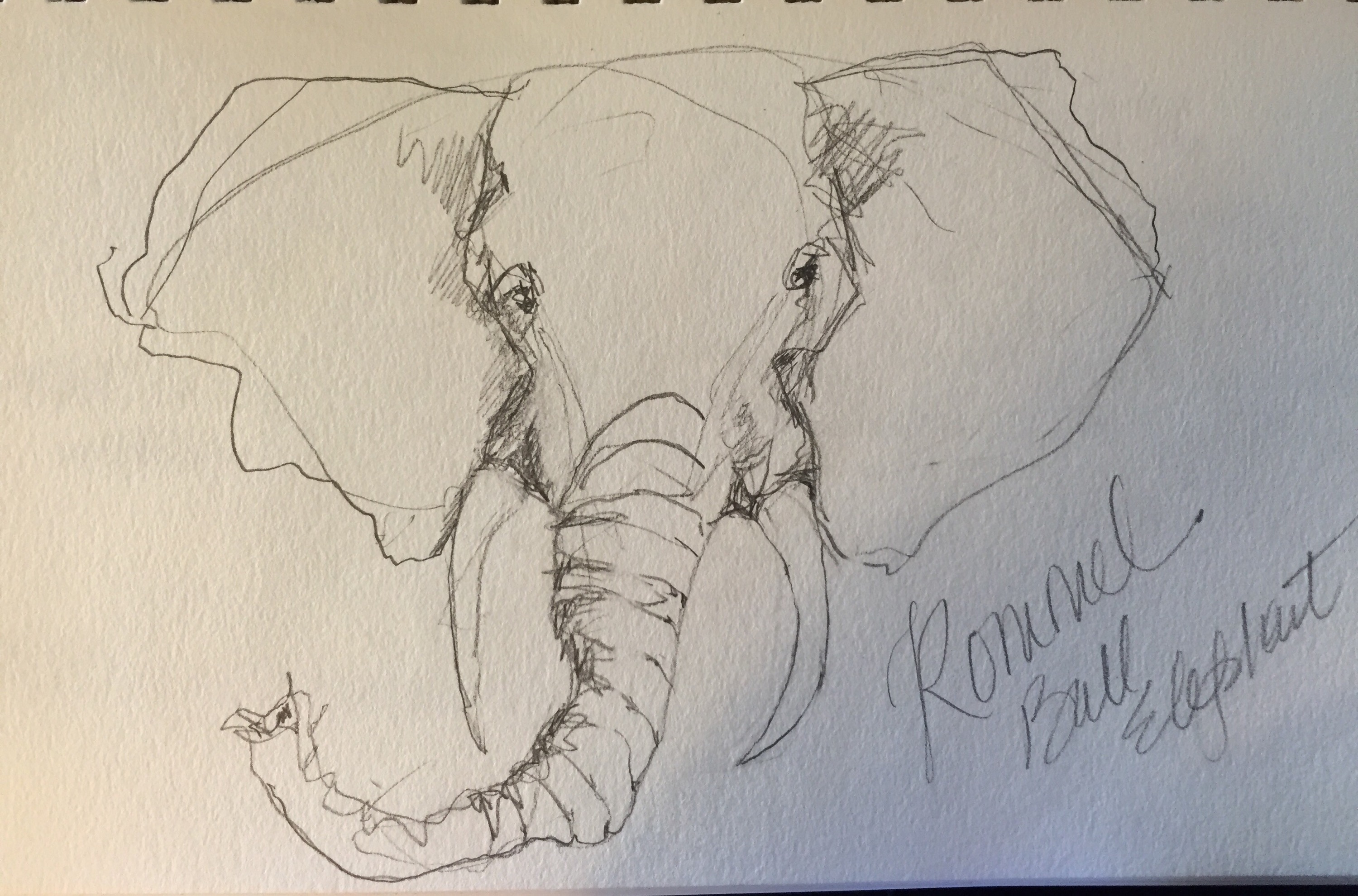
I did a pencil sketch first. As you will see in a bit the sketchbook loves the pencil.

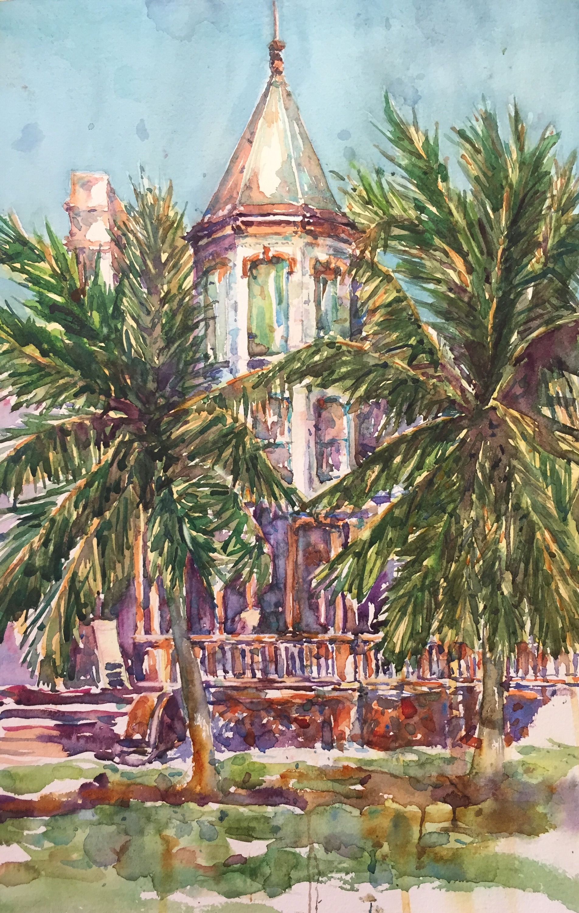
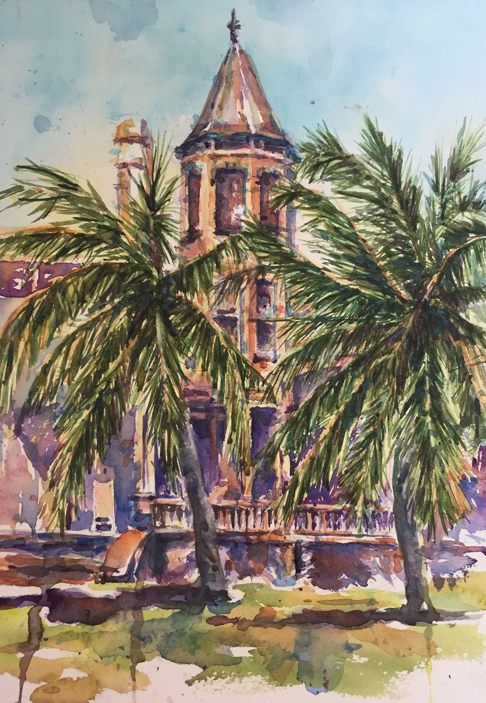
This is the sketchbook. Just in case you did not see the last post about it.
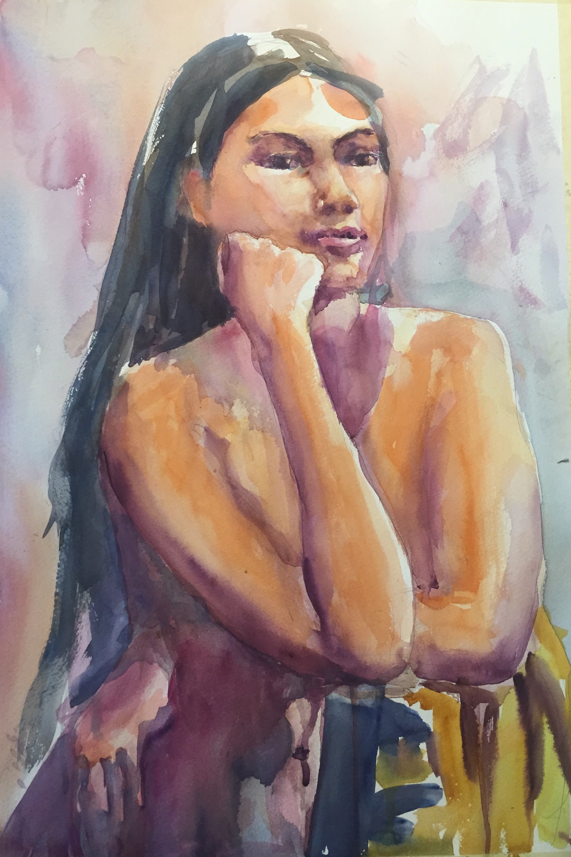
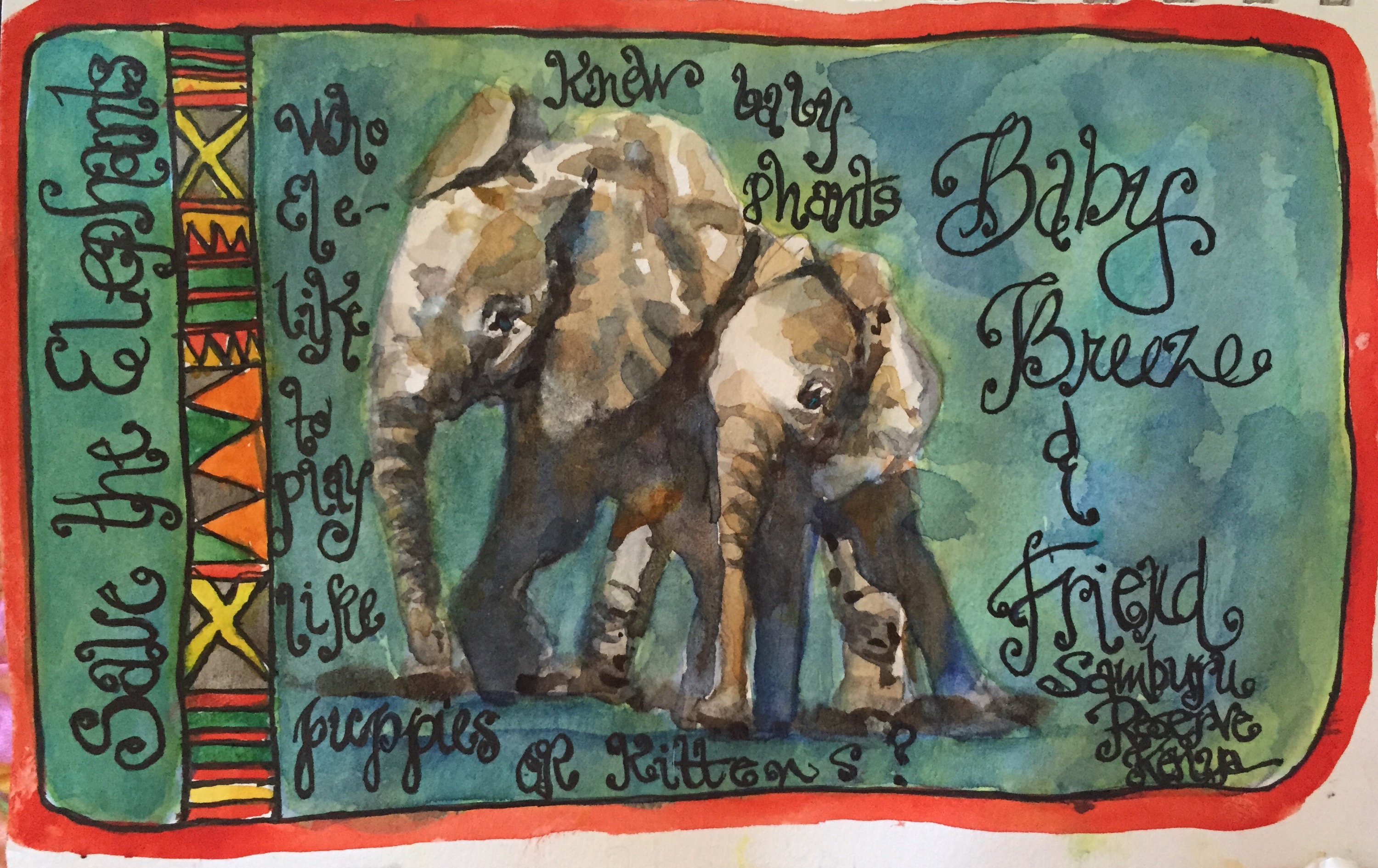
 Another sketch of Rommel a huge bull elephant that showed up on the Samburu Reserve in Kenya where the show was filmed.

I really like the way this pencil sketch turned out so I doubt I will paint it. It was done with a cheap HB mechanical pencil from Office Max.
One thing that’s great about sketching off tv is that you can pause it. Only thing I don’t like about pencil sketching is its tendency to smear. I need to spray this with fixative.
Save the Elephants http://savetheelephants.org. The show was all about an effort that is being made in Samburu to increase the numbers of elephants which were dwindling drastically. They seem to be turning around now due to the efforts of Save the Elephants.
I love drawing animals and now want to go to Samburu on a sketch safari. Would that not be fabulous fun?! During dry season they flock to the water holes in Samburu, prime time for sketching or photography.
Think about it. I know I am.
More about the Super Bee tomorrow!!
Thanks for reading.
Margaret xxx

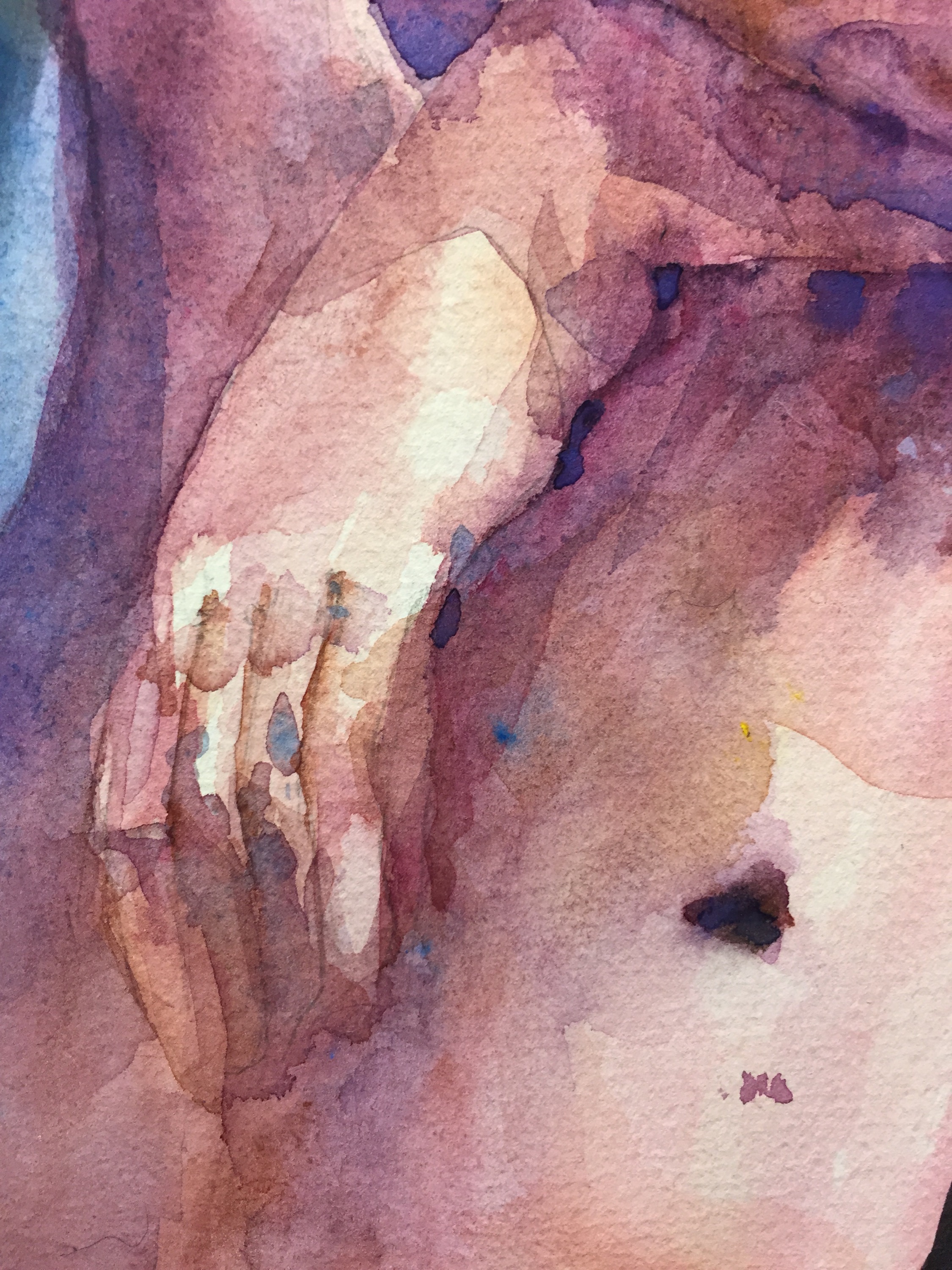
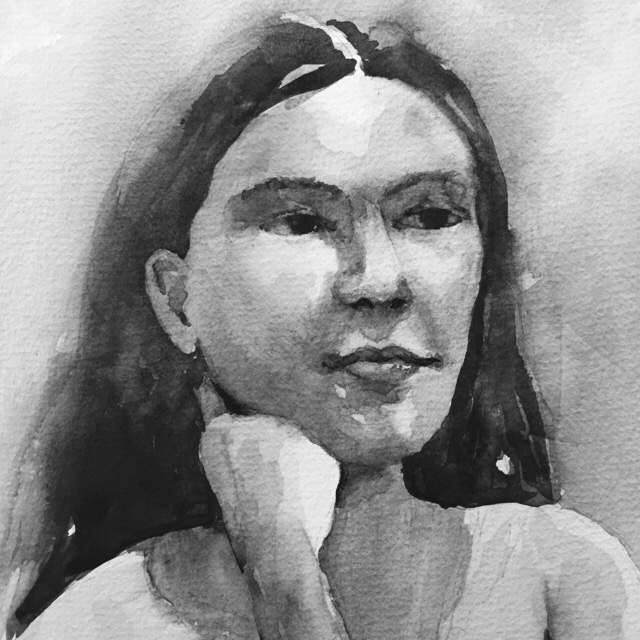
 I decided on a do over. There’s a lot I like about this painting but darn the right eye. I did try to fix tomorrow or add it to my bin pile. Lol. Or the compost heap.