Went out to lunch yesterday with my sister in law Jan at the Peachtree DeKalb Airport where they were preparing for their Spring Open House. We watched the planes come
And go during lunch. Then I decided to draw a few. All their antique WW2 planes lined up asking to be drawn.
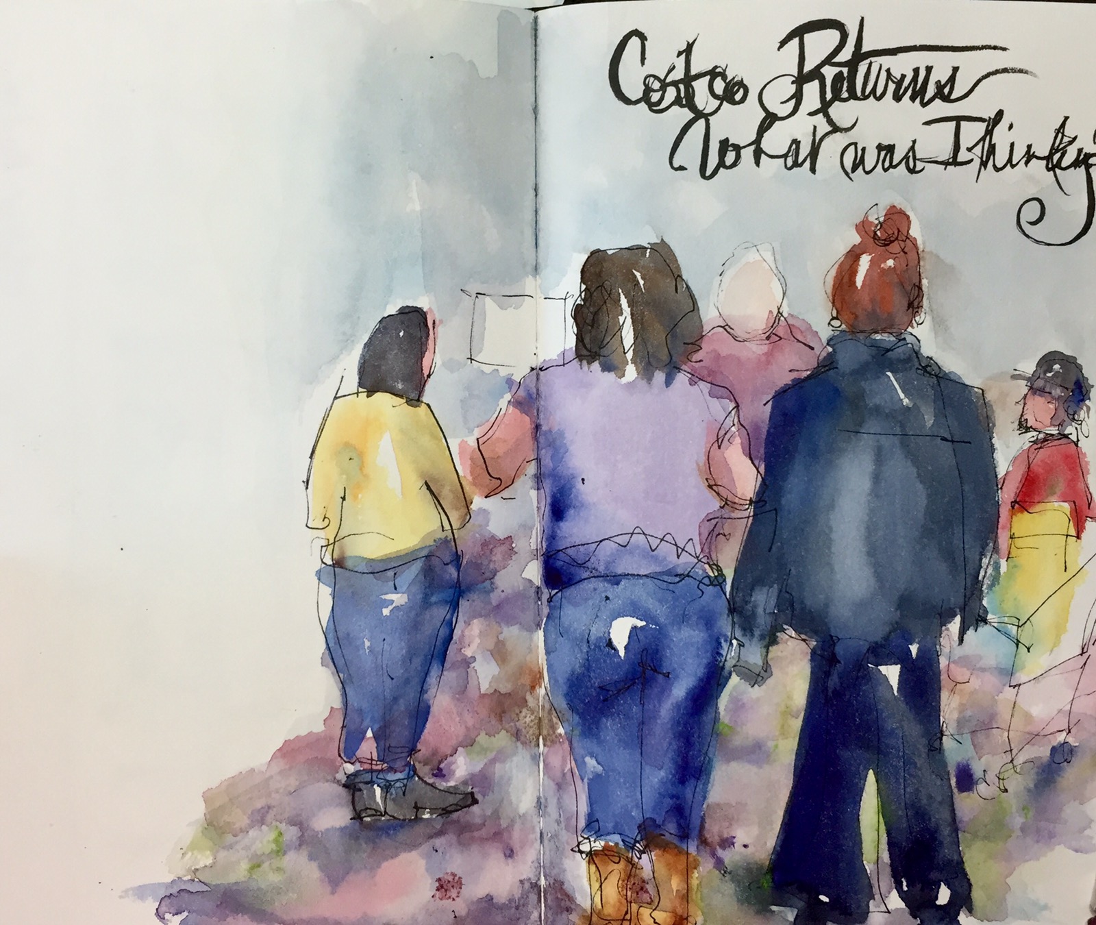
These were drawn on site with a Noodler Creaper Ahab in my Stillman and Birt Alpha painted with watercolor and touches of white get pen.

The Grumann Avenger Torpedo Bomber was the first one I drew. A nice Navy blue. How could u resist it shining in the sun, saying draw me?!
Sometimes crosshatching the background fixes mistakes but NOT this one. I think A bad line would have been better. Planes are hard to draw because there are so many angles going every which way. Typical perspective rules apply but don’t seem too. Easy to get off track.
I tried to stay on track by looking at the angles of the real wings compared with the angles I drew on the page starting with the fusillade then adding wings and tails. As it is I forgot to add the tail gun. So many small details it’s easy to miss a few.
When I got home I looked up the plants to try to figure out which ones they were. The Grumann Avenger was the plane Pres George Bush flew in WW2.
The navy blue is a mix of ultramarine and black a color I rarely use. It was hard to get a deep deep blue without the black.
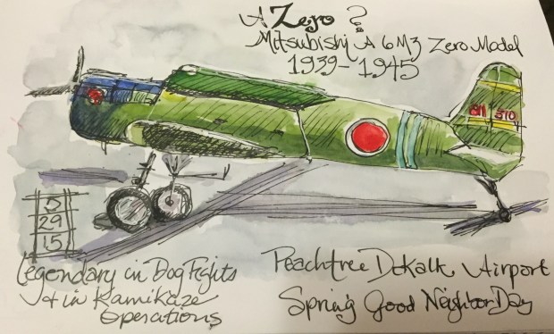
Next was the infamous WW 2 Mitsubishi Zero famed for dogfights in and kamikaze missions in the Pacofoc campaign. We thought surely it was not a zero but it had that big red circle on it. We knew what that meant. I looked it up and yes it was. This was fairly easy to draw. Profile views are easter even in a plane. Even the military green was easy. A bright green mixed with yellow ochre. Piece of cake. Success at last. I added a touch of Quin burnt sienna to the cad red of the circle.

Not sure what kind of plane this is. A WW2 Army Spotter plane I was told. Of course now the tail says USAF. Hmm I noticed that as I was drawing.
I used the same greens on this plane as the zero. The gold is Quin gold. Yellow ochre was just being when I tried it. Grey is ultramarine and Quin burnt sienna.
More planes tomorrow and a comparison of paint.
Thanks for reading.
Margaret XXX


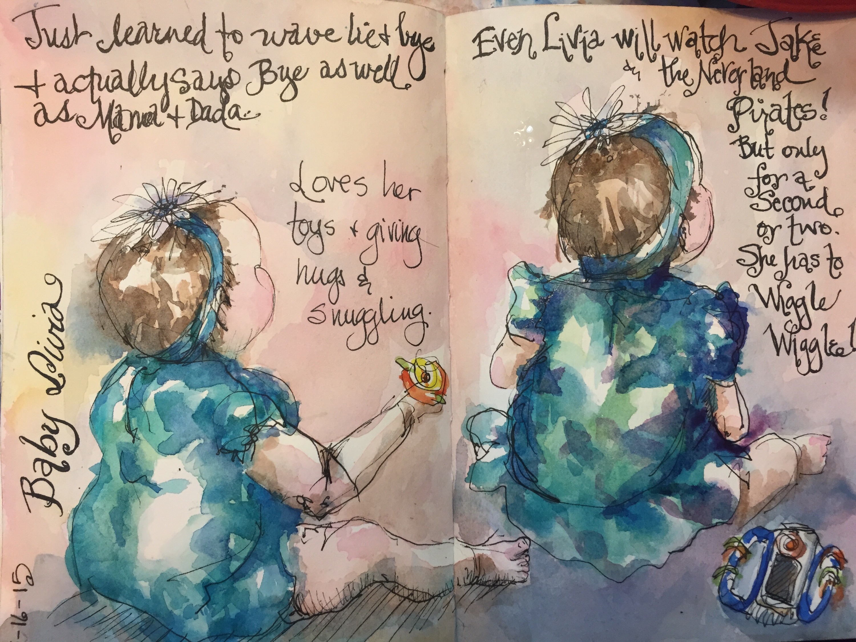
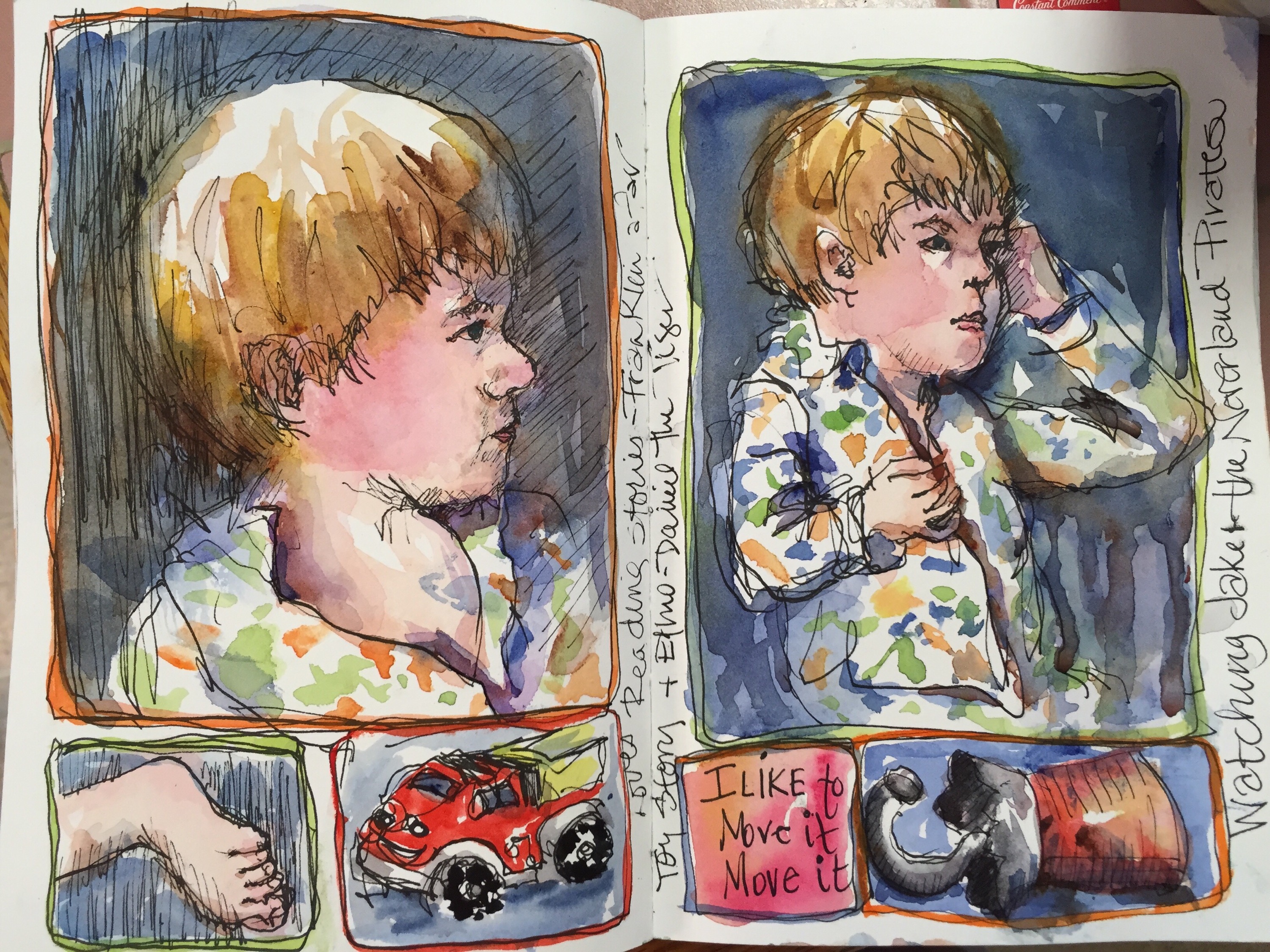
 His dad asked me if I bought him a car at Publixs and I said Yes of course he asked for one and a rabbit for his sister and flowers for his mom but we knew daddy didn’t want anything but that ham we cooked!!