Day 425 -a Tutorial – That bacKgRouD

  
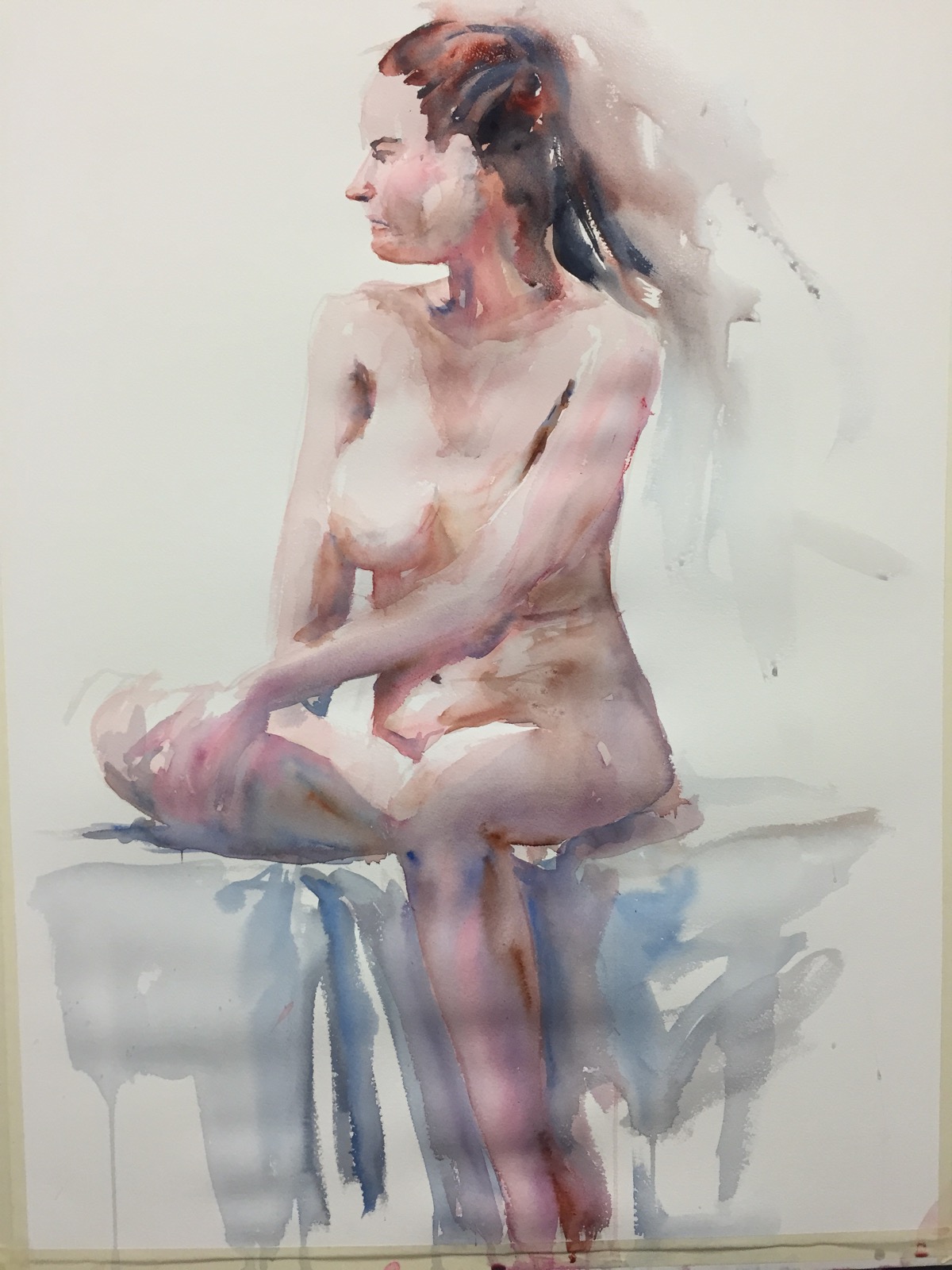
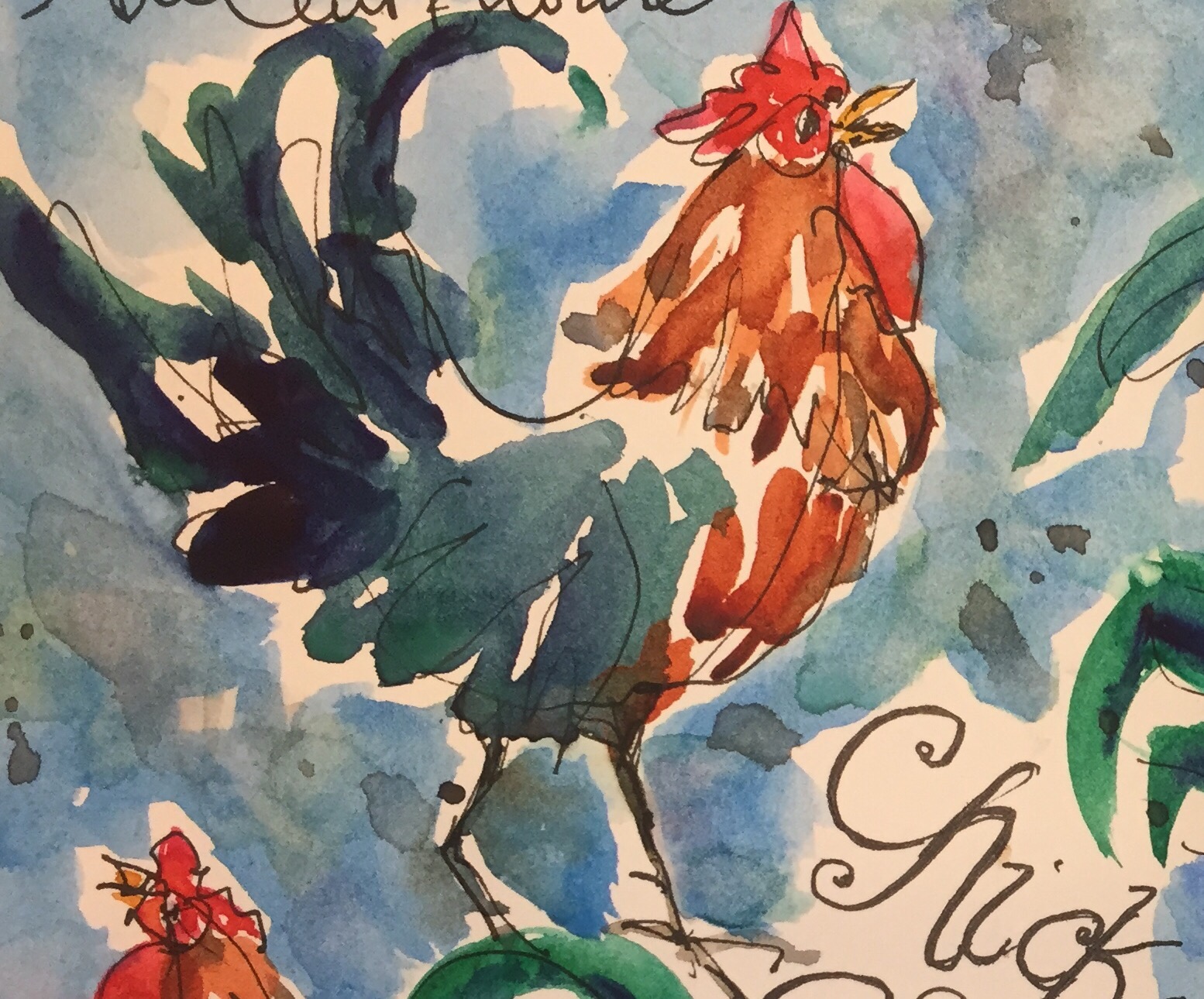
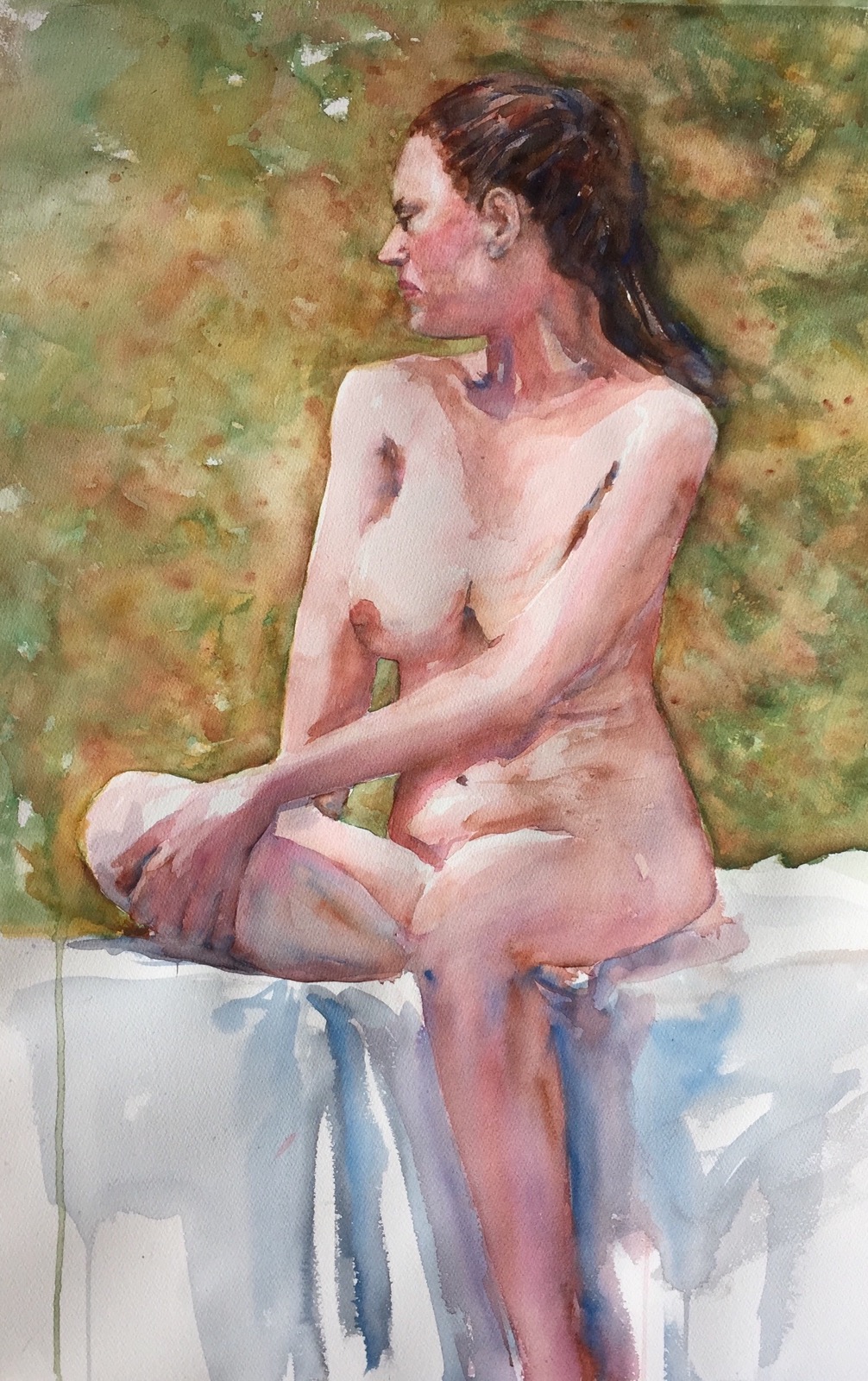
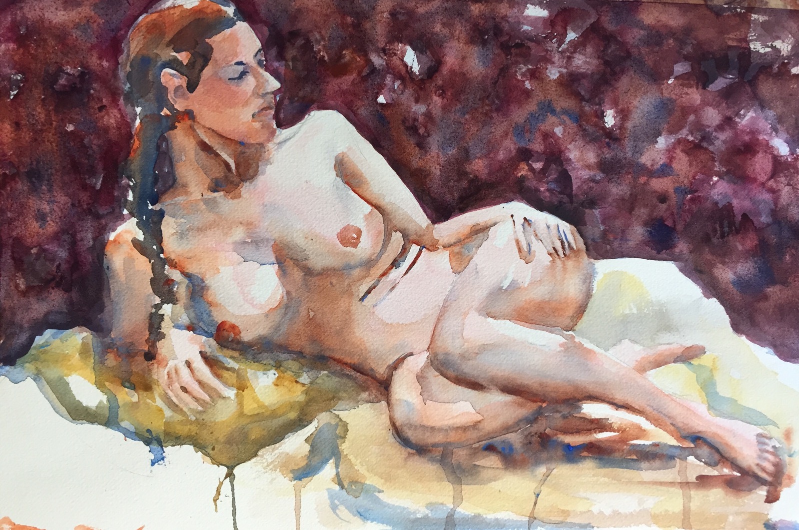
Ilenia Kilimanjaro #140 cold pressed 22×30 -for sale email me at m c m h u n t @ me.c o m  of you need her. 

Or how many ways can you spell disaster?! Disasters are hard to fix when you paint with watercolor but sometimes you can if you are patient. 

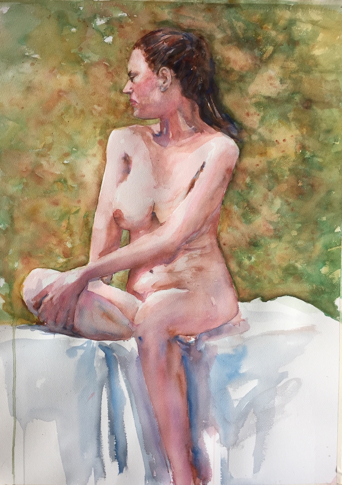
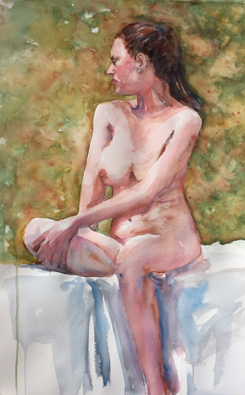
 Yesterday I said I would post how I did the backgrounds on these two paintings of Ilenia. It involves ALOT of water and dripping paint.  
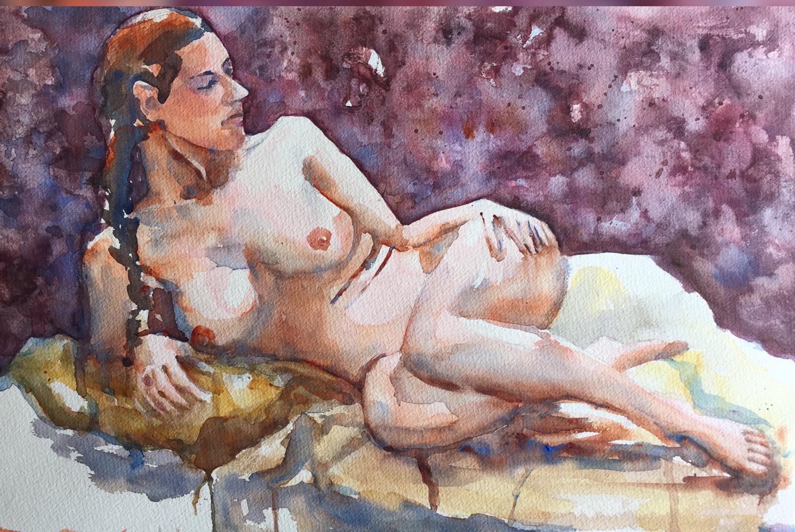
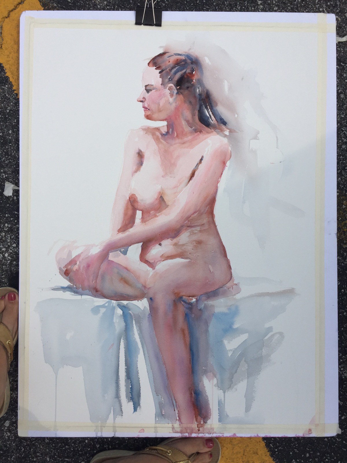
Ilenia Fabriano #140 cold pressed 12x 18-for sale email me at  m c m h u n t @ me.c o m of you need her. 


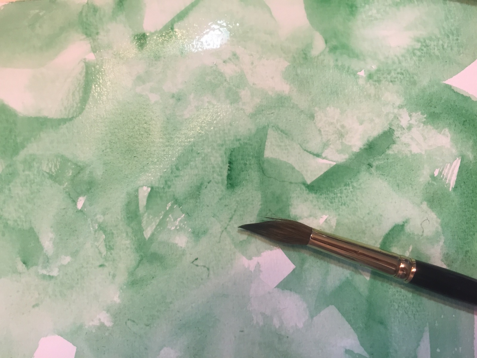
This was the background originally on last weeks painting.  What was I thinking?!  

Try lifting color next time you have a disaster. If it’s cold pressed paper you can lift the color. Some paper does it better than others. Fabriano does it best. The cheapest source of fabriano I have found is Cheap Joes. Cheap Joes Kilimanjaro also does a good job of lifting though not as good a job as Fabriano. 

Don’t forget Hot Press papers will not lift at all. Worst ever including my beloved Fabriano. I once mixed up some hot press fabriano with my cold press and used it accidently.  How many ways can you spell disaster?! 

This is basically how I did the backgrounds in the pictures. You may have to repeat the steps. hookers green size 12 sable legend I had the same reaction to that hookers green in this weeks paintings background. What was I thinking. Even worse the green is staining so I had to use other colors to get rid of it. 

  Blotting off that Ick green. 

So how to do that? First how I arrived at the background.  

  
Adding more water to lift the paint. 

  
More blotting with Kleenex. No puffs allowed. They have lanolin on them. 

  Adding yellow ochre to kill the green.   

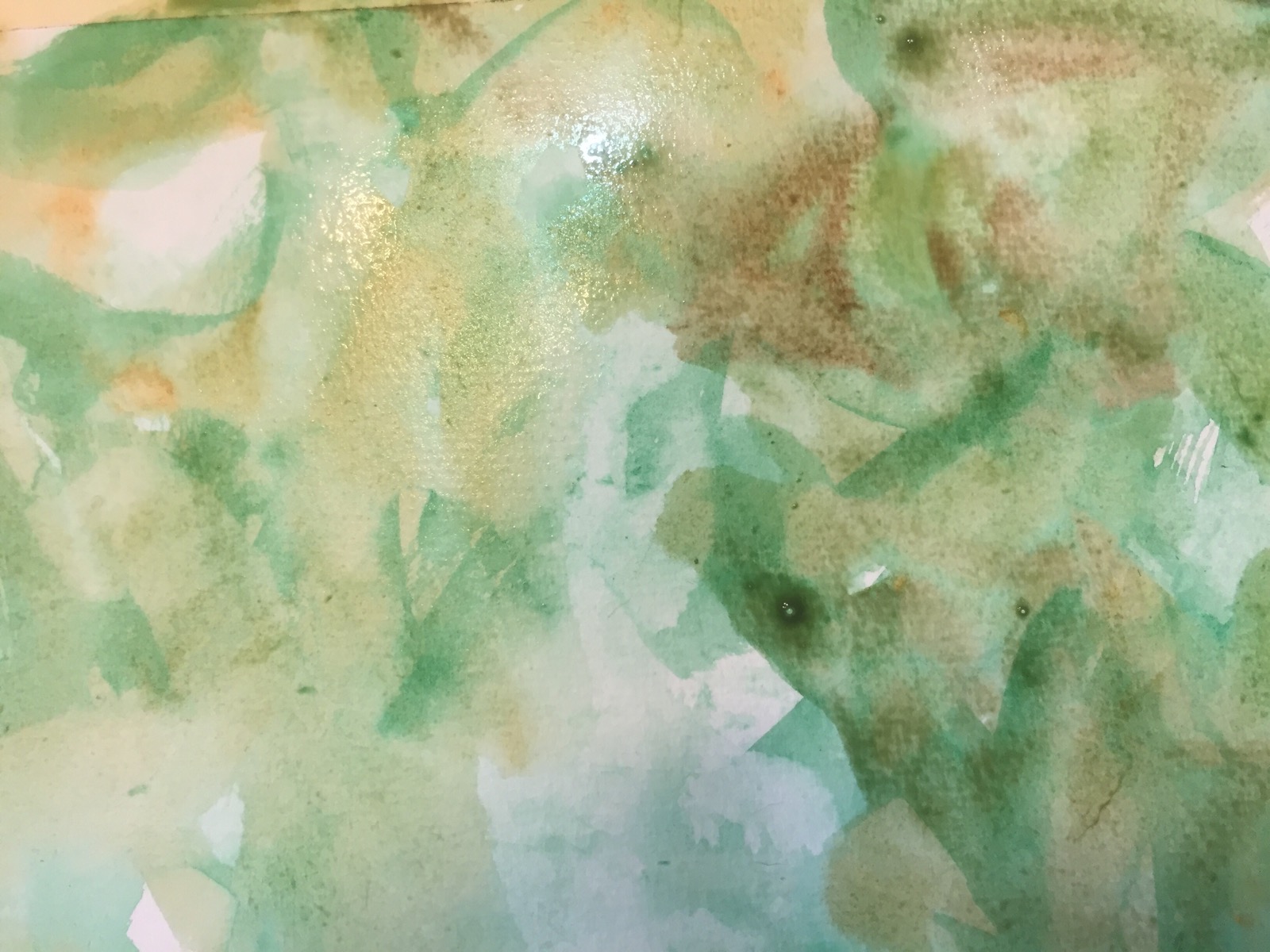
 And a little burnt umber. 
  
Splattering soupy burnt sienna with my Legend 12 sable. 


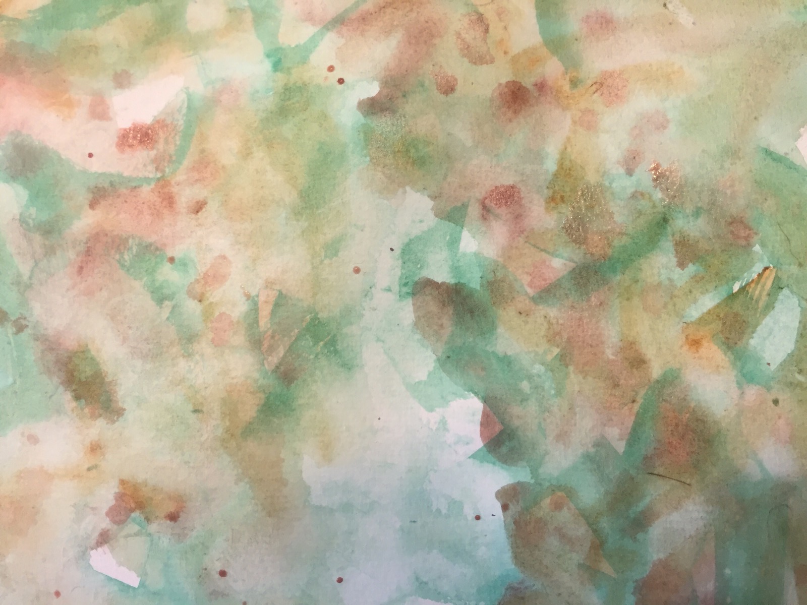
The spatters melt out because the paint is wet.  
  
Then I repeat the above steps blotting off color and adding more til I like it. 

  Now what did I do to get rid of this too dark color. I hit it with the spray bottle, let it sit a few minutes and started blotting it off with Kleenex or paper towel. It gets to be a drippy mess and it usually ends up on the floor. 
  
And it ended like this. I did splatter the background again.  I think the colts I used were alizarin, mineral Violet, burnt sienna, Inathradone blue and cobalt. 

Ps don’t forget to wipe the drips off the floor before you track them everywhere. 

Thanks for reading. 

Margaret xxx

Day 424 – Yes it’s SuNdAy!!! 

  
Ilenia full sheet 22x 30″ 140# Kilimanjaro for sale. Email me at m c m h u n t @ me.co m if she needs to come live with you. 

As you may know I usually post the life modeling session on Saturday but Miss Ilenia was misbehaving. Or maybe it was the painter?!  😳

Before I start wanted to remind you that if you haven’t seen Mr Yow doing Chinese painting on my Facebook wall you should. It’s only 4 minutes. https://m.facebook.com/MargaretMccarthyHunt?ref=bookmarks

 I am going to make a mental checklist or maybe I should write it down to review before I start painting. Meditate on it. Put it under my pillow and sleep on it. Put it on the bathroom mirror. 
   
She was drawn with a #4 Isabey sable watercolor brush w a grey that was mixed with everything in the corners of my palette.  Twenty minutes sketching. When you use a paintbrush on watercolor paper you have to think about where each line goes. Trying for no do overs. 

ChEcKlIsT:

  • No head smaller than 4″ EvEr!!
  • Shoulders even?! 
  • Arms the right length?! 
  • Eat in the right position?! 
  • Start painting on the face first. (The face makes me nervous so I tend to start on it after I do the body. NOT good because in a two hour drawing session I run out of time. Since I tend to slap paint on when I get in a hurry guess what I do?! Not a good look on a face!! )
  • And last shadows even across the face?? (Aka shadows on face should NOT Be darker than the body. Gives a beard effect. Not good on a pretty young girl!!!)
  • Ps only use burnt sienna and cerulean on a young girls face or the shadows get too heavy. Charles Reids rule and he is THE Master!! Www.charlesreidart.com

 
The first forty minutes including sketching. A Quin coral and french ochre wash. Both are transparent. Raw Sienna and cerulean shadows. 

  
Next forty minutes. Mistake number one on the face. Eyebrow and eye too dark and heavy. She had dark eyes but using burnt inner and ultramarine made them TOO dark. Next time repeat the mantra burnt sienna and cerulean only. The eyebrow is too long too. No shadows Around the eye make them look pasted on. 

Also lost the edges of the back of her hair so she would not look cut out and glued down. It makes your eye look at her face not her hair. 

  
After Life modeling. Two hours. I put her down in the parking lot and took her pic in the noonday sun. 

  She needs some background to make her PPP. I chose green because it’s the opposite of pink or red. But oh my gosh what’s wrong with that face?! 

Lots of minor things. Eat was a little low. The mouth too down turned. The eye shape off. Forehead a hair too narrow and TOO round. Otherwise she was looking great. 

   
 After a lot of twitching around I am happy with her. Shoot me an email if she needs to come live at your house!! 

   
 Now my biggest question is crop closer or leave full sheet?! Leaning toward the cropped version. It follows the rules of thirds and I like it best. Which one do you like best?! 

Tomorrow will tell you how I did the background. It too was rough for a while but really like it ALOT now. 

Thanks for reading. 

Margaret xxx

Day 412 People time


SOLD!!!

I drew this the other day when we had breakfast at the inner bean. A lot of times when I try to draw people like this I end up with a mess. For once I started in the front and drew to the back. 

Today sketching at Costco I  did the opposite. A bit of a mess. 

Since these are generally drawn in ink you don’t get a do over when the figures over lap shelves. If you start in the front not such a problem.  I started with the left bottom corner. 

  Contrast was a problem too. All the figures were blending into each other on the left. 

  
I converted it to black and white. With the color gone it was easy to see where the figures wee blending in. Bottom left was especially bad. 

  I uped the contrast aka value which I think improved life at the bean. 

Just remember my chickies it’s all about value. 

  An old page of dads on how to draw people I thought u might find interesting. 

Thanks for reading. 

Margaret xxx

Day 410 – More of those chickens!! 

  
Courthouse Chickens Key West 

Where else but in Key West would you find chickens at the courthouse?! 


I drew these toward the end of our stay in Key West when I went on a sketchathon starting at the Key West Wildlife Center and ending at Higgs Beach sketching the people as they walked by in front of the car. 

   
Fast sketching requires a good flowing pen – chickens birds and people don’t hold still for long!! I use my Noodler Craper Ahab or one of my two brush pens – the Kuretake or the Pentel.  The first two are always loaded with Carbon Platinum Black ink which dries so rapidly. I frequently paint them later especially if the weather is extreme like in the tropical heat of key west. 

 
 I thought you might like to see the chickens before I painted them. 

  
  While in Key west I saw a lot of Chinese style brush work paintings of animals in one gallery on Duval. And decided to try it out on the long chicken strip. I liked it so much I did it on these pages too. 

There are really only a few pure colors used on the chickens. Quin gold, Quin Sienna, Quin burnt orange, Inathradone, Quin red and alizarin period. All the colors were allowed to combine on the page. Painting was done with my large cheap joes legend #12 sable even the large splatters. 
  

Tip: To make the splatters. Choose a color or two and make a soupy mix. Fillup a large brush and gently tap over the painting. Yes I have a toothbrush but I always get little splatters not big juicy ones with it.


Probably due to heat stroke I was imagining what the chickens might be thinking as I drew.  What would I think if I were a courthouse chicken?! Look there goes another felon?! Wonder what they did?! Hope I win my case?! 


Before I started drawing chickens  I thought roosters were mean ready to attack you at any second like the ones we had as kids. When get are with the chicks and be a they are very different beasts. They are not aggressive. Feed them and they defer to the babies and hens to eat. They also stand vigil while the hen takes care of the babies. Who knew??! 


Thanks for reading. 

Margaret xxx 

Day 392 – A Few Ibis

  
Three times is the charm they say!  Wordpress keeps eating my post today. These were all drawn on site at the Key West Wildlife center. I counted at least 8-10 pages of ibis sketches. 

  
Stay tuned tomorrow for painting details. Want to be sure WordPress behaves before I write one more long post. 

Thanks for reading. 

Margaret xxx

Day 328 – Quick Dog Sketches


The Watch Dogs aka Pits on guard

Happy June!!  Can hardly believe it’s amer again! 

After one false start this one went very well. The two dogs were guarding the house while strangers were getting giveaways on Craigslist  off the porch. 

They will sit still barking their heads off for what seems like hours.  This sketch took at most ten minutes and perhaps ten to color it.  Quick and dirty.  It was done with my Noodler creaper Ahab loaded with carbon platinum plus. The ink should not have run. Maybe I will make this mixed media when I get home by adding a piece of ledger paper over the lettering on the right. 

Tips aka How I did it. Colored with Caran d’ache watercolor crayons wet with a waterbrush.  The brindle pitty was a problem as usual with his tiger striped coat. I started with the same colors as the fawn pit bull Livia. Then I added black to Bear. I wet it down hitting it here and there with the waterbrush. If I had brushed the water on it it would have blurred the colors. 

The blinds were done by coloring with  a burnt umber crayon and washing the blinds with it. Then letting the wash dry and drawing new lines on the blinds with the  burnt umber crayon. 

I had thought about getting my fine mister out and spraying it allowing the colors to run.  Glad I didn’t. I really do like this sketch. The mister spray effect is totally unpredictable. 


This is the first attempt at drawing them. A contour sketch that didn’t have room for all of Bear the pit on the left or all of Livias tail or the chair. Sometimes it’s just easier to start over. 

Thanks for reading!!

Margaret xxx

 Day 288 -The Walker Sisters Cabin

about 2 miles up a mountain and across a stream sits the Walker Sisters Cabin along with several out buildings. The five sisters held a lifetime lease and lived in this two room cabin till their deaths.  Their father built the cabin when Abe Lincoln was still practicing law. 

 The hike up there is lovely with wildflowers on the side of the road but I can’t imagine what it would be like to live so far from civilization. I guess they didn’t go to the store very often! 

 Four of the five Walker Sisters. From a 1946 Saturday Evening Post article http://www.saturdayeveningpost.com/wp-content/uploads/satevepost/time-stood-still-in-the-smokies-SEP.pdf

 Painting the picture 

Done in my Stillman and Birn Zeta. Drawn with A Noodler Conrad pen and lexington grey ink in the rainy drizzle. 

I started with a wash of Sky aka cerulean and trees – spring green and viridian. I let that dry and added the trees in the background with indigo and a grey made by adding burnt sienna to the indigo. Different strengths  of these two colors make the trees recede into the woods. 

The cabin was painted with the same colors. Yellow ochre was added on the chimney burnt umber washed over the greys of the cabin. 

The dogwood was painted with white gouache. Next time I think I will use some masking on a sponge to do this. I like the look better. 

 My son crossing the log bridge to the Walker Sisters Cabin 
(Painting the picture continued)

 The grass was added with the same spring green and viridian as the background just not as diluted.  Some negative painting with the darker green was done to make the grass spikes. 

 
A red salamander that was on the foundation rocks of the cabin. 

  A fern on the path to the cabin. Both of these pictures were taken by setting the end of the iPhone6 down on ground level and clicking away.  


Wild orchis
  
A trillium 
  

Day  280 -Making Accordion Books


Why make them?? Because they are the easiest book to make because no sewing is involved. 

And because you can do this with them.  

My Sennelier USKsketchbook.

 Nice heavy paper but only one length of paper.   Too short. Another reason to make one.  Dull black cover. 


 210″ small Moleskine accordion 

Or the famous moleskines. Again a dull black cover. Great length but the paper is terrible now that they are outsourced to China. Watercolor and pens will bleed they to the back so you can’t use it.   

So now that we know why we need to make one lets get started and gather our supplies. 

 Supplies

Book board or heavy cardboard

2-3 sheets of All purpose paper such as Stonehenge. 

PVA glue

Fabric for the covers – cotton muslin or sateen

Bone folder

Rulers

Pencil

Exacto knife or carton cutter

Optional

Self healing  mat

Parchment paper. Glue won’t stick to it. 

Let’s get started!

Sorry not to have better photos. I am out of town. No wifi no fabric or glue. I will update this when I return home hopefully next weekend showing how to cover the book board. 

Measure the width of the paper. 

Divide the width of the paper by 3 or 4. I made books ranging from 5″ – 7 1/2″ tall. I got three to four strips out of each piece of paper. 

Most books are 3 1/2″ x 5 1/2″ tall or 5″ x 7 1/2″ size. 


Folding the paper 

 Measure and mark your strips. It’s easiest to cut them with the Exacto  knife or a rotary cutter but I like the look of ripped paper edges.


Ripping the paper.  

 An easy way to get the torn edges is to fold your paper across the width and crease it with the bone folder. Then SLOWLY slide the bone folder along the crease ripping the paper. Roz Stendahl (Www.rozwoundup.typepad.com) has a you tube video on how to do this. http://youtu.be/pzlXHZ0f3kg Amazingly easy. 


  The paper accordion folded. 

 Next fold your strips in half. Crease with the bone folder. Mark your fold lines either every 3 1/2″ or every 5″. Fold like a fan or accordion.

 Joining the pieces. There will be a tab of extra paper left on each end of your strips. Remove the tab from one end.  Cut the other tab down to a 1/2″. You will use this to glue the strips together. 

PUT THE GLUE ON THE BACK OF THE STRIP WITHOUT THE TAB AND GLUE THE TAB TO IT. AS IN THE PHOTO. 

BE SURE YOU GLUE ALL THE STRIPS TOGETHER ON THE SAME SIDE OR YOU WILL HAVE SOME TABS ON BOTH SIDES. YOU WANT THEM ALL ON ONE SIDE


 If this frustrates you you can also use Washi tape to join your paper. 


 You can glue as many strips as you want together. The small  moleskines have 210″ of thin Chinese paper in them!! The larger moleskines have 124″ of thin Chinese paper. 

Just remember that heavier the paper is the fatter the book. 

Cut the cardboard covers 1/4″ bigger than your paper strips. Cut your fabric about 2″ bigger than your cardboard pieces. 

Spread glue on the board evenly.  Be sure to cover the whole board. and apply the fabric. Smooth the fabric with your bone folder removing any wrinkles and bubbles in the fabric. 


Mitering corners /Gluing sides. OPPS a wrinkle. 

 (This photo is from a tutorial I did on how to make a pamphlet stitch sketch book.http://scquiltaddict.blogspot.com/2014/10/day-96-sketchbook-part-2.html?m=1)

 Miter and glue the corners. Trim the fabric diagonally down before you fold and glue the corners. 

Neatly glue the sides down. 


 Glue the paper to the covers.  (I am not happy with the wrinkly paper. In later books I glued paper over the fabric covered board to make the end papers smoother. 

You are done. 👍 See not so hard. 

This webpage has great instructions with pictures. http://www.designsponge.com/2013/03/bookbinding-101-accordion-book.html

Thanks for looking!!