Day 568 – The Seine at Mericourt

  
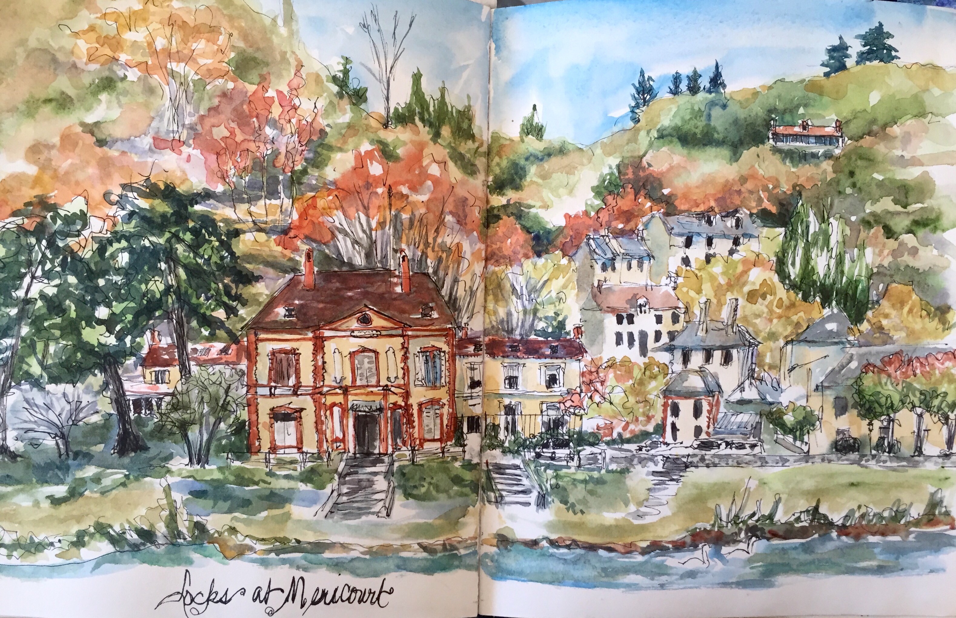
There are huge locks at Mericourt to let the boats sail the shallow Seine River. Everybody on the boat was up top to get a good view of our trip thru the locks. Did you knw it’s a good way to get a bath? As you pass under the lock gate it drenches you with the water accumulated as its raised from the river. 

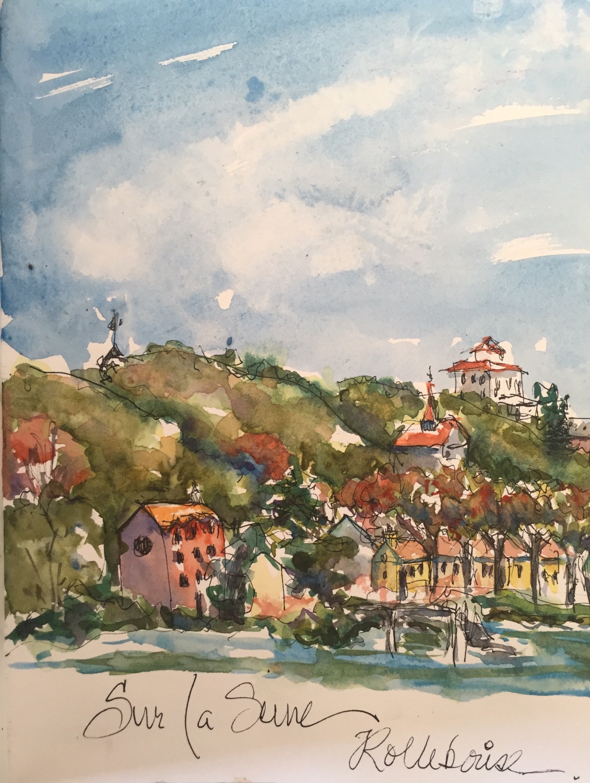
Again a compilation of houses.  Mostly from Mericourt and Roche Guyon. 

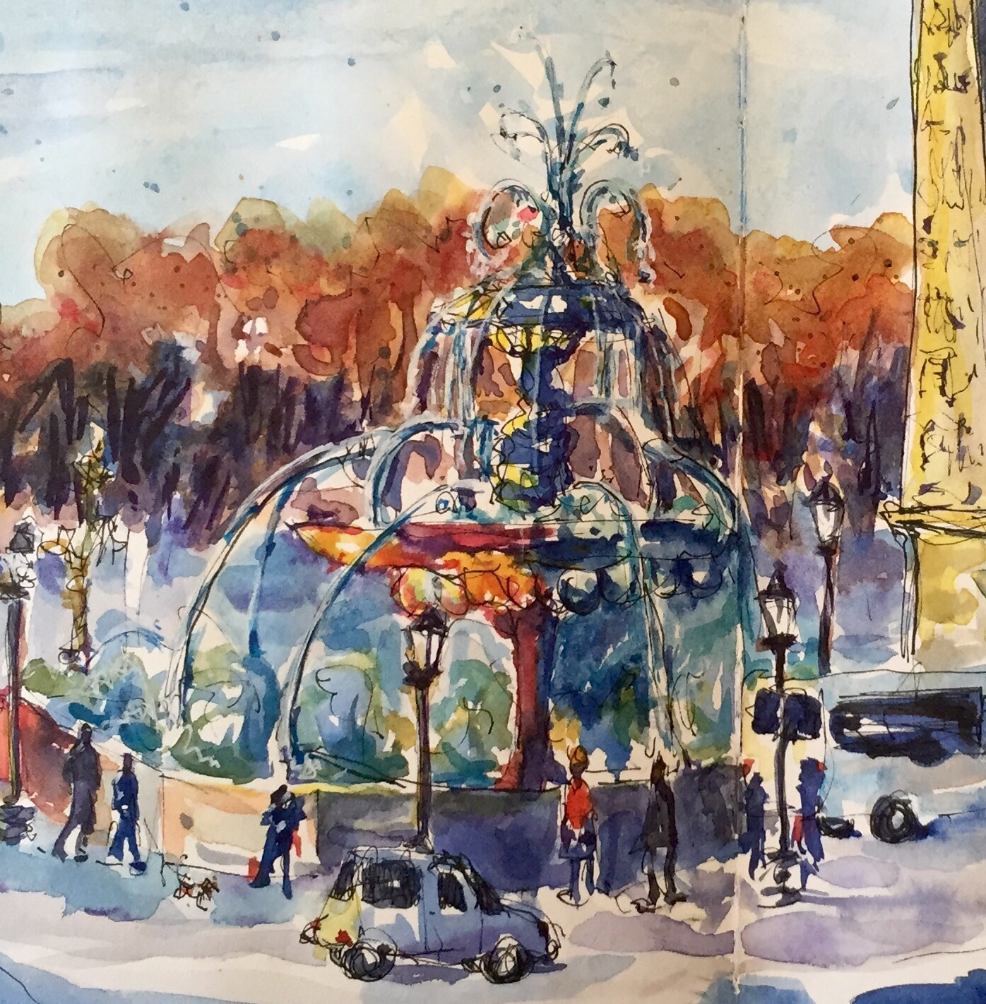
 There was almost a disaster. There was a big black blob of ink fell on it in the pine grove. Eeeekkkk. I managed to save it by watering the blob down and painting the pines dark. Can you find it?? 
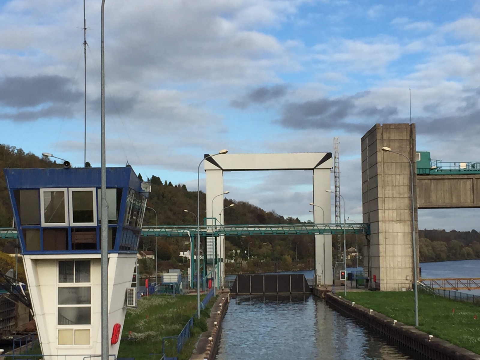
  
The locks. 

When painting these it’s necessary to use a lot of negative painting and contrasting colors to get the light buildings to show up. They can get lost on the riverbank if you don’t. 

TIP:  I check values by using my phone camera and turning the painting black and white. You will see if you have lights and darks or if everything is painted in a midtone which is what most people tend to do. 

Colors used Apatite green and hookers. The apatite green granulates into lovely purples and Browns. Quin gold and red orange in the rusty trees. Winsor yellow to lighten the greens. Greys are burnt sienna and cerulean or Inathrodone. Blacks Inathrodone and burnt umber. Sky water blues cerulean. 

Thanks for reading.

Margaret whose hoping the Savannah doesn’t flood Augusta again with all this rain. Xxx

Day 567 – Up the Seine to Rolleboise

  
Don’t you LOVE the name??! Rolleboise!!! 

As we floated up the Seine to Normandy the most charming scenery floated by. Every building was unique but they whizzed by so that I could only draw one or two at a time.

 The a light bulb went on!! I could compile buildings on the hillside just like I do people. I drew several pages of them before I was done. 

This is the first one I did. And yes the hillside was surprisingly green for fall. 

Hillside is Hookers green and green apatite with Quin burnt orange and Quin gold with bits of Inathrodone blue. 

Thanks for reading. 

Margaret off to painting class.  Xxx

Day 566 -Quai Grenelle / Radio France


Quai Grenelle / Radio France building as the sun was setting. It does that early in Paris because it sits at such a northern latitude. That said the walk along the quai was  bustling with people going for evening walks. 
The people were added as they walked across the path at the top of the quai. I really think people bring a landscape or cityscape to life. 

This part of Paris had a lot of interesting modern buildings which I would still like to draw. The terrorists interfered with my plan. 

This is painted with a bottom coat of Winsor Yellow and bits of Quin gold. 

The blue is mostly cobalt blue which is a good transparent color. Harder to get muddy colors if you start out with transparent colors. 

Greys are cobalt and burnt sienna or inathradone blue and burnt sienna. 

Trees are Quin gold and hookers green and green apatite with Inathrodone blue. 

Day 565 – St Maclou 

   
St Maclou Neighborhood Rouen

Noodler Konrad Platinum Black Ink Strathmore 500 Mixed Media journal

I sketched this late one grey afternoon sitting under an old tree in the square in front of St Maclou which is a lovely Gothic Church surrounded by half timber buildings. People continually walked by and I dropped them in here and there in the drawing. 

St McClou was probably my favorite church. A gothic pile of confection like a wedding cake encrusted on every surface with lace and gargoyles and embellishments  of every kind. 

  The church is on the small side in the sketch  but I like it a lot anyway.   Originally I had the church too light. I was trying not to get it too dark but the house was too dominant so I had to darken it. 

I also darkened the sky which made the very light church pop more. 

Colors used. The ones I usually use aka I can’t remember which ones. Oops. Sorry!!

Thanks for reading. 


Day 565 – Place de la Concorde 


Place de la Concorde where Madame Guillotine once reigned and  Madame De Farge knitted madly away as royals heads rolled during the French Revolution. The place is enormous. The statues were nearby and the fountain and obelisk a long way off. 

  This was drawn while I sat on a bench in front of the L’Orangerie in the late afternoon. I think we had walked about 8 miles that day. A LONG day. Good to put my feet up and draw. 

I used a lot of Winsor yellow, Inathrodone Blues. The turquoise green on the lights was made with either Holbein Marine blue or Cheap Joes Andrews Turquoise. I can’t remember which. Sorry. I also used a lot of Quin magenta and coral and Quin gold to make it glow. 

Once again my brain is fried from too much walking in Hitchcock Woods in Aiken today. Not quite four miles.

Stay warm. Going down to twenty tonite. Brrrrr. Break out those wooly socks!!  

Margaret xxx

Day 564 A -Ilenia part deux

    
Uses a one inch and an one and a half inch hog bristle to lighten the offending darks. I also added white and cobalt blue to the background using sheer layers. Lightened a lot of the face shadows with a watered white. 

No beards on Ilenia!! 

Of course I lightened the background w a dry white and cobalt blue. It helps soften some of her edges. Probably could do more but I am leaving her alone for now. 

Thanks for checking in!! 

Margaret who is off to knit and contemplate another painting. Xxx

Day 564 – Ilenia time!

  
After forty minutes work. Other than her eyes were a little close together I think I like this one better than the more finished product. Like the immediacy and the brush strokes – the looseness of it. 

This was painted with three colors. Goldens Nickel ago gold, alizarin Crimson and titanium white. I did add ultramarine and burnt umber to the hair. 

  Here she is now. Looking a little too old and what’s with the stripe on her tummy!? And the neck. An old lady chicken neck. Not good on a thirty year old. Too many hard edges. 

 That’s ALL got to go. No more small brushes!  If it’s not a big hog bristle I can’t use it. Lol. 
Back to the easel!!

Repost her when she gets better!! 

Thanks for reading. 

Margaret xxx 


Day 560 A Chimera

  
And I know you like I thought they were all called gargoyles. Nope this one is a chimera on Notre Dame in Paris. It’s the companion page to the Notre Dame sketch. 

  
I actually like the journal side of the page a lot. Colors hmm Quin magenta and sienna?! Quin gold and of course Quin sienna and cerulean on the chimera. 

Think I will go back and paint the left band cerulean too. 

Thanks for reading. 

Margaret xxx

Day 559 Rue de Renard 

  
Opposite the Cafe La Pause Beaubourg near the Hôtel de Ville in the Marais. Also down the street from the Pompidou where we had spent the morning. 

Absolutely loved the art in the Pompidou. What a massive building. With its insides on the outside odd looking among the late 19th century Hausmann style building. And this day so hot inside. No cold weather when we were in Paris during November. A very muggy 70-80 degrees with 91% humidity. 😳

I was impressed with the great masses of humanity walking the streets of the Marais.

 People everywhere and almost to a man or woman dressed in black. Evidently after September one must wear black in France!! And most had their faces down reading their phones. 

TIP: I always take a just in case photo of my drawings as I do them. I actually popped the original photo of this into Waterlogue to see what it would do and tried painting it that way.  Not easy since the colors in the ap are not normal watercolors. But fun to try. 

Colors used!! Painted with my travel pallette. Cerulean, Quin gold and Quin sienna on the buildings.  Quin magenta, burnt umber and Inathrodone for the darks and watered down for the side walks and greys. 

Red is cad red mixed w Quin coral to brighten it. I was too lazy to go dig up my Quin red.  Lol. 

A little hookers green and some phtalo blue. 

Thanks for reading. 

Margaret xxx

Day 558 – Which do you like? 

  
Background 1

I spent most of yesterday repainting the Ilenia’s background. This is the current background and my favorite so far.  I also did a lot of work on the bottom background adding alizarin here and there to tie it to the background. Trying to loose some edges and get rid of the pasted on look of the figure bits of the purpley dark was added to her hair to blend it into the background.  I had to completely paint out the blue background 2 with titanium white to get rid of the blue and paint the background as it is in the first picture. 

The background colors are burnt umber, alizarin and ultramarine blue. I also added touches of burnt sienna and yellow ochre. It always seems that I scumble backgrounds a lot. And of course some of it was just painted with a sable paint brush which gives a smoother finish than the hog bristle that I used for scumbling. 

 
Background 2 

I thought I would like this color better than I did.  It’s cerulean, nickel azo and titanium painted over background 3 which is really the first background I tried out and another I usually like. I thought it was too over powering. 

  
Background 3 

Burnt umber and ultramarine blue with some nickel azo over brushed or scumbled over the darker colors. 

TIP: if you get tired of getting up and walking back from your painting to look at it you cab use your home.   

  
 Here are a few other versions of background 1.

So my question dear readers is WHICH do you like? As I said so far background 1 is my favorite. 

Thanks for reading!

Margaret who is off to class to make great art tomorrow. Xxx