Day 371

a year and 6 days of consecutive daily blogging. Not easy when u r on vacation!!  

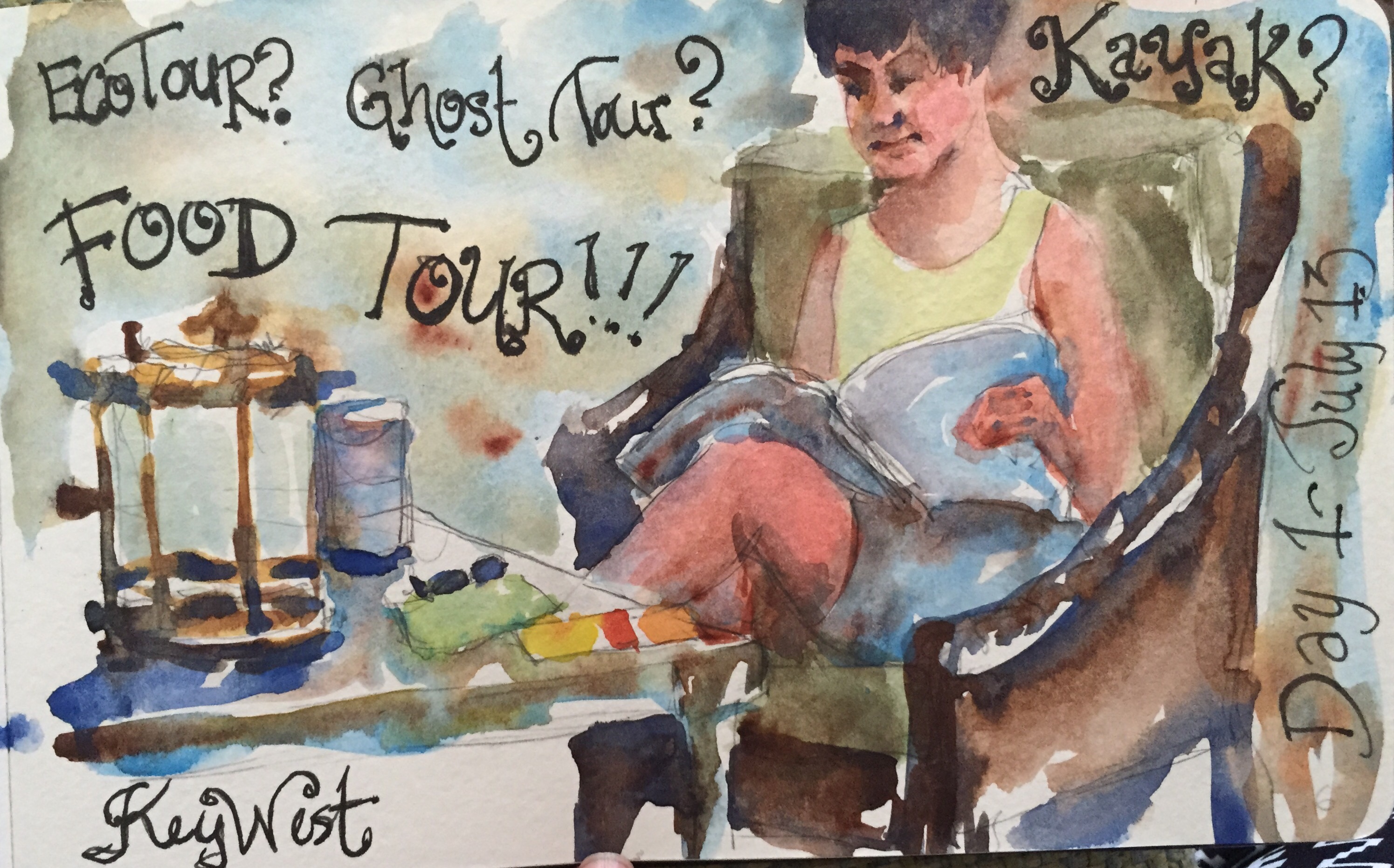
  My sis in law while we waited for the concierge so we could book some tours. Right now we are going on the ghost your Tonite and the food tour Thursday.   

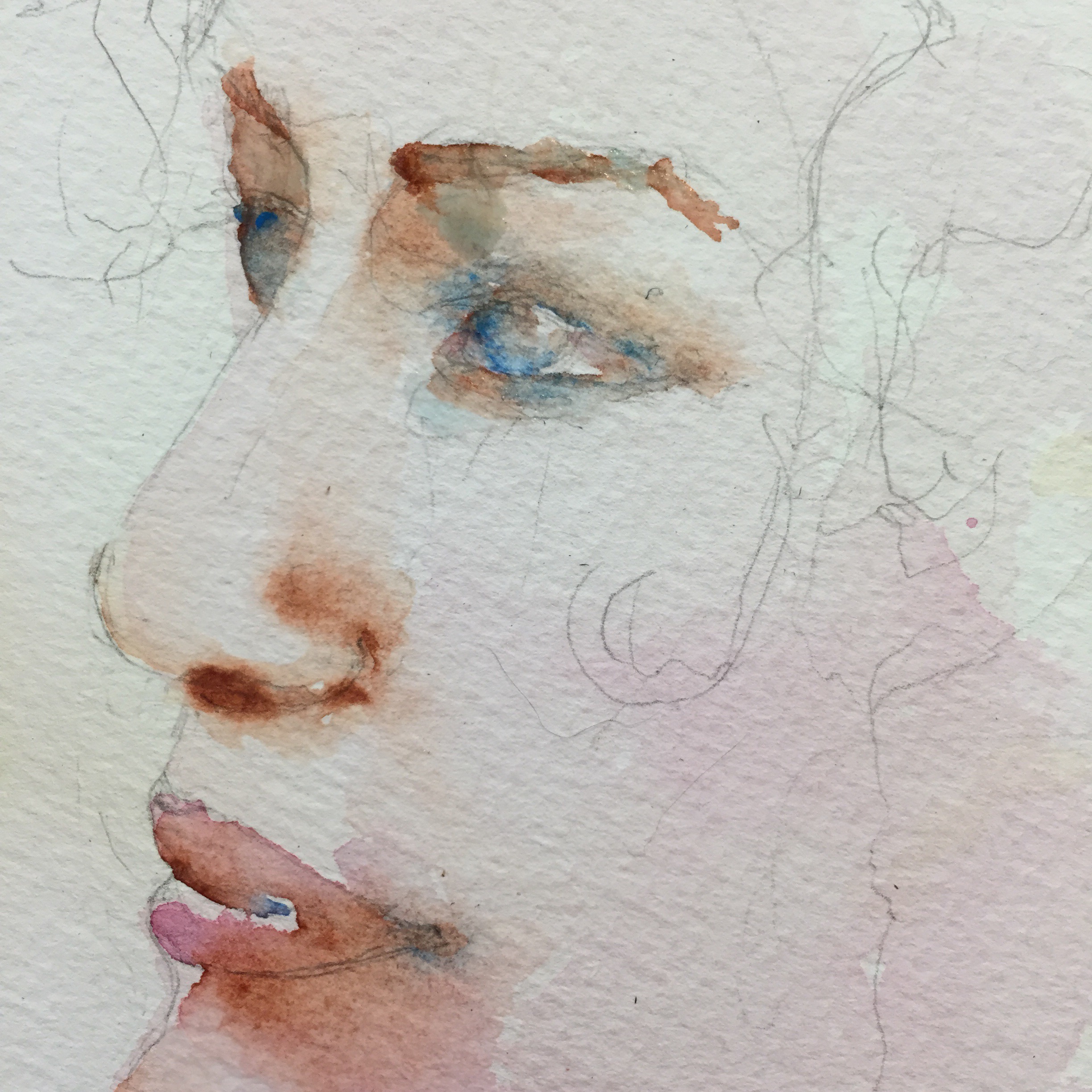
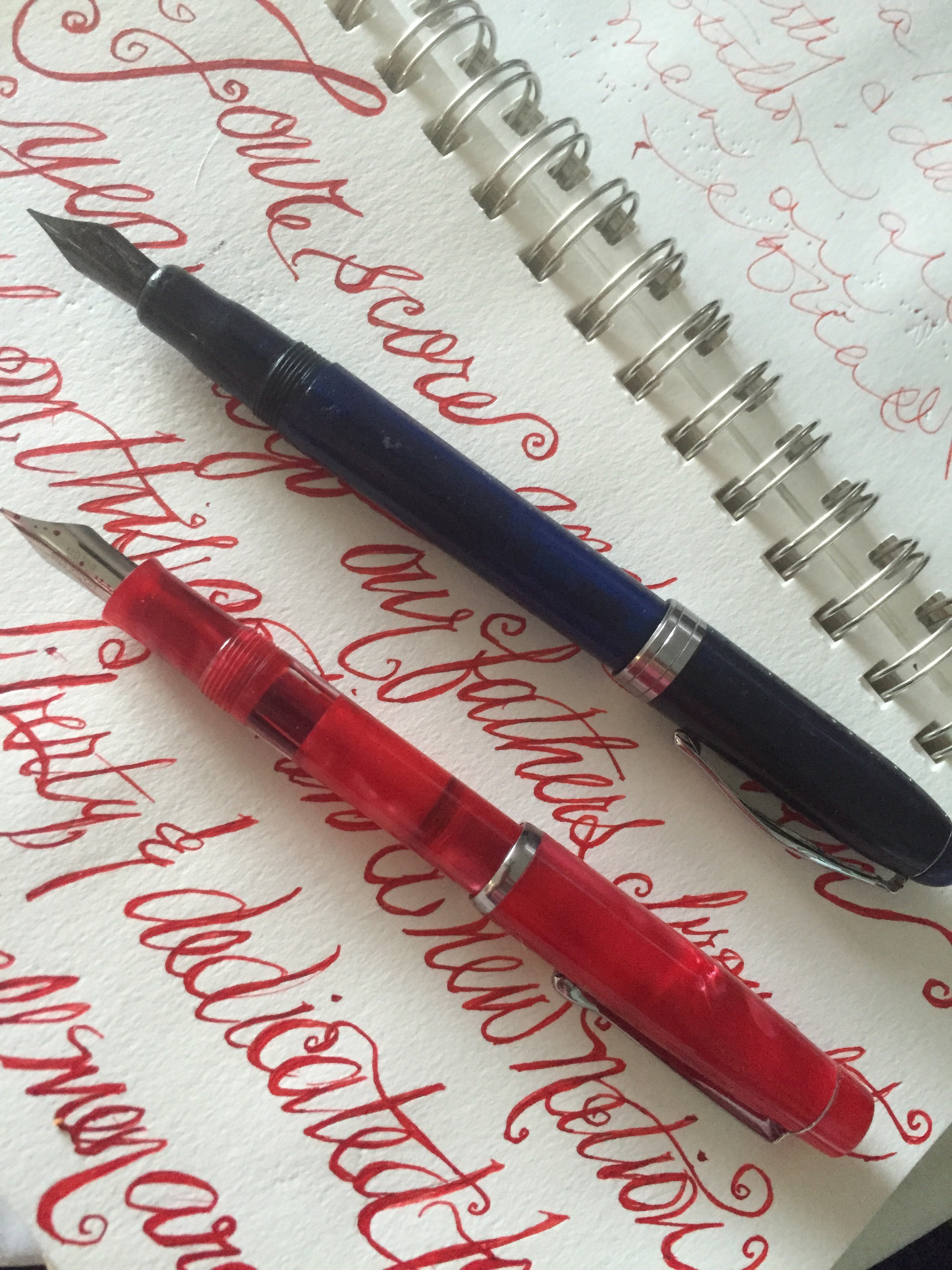
Lettering done with my Noodler Creaper Ahab and Carbon Black Ink in my moleskine Wc sketchbook. 

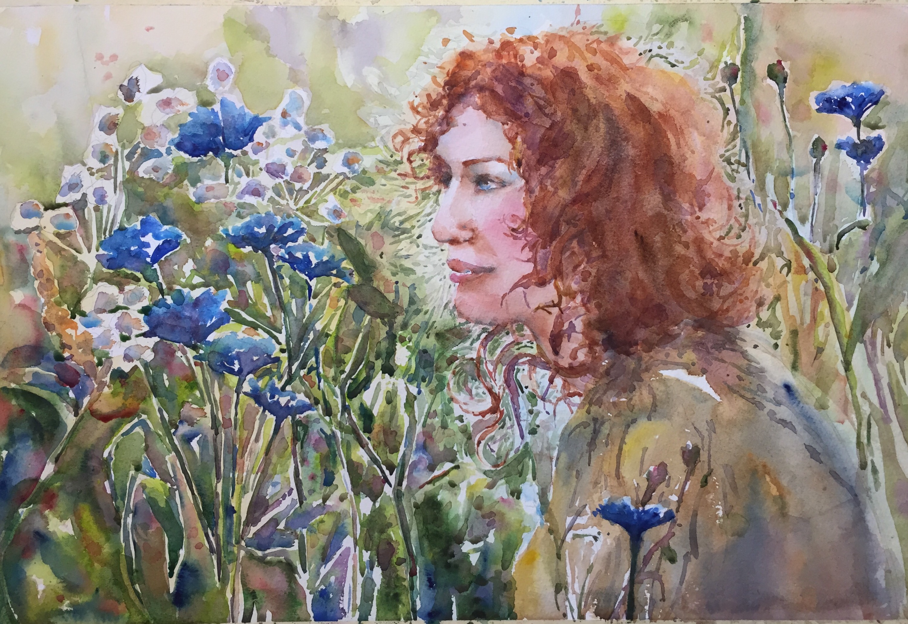
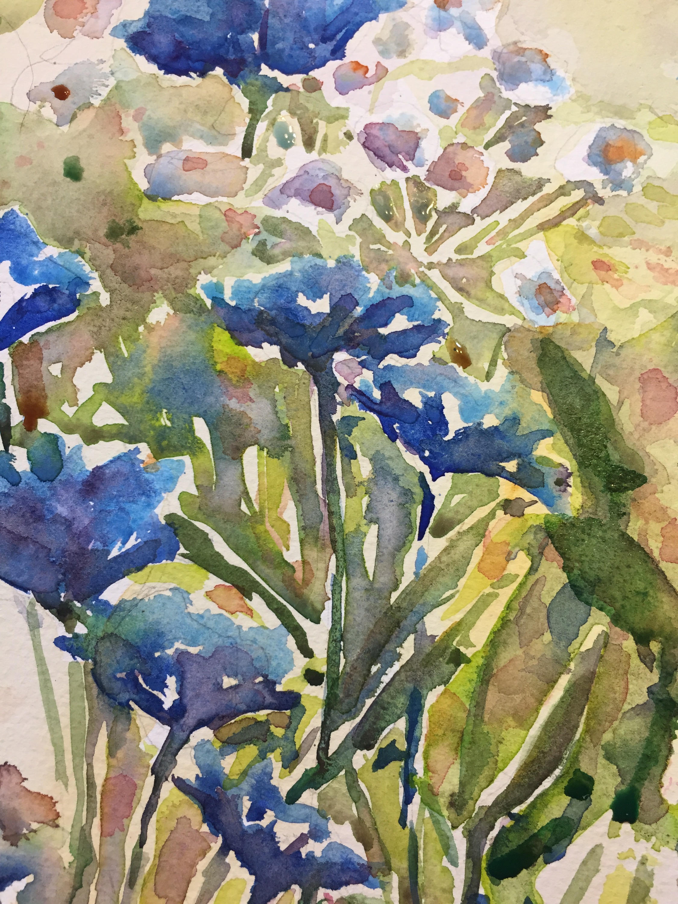
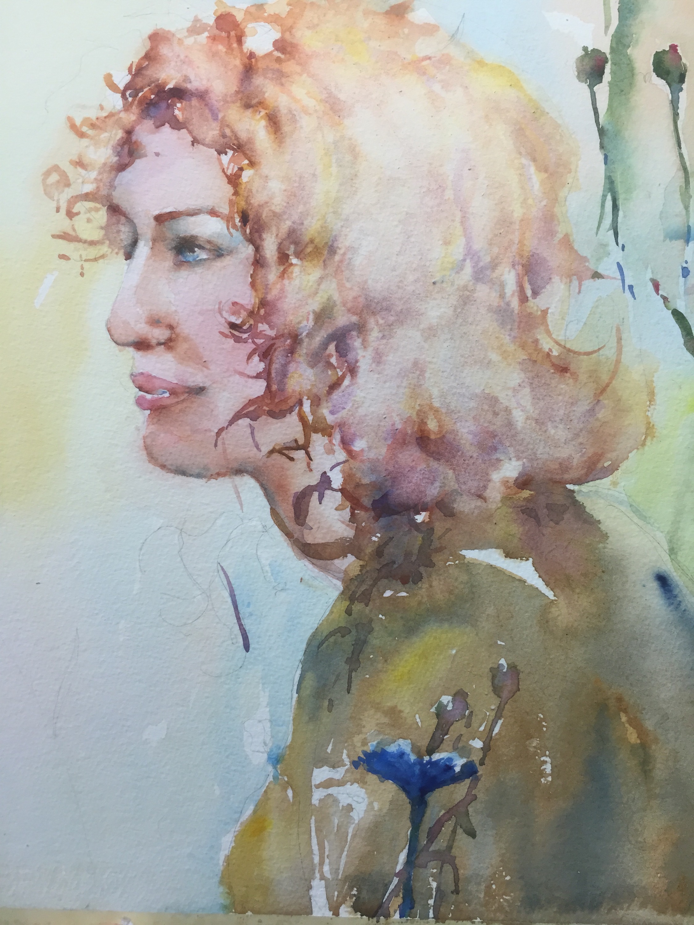
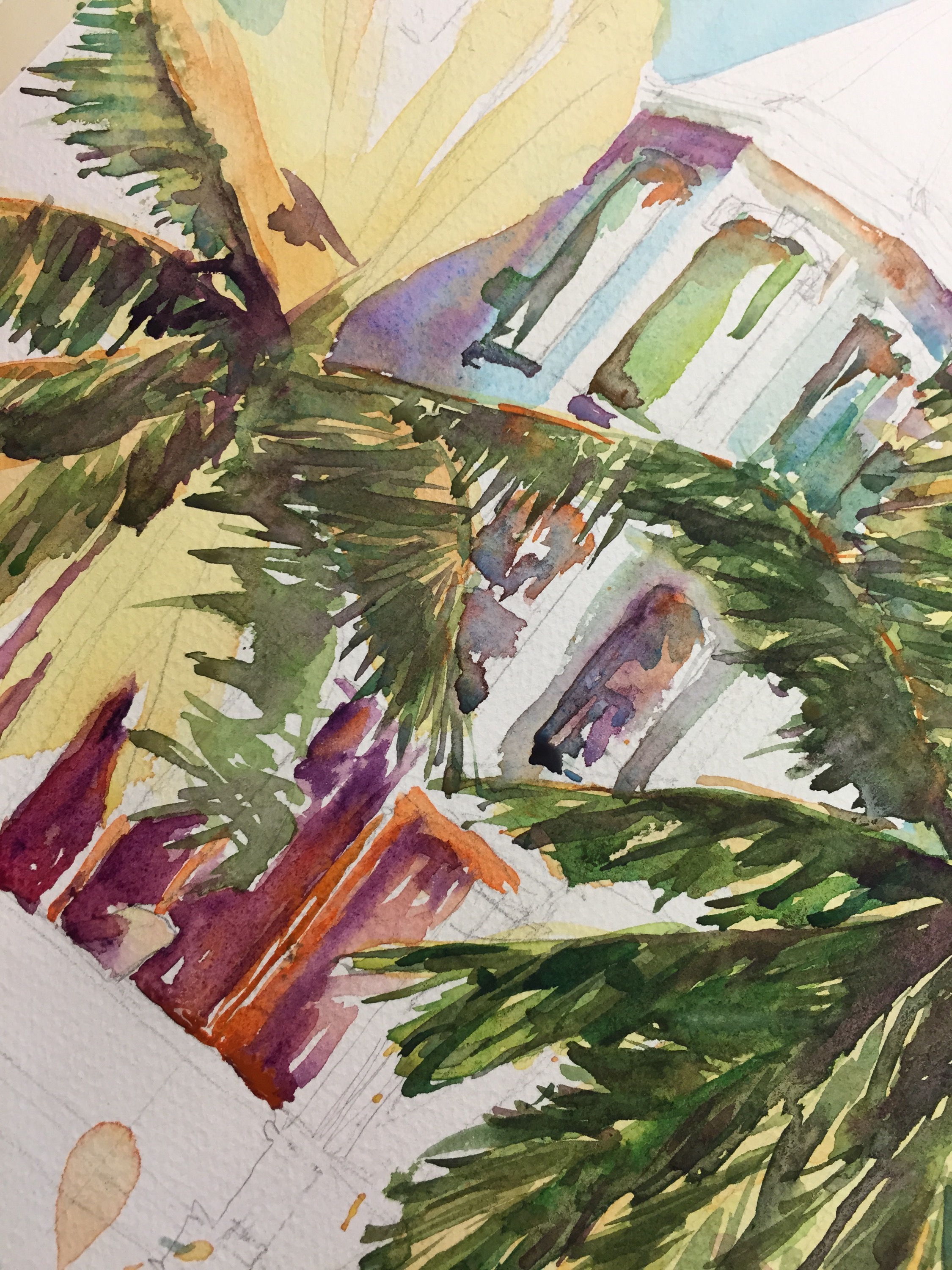
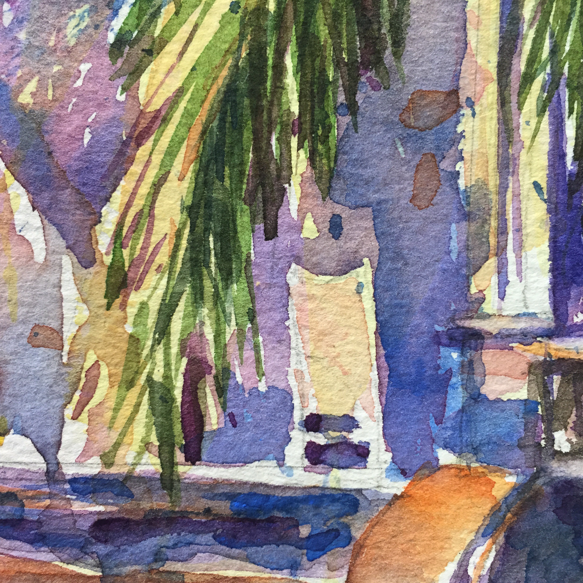
Colors either Holbein or Daniel Smith. Ultramarine blue and burnt umber in the chair with yellow for the couchins. Cerulean and burnt sienna for the magazine, shorts, light, the table and  the background all done wet on wet. The light is burnt umber, Quin gold, burnt sienna and ultramarine blue. 

The blouse is cerulean and Winsor yellow which is a transparent yellow. 

Skin Quin coral and yellow ochre. This usually makes a really pretty skin tone but NOT on this darned paper. 

Ok next up. Rant about that moleskine I am trying to finish. So skip it if you don’t want to hear me froth. 

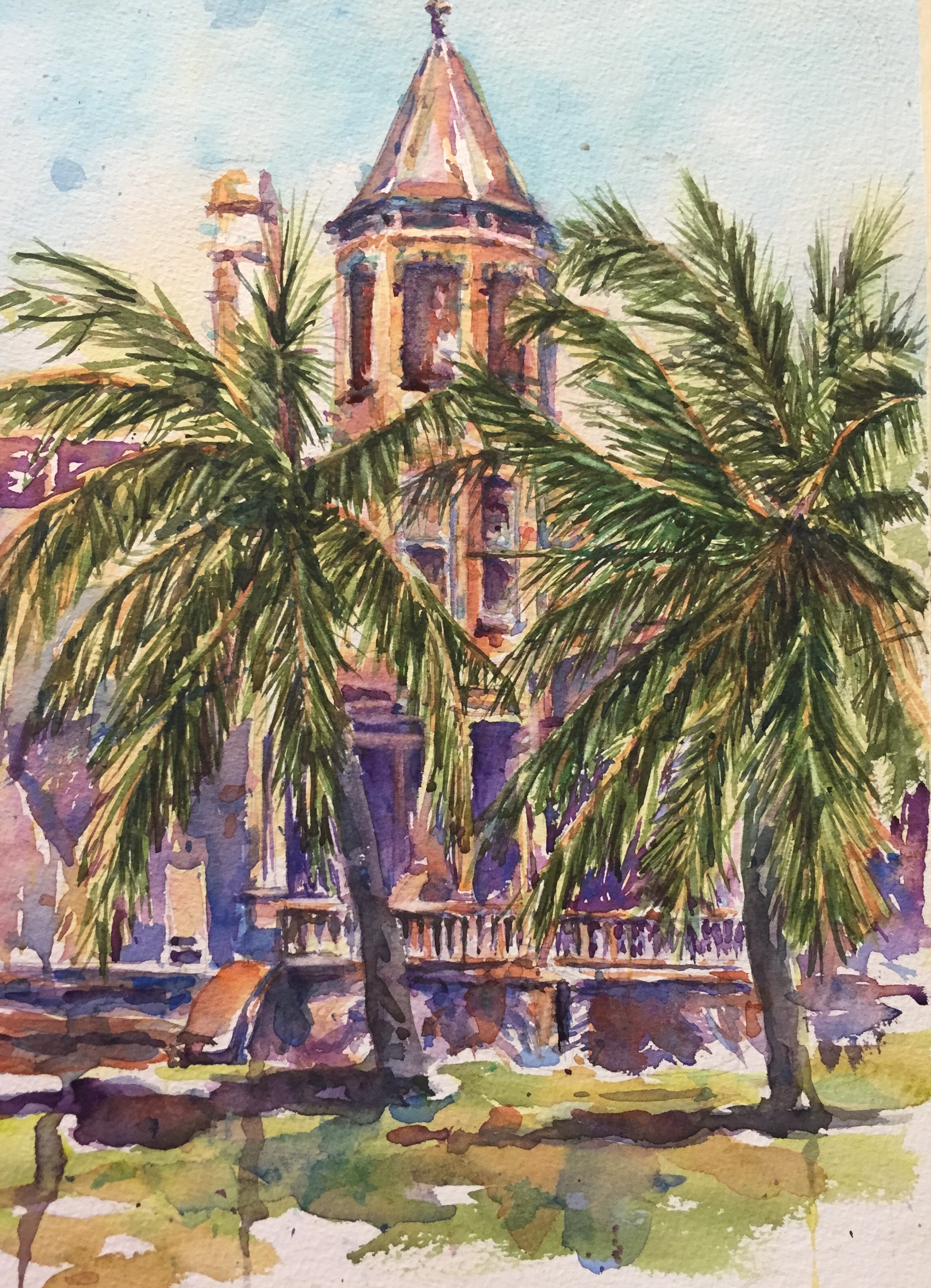
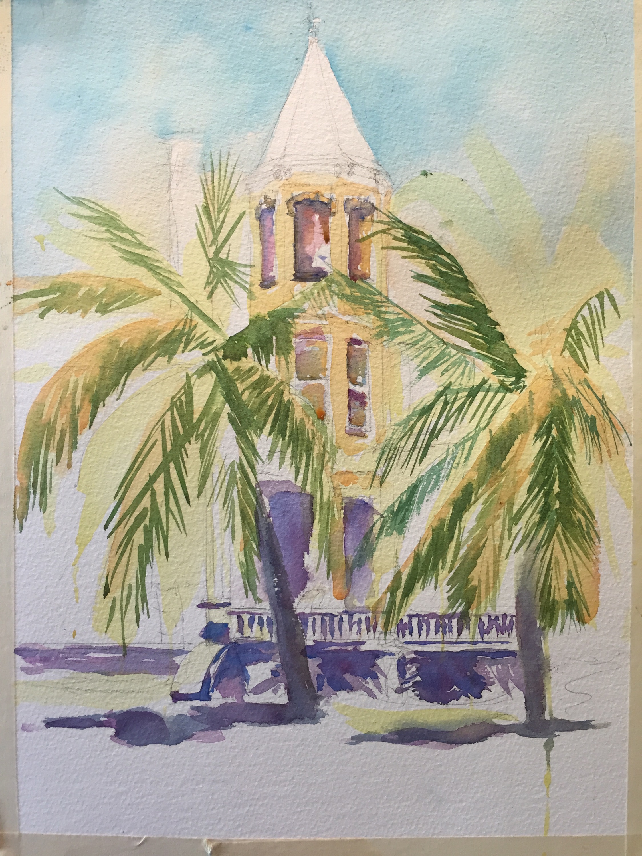
Wishing I had brought another sketchbook.  Really LOATHING the moleskine Wc sketchbook. It acts like Hotpress paper. Very annoying. Colors act oddly on it. Thinking of ordering an S&b zeta or a strathmore ASAP from amazon. 

There is a Ben Franklins here BUT no hard bound sketchbooks. Great clerk there. We chatted for a while about art  quilts and sketching. 

 Don’t ask me how many new clean sketchbooks I have at home. At least four! Groan. Oh well. They keep.

    I don’t know what it is about this paper but I DO NOT LIKE IT. NO more moleskines for me.  At least til they start making them here again and improve the paper. I used to love them. Makes me sad when a product changes so radically. Greed will get you!! 

   
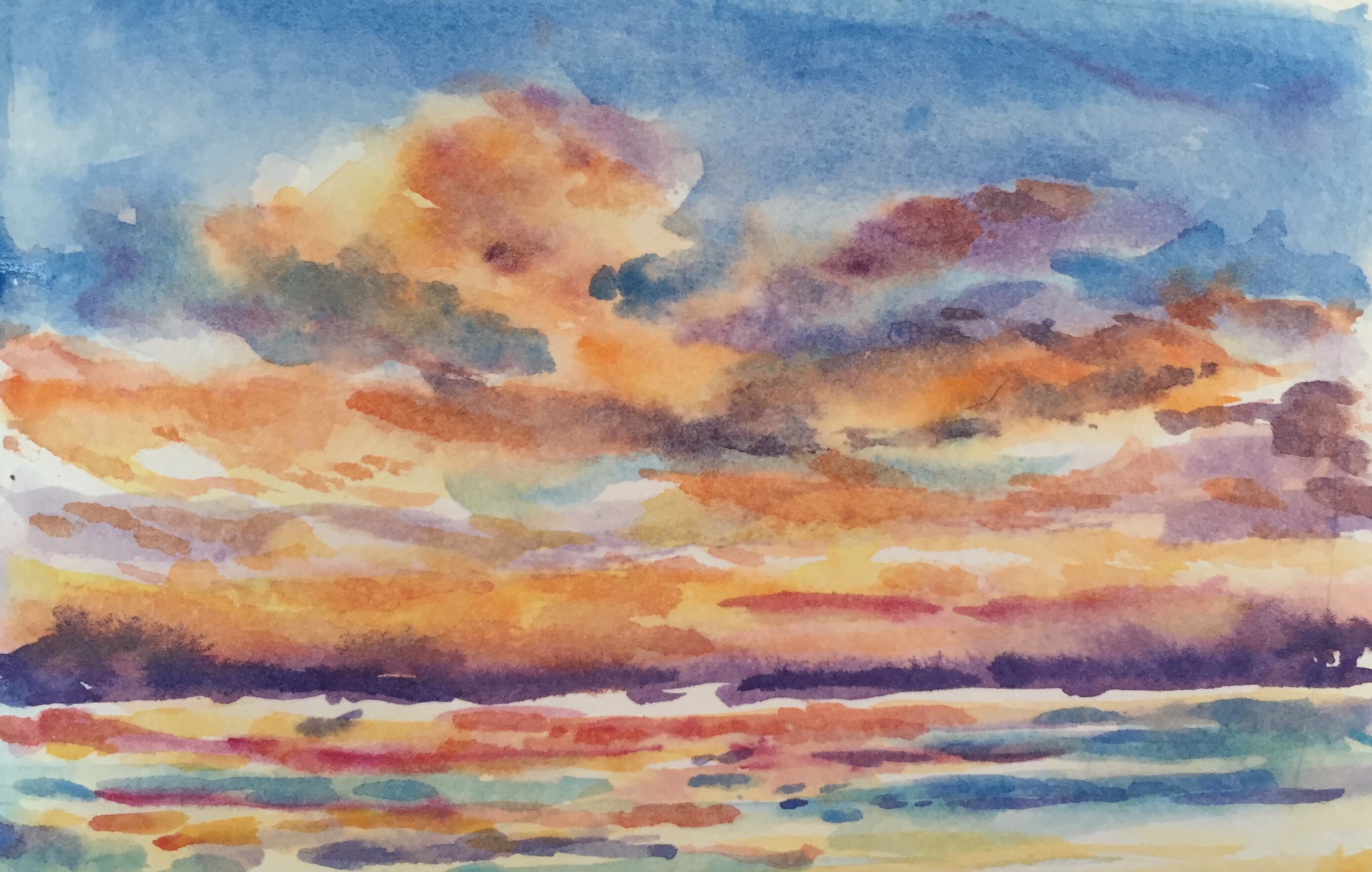
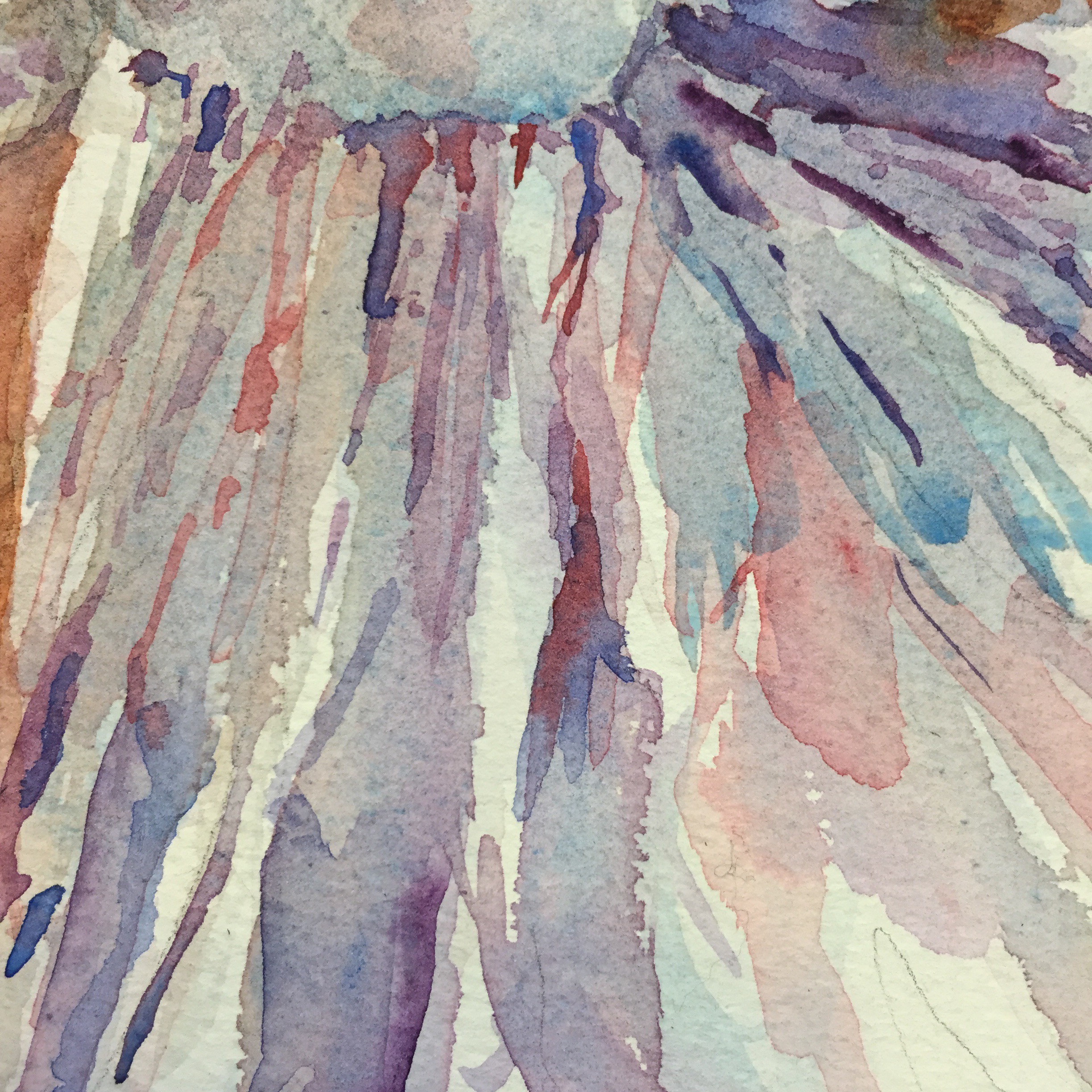
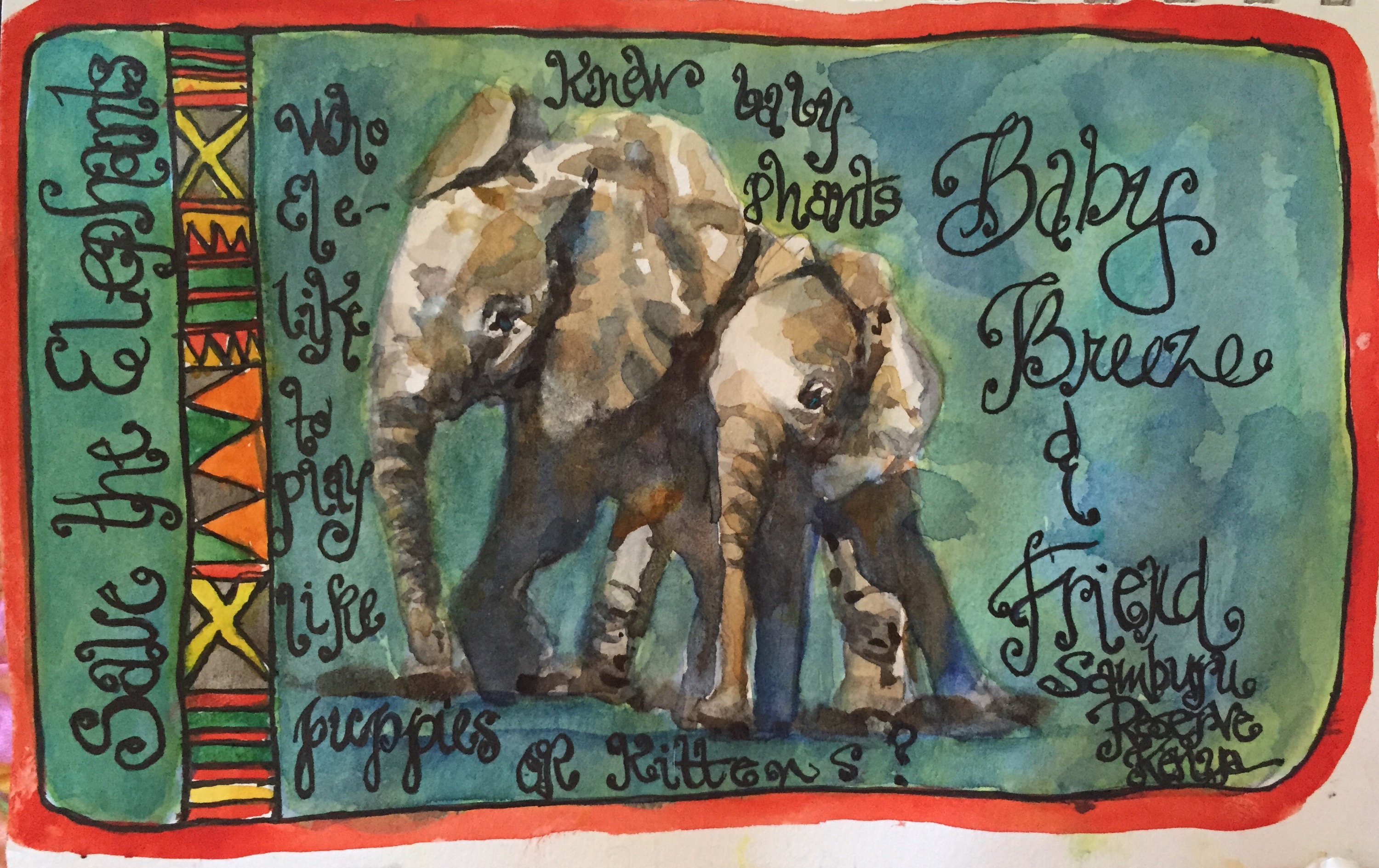
Last nites sunset. First one is in the moleskine. The colors just don’t look so bright and clear as in  the next one which 

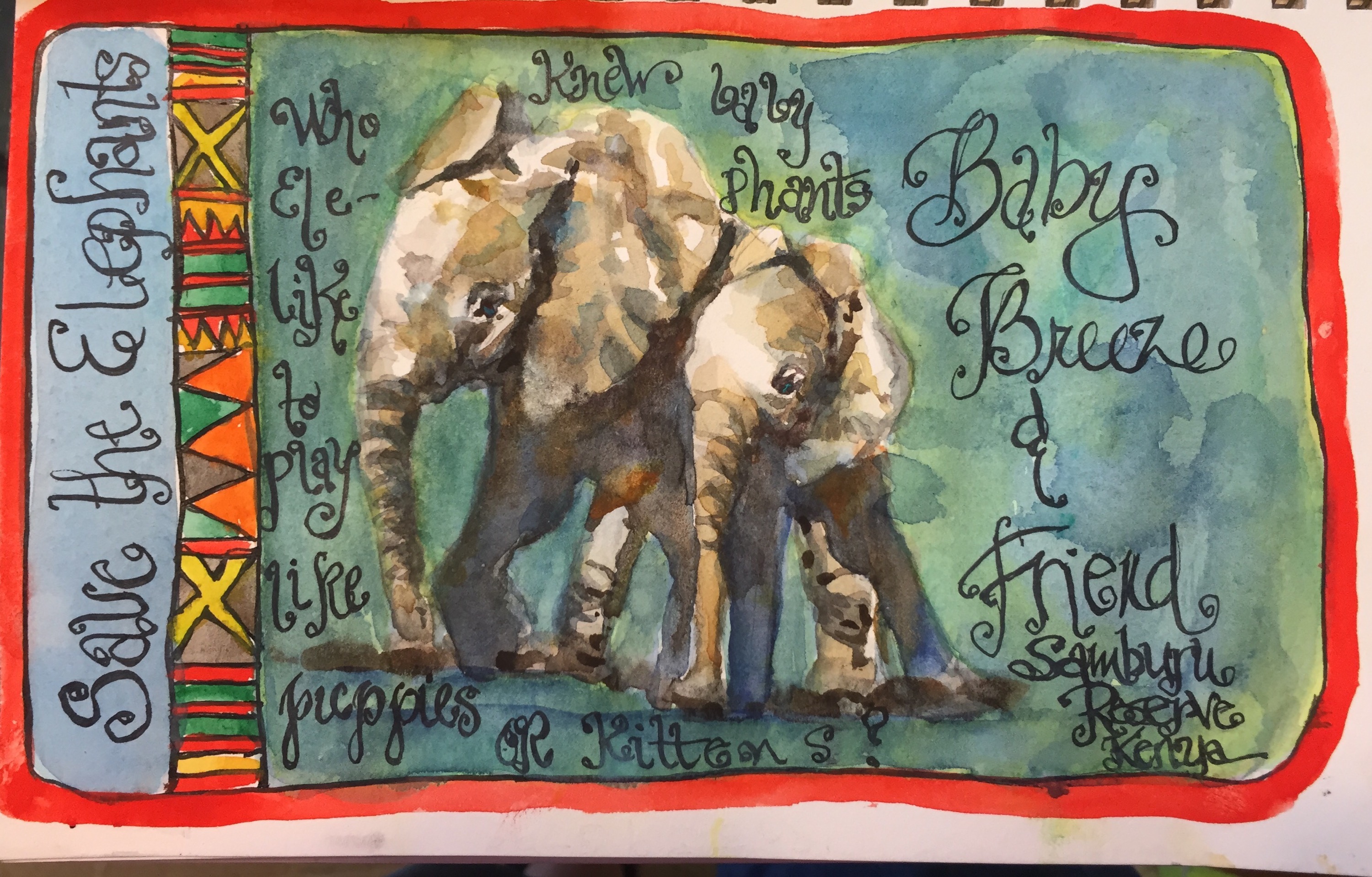
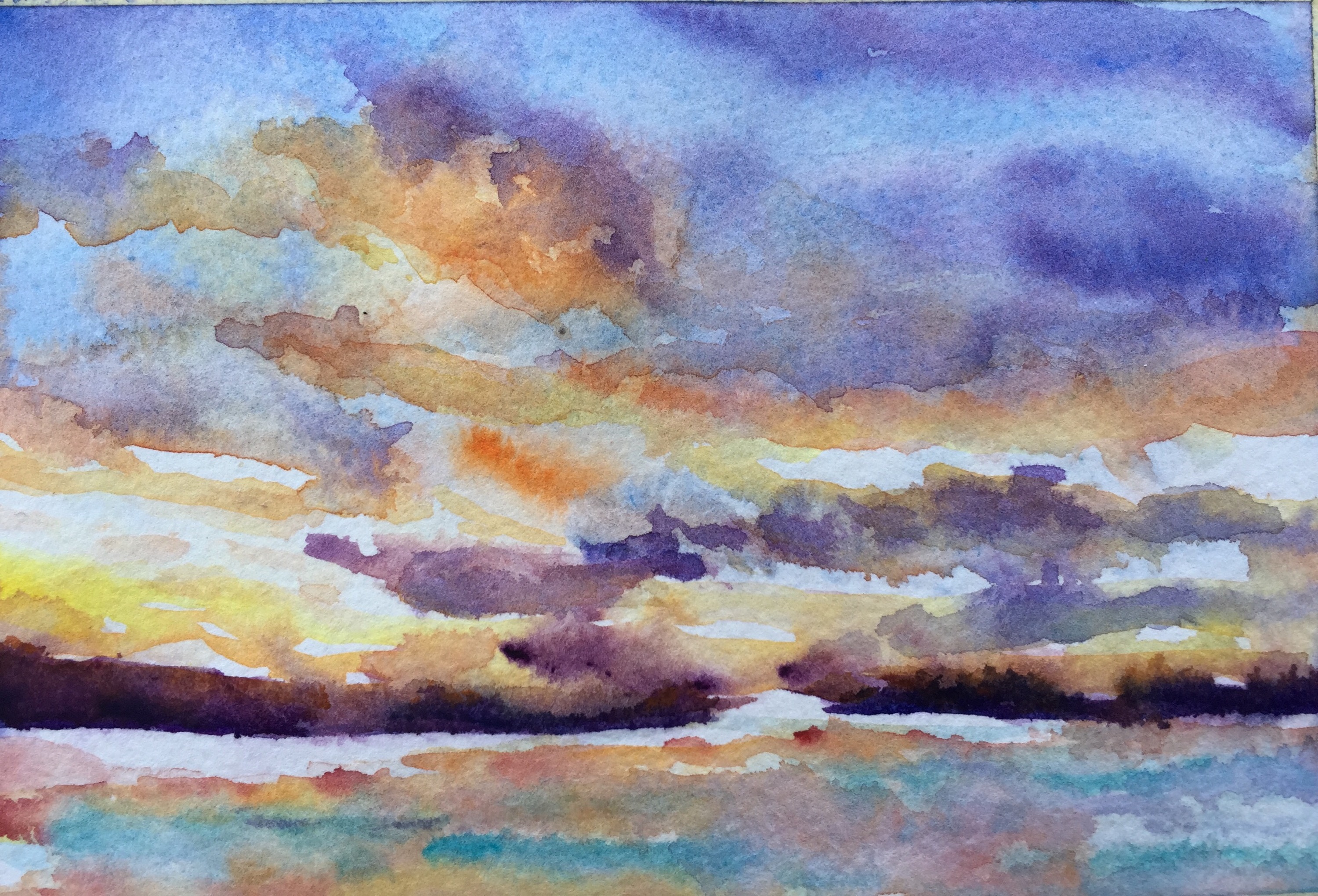
  Is on a lovely piece of Strathmore 500 watercolor paper. GREAT stuff. Love it!!! All the usual colors with the addition of cheap joes Andrews blue, Holbein mineral Violet, and DS Orange which is transparent. Oh and any red I thought would work. Can u see how this one flies compared to the one done in the moleskine?!  

Thanks for reading!!

Margaret xxx who needs a nap before the ghost tour. 

Day 367- A Few More Favorites


Day Dream 1/2 sheet 300#  fabriano 

This one just squeaked in last year but she won’t be finished for a while.   I love the way she’s going so why not show her off?!! 

She needs more jewelry aka dots in the grass and more done to her hair more curls and frizz aka dots. Not sure if I will do more to the left side. Will think about it a while.  They always tell you what to do if you are patient and don’t hurry them. 

   
My favorite part of the field. I love all the negative painting. The batchelor buttons are cerulean and Inathradone blue painted wet on wet as so much of this painting is. The stem is DS green apatite added while the flower was still wet so it bled. The small white flowers are alizarin, cerulean and a touch of orange added all while wet. Love the way it looks like tiny white flowers in the grass. 


My son Ben.12×18″ All wet on wet on 140# fabriano artistic cold pressed. Love all the drippy runny colors. Let me know if you need a portrait commissioned mcmhunt @ me.com!! 

  
 A quick dirty journal page. Major excitement here. Booked a Viking cruise from Paris to Normandy yesterday!! 

I am going to sketch the Eiffel  Tower, Notre Dame oh and did I say Giverny?!😳 Good enough for Monet good enough for me!!

Pentel Brush pen in my SuperBee

 Buy something!! I have a cruise to pay for!! 

Thanks for looking!! 

Margaret ️xoxoxo

Day 366 a Retrospective

Onward toward year two!! 

Since I am going to be traveling the next few days I am going to be posting a few retrospective paintings. Some of my favorites over the last year. 

   
Tea time. All southerners love to drink tea. I love the way the colors mingle and flow on her. Also her hair. She’s for sale $350! Mcmhunt@me.com

  This is a detail of the skirt. 

Lily Tomlin from Grace and Frankie series. Drawn off tv.

  Some old board books that I am taking with me to draw in at key west. I bought them for .50 at goodwill and painted them with a credit card a few years ago. They have languished since I didn’t know what would write on them. All my pens bubbled off. Gel pens died on them.   But today my friend Staci Swider said to try some acrylic markers. Stopped by Michaels. And yes indeedy they work. 

Get ready Key West here I come!!!

Thanks for reading. 

Margaret ️xxx  

Day 364 – Another girl

Since I already did this post once on the WordPress ap I am hoping it does not post twice or disappear like the last one which  disappeared when I tried to schedule it.  I guess because I am getting a little crazy…tomorrow will make 365 days of continuous daily blogging AKA ONE YEAR ANNIVERSARY!!! My grandsons third birthday is Saturday – I am in charge of making the cake AND we are leaving for Key West right after the party…HELP HELP!! And making arrangements for pet sitting….oh MY!

After wiping out the girl yesterday I decided to just start a new one.  I think I have about 25 sheets of 300# cold press paper so WHY not use them…thats not counting at least two blocks of it..one arches and one Richeson block or is it Stephen Quiller?? Time to use the paper up!!

So I started another girl.  She is done on Fabriano 300# cold press and painted with Isabey mops, #2,#8 and brushes, #4-#8…and one #12 Cheap Joes Legends…LOVE all those brushes..start collecting yours NOW!!

IMG_3428

Here’s the sketch.  Next time I am changing to a darker pencil EVEN if it smears.  I didnt notice the chin was a touch too long because the pencil is too light.  That is UNTIL I painted it…had to do a little plastic surgery….oops..

IMG_3433

The first wash…its one of my best I think …Skin done with Quin Coral and Winsor Yellow which are both transparent.Burnt Sienna and Cerulean for most of the shadows.   Hair is any reddish paint I had and a few golds and yellows like Quin gold, quin sienna, burnt Sienna and a little purple a little burnt umber and even orange.

IMG_3435

I did surgery on her chin…it was just too long…I used a straight edge brush and clean water and a kleenex to wipe it and lift it…its easy to do on Fabriano which is amazingly forgiving….

  Well if it won’t upload on my laptop u can always add it after it’s posted on the ap.  Thank goodness it’s done. Between the slow computer the crashing so and my neighbor jack hammering his swimming pool deck I have gotten quite the headache. Sigh. 

Then I decided I hated her hair and used a mr clean wedge to just wipe it out….all gone.  I actually like it better now….who knew but you cant see it because WPress will NOT upload the image…sigh…only one day to go only one day to go ONLY ONE DAY TO GO…Imagine theres a picture here!!

Next to soften some of the hair around her face…wet and blot!! Sigh….

IMG_3439

Helmet hair is NOTTT a good look is it!?

And now her chin looks a little dirty…opps…an easy fix…what i love about watercolor…it will drive you nuts!! :>

I seem to go straight to the dark side with watercolor…I need to stop.  I am trying to stop…i wonder if there’s a meeting for that.

Thanks for reading!!!

Margaretxxx

Day 359 a few more palms


 Just thought I would trade you today with a few details of a redo on Island Dreaming. Who knows I may do a third one before I am happy with it. I do need to plan a little better. Ah the challenges of watercolor. Ultimately i lightened up the purple orange at the bottom and added some cobalt. 

The beginning of the Palm trees. A mix of cad yellow light and Quin gold.  

 Juicy colors. The fun of watercolor is letting it do the playing.  Of course the purple did not stay that dark darn it. 
  
One more detail just to tease you. Will post the whole thing tomorrow. I think I used every green I own painting the palms and a few that I made. 

Thanks for reading. 

Margaret xxx

Day 358 Those Palm trees 

  been trying to paint Palm trees again  not sure how successfully.  I tend to get heavy handed with them or get too heavy with the darks. Then I have to lift some of the darks. No wait ALOT of the darks. Thank goodness this is on Fabriano. 


I under painted a lot of the trees and the building with light yellow. The green is Daniel smith green apatite. The purple is mineral Violet. 
  
My favorite detail because I like the way the colors blended and a lot of lights. Cobalt mineral Violet and cad orange blended for the darks. 

  
Colors used. Lots of mineral Violet and cad orange a fun combo when painted wet on wet. There’s a lot of orange made with Quin gold and Quin red too. It’s not opaque like the cad orange is. 

Thanks for reading. 

Margaret xxx

Day 357 Henry Time!!!

  
Always one of my favorite people to hang out with my grandson Henry.  I meant to post these a few days ago before I got bogged down in elephant mania. Still have at least one more elephant in mind. 

These were done Fathers Day Weekend so they have been in the sketchbook for a week waiting their turn. 

  He’s very good at holding still only when watching his favorite tv shows or when reading. Otherwise a perpetual motion machine.
Thanks for reading.  

Margaret xxx

Day 356 – Love my Noodlers

I am embarrassed to tell you how many I have. 

  
This was done with my latest acquisition a ReD Noodler Konrad loaded with Diamanté Wild Strawberry. Don’t knowwhich I like better.  The red ink or the red pen. 

I wrote it in my Super Deluxe Bee sketchbook. No fuzzy letters.  The paper loves ink.   

 
My new Konrad loaded with wild strawberry and my beloved Noodler Creaper Ahab loaded with carbon platinum black ink. I have four more Noodler pens. LOVE their flex nibs.  Super for both sketching and lettering because they have an interesting line similar to a dip pen.  I only occasionally make messes with the ink.  I always do with dip pens. Try the Ahab. A bargain at $20 and holds a huge amount of ink.   

  
My other Noodler pens all loaded with different color inks.  A girl needs choices, right?! The top pen, a Noodler Konrad is loaded with Noodlers Lexington Grey, the brush pen is new.  Not sure what color but probably will get Lexington Grey since I have Carbon Black in my Kuretake pen. The slim red Noodler is loaded with deartrementis document brown. The bright yellow one is loaded with deartrementis Petrol a turquoise greeny bluet color. The two small pens were dirt cheap at Goulet. $10 or so each. The Konrads are the priciest at $40. I have a couple of Lamys that I never use.  Hmm I while gift them on at least the safari. May be great for writing but didn’t like it at all for drawing. 

Thanks for reading 
Margaret xxx

Day 355 – like elephants better. 


  Now I am done. The letters are Reinked with platinum carbon black ink in my favorite Noodler creaper Ahab. A great pen and so reasonably priced. Mine was $20. And it holds cats of ink.


In my 93# Super Bee Deluxe sketchbook. 

Problems problems. I guess that’s why I like watercolor. It’s prone to misbehave. 

I had started out with a yellow green background to go with my band of “kente cloth”. It was terrible. I painted over it with green. Also bad. Just not so bad. So I added cerulean blue to it. Improved. Then I  added some cobalt blotches. And was happier with it. 

The cad red light outside band was to cover up some of my ink smears. 


For a while it looked like this.  Decided the blue band on the right had to go.  Made it to match the right side by adding the same colors.  

 
So what colors did I use on the elephants?! Quin gold and Quin Sienna  mixed with a grey made by adding Inathradone to burnt sienna or burnt umber.  The darks are made with the Inathradone with cad orange added to it while it was wet. I also saved a lot of whites which makes the elephants sparkle. 

I do still need to go over the lettering. It always seems to dull out when I paint over it. 

Thanks for reading!!

Margaret xxx

Day 352 – Super deluxe Bee


Rommel 6×9″

Decided to give it a work out last nite while watching the Secret Life of Elephants on GPTV last nite.  This was the last sketchbI drew off tv the big bull elephant Rommel. 

Most of Rommel was painted wet on wet to loose the edges. I downloaded several of Thomas Schallers videos from Northlight. Good deal for $13. Though he does not paint animals I thought why not try out his techniques on this elephant. He’s big on transparent colors, letting the colors blend on the paper and loosing edges by keeping the paint wet.  I do wish II had thought to add in some blips of others colors like orange and purple but I can use my handy fine spray bottle and do that later. 

This was a very wet painting. The Super Deluxe did not wrinkle anymore than a 140# paper would.  I lifted some of the shadows off the left back leg and as usual it was easy to do with this super sketchbook. 

Colors used Elephant and dirt – yellow ochre, burnt sienna,  and Inathradone blue. Sky cerulean trees green Apatite and Inathridone. 


I did a pencil sketch first. As you will see in a bit the sketchbook loves the pencil.  

  
This is the sketchbook. Just in case you did not see the last post about it.  

 Another sketch of Rommel  a huge bull elephant that showed up on the Samburu Reserve in Kenya where the show was filmed. 


I really like the way this pencil sketch turned out so I doubt I will paint it. It was done with a cheap HB mechanical pencil from Office Max. 

One thing that’s great about sketching off tv is that you can pause it. Only thing I don’t like about pencil sketching is its tendency to smear. I need to spray this with fixative. 

Save the Elephants http://savetheelephants.org. The show was all about an effort that is being made in Samburu to increase the numbers of elephants which were dwindling drastically. They seem to be turning around now due to the efforts of Save the Elephants. 

I love drawing animals and now want to go to Samburu on a sketch safari. Would that not be fabulous fun?! During dry season they flock to the water holes in Samburu, prime time for sketching or photography. 

 Think about it. I know I am. 

More about the Super Bee tomorrow!! 

Thanks for reading. 

Margaret xxx