Day 2o7 – Shoe Time

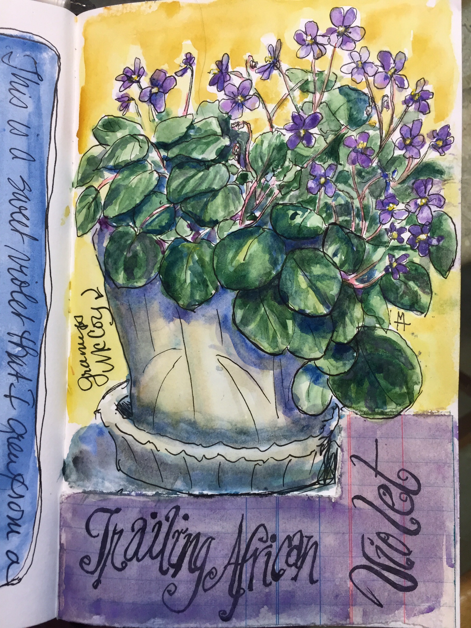
When I was a kid going to UGA we had to draw 150 drawings per art class each quarter. At times I took 3 art classes, a full load. That was 450 drawings besides 6 hours of class daily and lots of homework. We would run out of ideas for drawing.

One of my friends Carolyn Cates drew her shoes. I decided to draw my favorite Pappagallos. I loved these shoes. Expensive for a student but not meant for walking the campus in all weather. They were notorious for falling apart in a sudden rain shower.

Anyway, you are not here to hear me reminisce but to talk paint. That painting and the shoes have long disappeared so I decided it was time to recreate them.

I googled Pappagallos to see if there were any photos online. I didn’t find mine but I found a few similar pairs for sale on etsy.
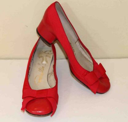
IMG_7722
Cute aren’t they?!

These are for sale on Etsy!!

IMG_7718
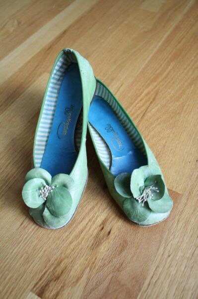
Love these. Too bad they are the wrong size I would say SOLD!!

These pics revived forgotten details like the blue striped interior, the turquoise sole, the small stacked heels.

IMG_7745-0
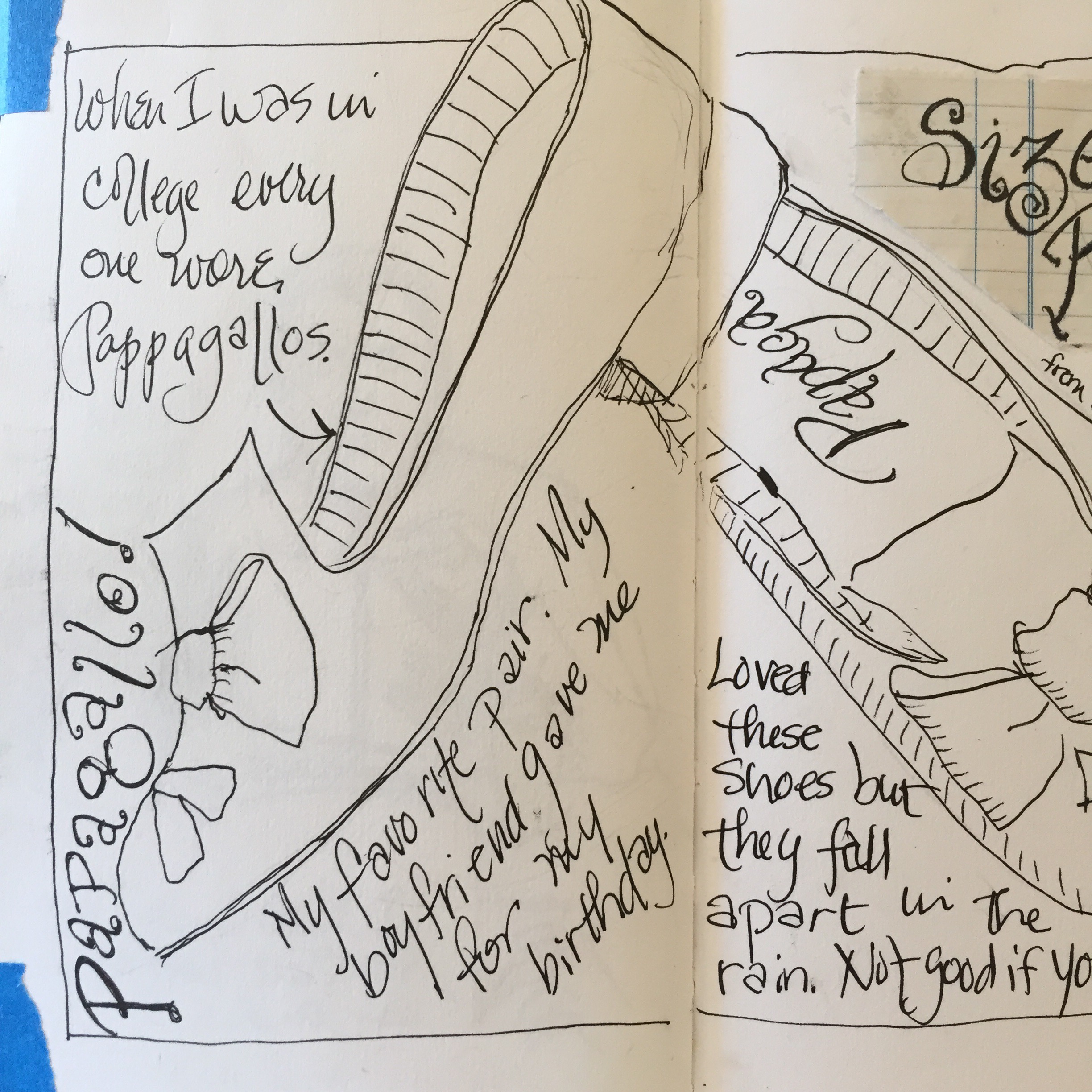
So I drew my old long gone favorite Pappagallos with my Noodler Creaper Ahab.

IMG_7751

I was cleaning up the lettering. I thought it was dry. OOPs, it wasn’t!!! A smear!!!

What to do??!

TIP–  You can always glue some of that paper we all save over your mistakes.  Glue some of my vintage ledger paper over it.

IMG_7750-0

Oops, that didn’t work. Look at all the feathering around the pen line!

IMG_7749-0

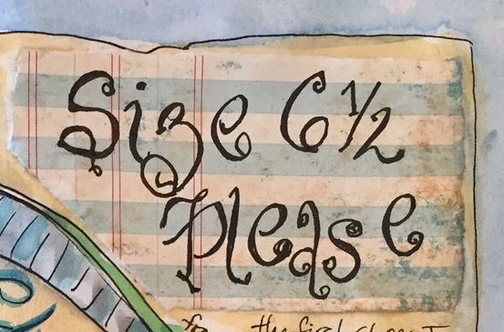
Finally I found a piece of scrapbook ledger paper. Tested it with my pen. NO feathering. Hallelujah!! Modge podge it down!!

TIP- Modge podge is great for gluing down great for SECURELY gluing paper down in your art journal. Learned that from Mary Ann Moss!! Thanks Mary Ann!!

IMG_7749-0

Here it is finished?! Wait – no it needs something in that wide border. What?

IMG_7757
FINISHED Finally!!!

Colors? Dark blue cobalt outer border and a double black line done with my Noodler helped. And the ultramarine blue line around the title with another double black line helped to make it pop. I am
Not a faded out kinda girl. Vivid and bright is me!!

Once again contrasting colors helped with that. For the background I used yellow ochre with a little grey mixed from burnt sienna and cerulean. The cobalt blue border made it pop. The cobalt also brings out the blue bows on the shoes.

The green is manganese blue and yellow. The almost black dark on the bows and x’s is ultramarine blue and burnt umber.

And that’s it. Go forth and paint your shoes. The brighter the better. Maybe some of the snazzy sneakers in wild colors!  And use contrasting colors. You will be glad you did.

Thanks for looking!!!

Day 206 – Fast and Slow 2

Kind of describes my day. Today I signed up for Fine Arts America. You can sell prints through them. Don’t go look. So far after four hours of trying to scan not a thing ready to upload. Scanners are not usually so difficult. Hopefully problems will be resolved shortly.

IMG_7713

This is another fast slow painting I did yesterday. Clutter on my Art Table aka Kitchen Table -This was fun…think I should have colored the letters? I really wanted a neon green to go whang…settled for cad yellow new gamboge and maganese blue which is a brilliant blue.

I knew what colors I was going to use because Lime is my favorite color but I can not wear it. Makes me look yellow. Not a good look!!

Pink goes with lime and so does purple…so picking the colors was easy. Splattered with purple on the pink and a darker blue violet on the bottom.

The pink is quinacridone magenta. The purple is made with the manganese and Quin magenta. Top splattered with the purple. Bottom splattered with some darker blue violet. Aka I added more blue to my purple mix.

Flipping thru my almost full sketchbook I had the thought that I had drawn/written a book. Yes it’s about my life but still a book. People are always telling me to make a picture book and I tell them too many pages. It takes 32 drawings to make a picture book. And I have filled 70 pages. Maybe I will rethink that picture book?!

Thanks for looking!!!

Day 205 – Fast and Slow

Taking Sketchbookskool beginnings and Seeing. This is the homework for Seeing, Danny Gregory’s Fast and Slow assignment. Yes HOMEWORK!!!!
Despite the fact that it was the h word it was a lot of fun. Betting I will do a few more.

2015/01/img_7694.jpg

I had already collaged the background with old accounting paper and a piece of paper bag from Little Shop of Story’s in Decatur Ga – our favorite independent bookstore. It has quotes from story books on it- Wild Things is my favorite.

First choose an intricate object to draw. I chose Henry’s Rocker. Rockers usually give me fits.

Next you make a soupy puddle of any color watercolor and using a big brush you try to paint the object quickly. I used Daniel Smith piemonite and American Journey cobalt with a size 8 sable brush.

Let it dry. Take a fairly thick pen (Noodler Creaper Ahab) look at the object carefully and attempt to draw it. Add in details with a finer pen(Lamy Vista Fine Nib).

And that’s it. Of course I had to decorate the page. The words Henry’s Rocker are painted in his favorite color in this case Holbein cad red light. Background is Daniel Smith new gamboge with a touch of Holbein cad light.

Lettering done with my Noodler Creaper Ahab loaded for business with Platinum Carbon Black INKC 1500.

2015/01/img_7710.jpg

Tonites sunset.

Thanks for looking.

Day 2o4 – Stuck on Birds

2015/01/img_7682.jpg

Drawing birds out my back window at the feeder this am. Not many cardinals but a wren that hangs around eating suet and chirping away in the Rose bushes, chickadees and tufted titmice diving in for seeds and those pesky red finches. Red finches an invasive species have run the beautiful purple finch out of this area.

I tried to draw these in as few pen strokes as possible. Looking at the birds as they landed. Thank goodness the wren hung around. Such cute little fat things.

Colors- Burnt Sienna, the greys were made with Daniel Smith Primateks purple hematite and piemonite with cobalt or ultramarine. That combo makes such a yummy grey. The Daniel Smith Primateks are wonderful because they granulate as they dry adding nuances of color. In case you haven’t guessed I can’t get enough color!! 😃

Black was made with burnt umber and ultramarine blue.

Shadows cerulean and burnt umber. Then I went back in with the Piemonite and purple hematite mixes to grey them some more.
Soupy American Journey Orange for the background.

2015/01/img_7692.jpg

Yesterday when we left life drawing the tree near the parking lot was loaded with cedar waxwings gobbling berries. Instantly I knew what they were because as a child they would descend on our bushes and gobble outside the kitchen windows. And I can hear mom saying the cedar waxwings are back. What a racket they can make.

2015/01/img_7691.jpg
Here’s the story!!

I also looked them up to write the left hand page. Then I remembered sitting in class in third and fourth grade entertaining myself making bird books from some little bird guides someone had given me. Those involved notebook paper and pencil sketches. I guess I have come full circle!!

Colors New Gamboge and virisian to make that Limey yellow. New gamboge is such a bright clear gold. Once again the greys were made with purple hematite and piemonite with cobalt or ultramarine.

2015/01/img_7689.jpg

Those Daniel Smith granulation colors!! You guessed it!! The greys were made with purple hematite and piemonite with cobalt or ultramarine.

2015/01/img_7690.jpg

Here are the greys with purple hematite and piemonite with cobalt or ultramarine on my pallette done. Great colors I think!!

2015/01/img_7683.jpg
Somebody asked me how I splatters so I took a pic of the cedar wax wing prepared for splattering. I used a soupy mix of cerulean and yellow ochre. Remember that paint will also go allover your table. So cover it up unless you want speckles.

Thanks for looking!!

Day 202 – Time Flies!!

image


Especially when you have something interesting to do…I seem to draw and or paint something or someone just about everyday now.  I am taking TWO Danny Gregory Sketchbookskool online classes at the same time…Beginnings and Seeing.

Lots of fun! Some great teachers.  I highly recommend it.  Each one is six weeks long with a different teacher every week…and theres that dreaded word HOMEWORK!! aka Assignments….OH MY!! But since I am drawing and painting sometimes all day long it’s not a problem!!  All those skies started out as homework…we only had to do one…I did EIGHT!! OPPS!!! And have one more in mind to do…

image


Today its rained all day.  Skies were an uninspiring grey grey grey so I drew this perky violet that seems to resist my best attempts to kill it.   A friend gave me a small piece last winter saying it would root easily in water. Hers was huge!! More than a foot across.  I thought uh huh…this wont last long.  Lo and behold it rooted…I planted it in an old McCoy pot of my grandmother’s it continued thrive.  It sits on the kitchen counter where it gets little sun except thru the backporch skylight.  So today I drew it…growing against impossible odds…thriving!!  I also journaled about my mother and grandmother -both famous for their green thumbs.

Now to get my homework drawn-draw a piece of bread.  In my case a biscuit. Near enough!!!

Thanks for looking!


Day 201 – A Sunset and some Ink!!

The contest winners are Karen, Rena Lewis and Peg. Thanks for all the comments. There will be another contest soon!! Please contact me at m c m h u n t @ m e. C o m so I can mail you your prize!! I will also try to contact you!

I had another go at Tuesday’s sunrise. I was tired of painting the sycamores so I traded them for firs.

2015/01/img_7638.jpg

I got my bottle of Platinum Carbon Black ink from Goulet today. So excited. I drew this pic to see if it would bleed. Not a smidge. The ink didn’t even lift. Hurrah!!!
Get a bottle at Goulet Pens

2015/01/img_7644.jpg

2015/01/img_7642-0.jpg

Pictures of the box just in case you need them.

2015/01/img_7641-0.jpg
Your ink should have INKC 1500 on it. Beware of the one with 1200 on it. It’s not waterproof. Now to get some. De Artmentris (sp?) document ink. Also supposed to be waterproof and comes in colors!!

Day 200 – Sky Practice

Don’t forget to leave a comment and a like to have a chance on a watercolor. Contest is over at midnite.

My 200th day of consecutive blog posts!! Who would have thought I would get this far. Originally I was trying for 50 days of posting, and here it is Day 200!! No skyrockets but a wild sunset.

2015/01/img_7630.jpg

A redo of last nights sunset. This picture is bluer than the actual painting. The treeline and foreground is purple and blue not blue in the original. I used quinacridone Rose instead of the red in the first version. This is the third try and I think the best. The first one got glued over with a fresh piece of paper. I think I am ready to paint some new trees. Some firs?! My neighbors are looking better and better.

Tip: wash sky starting at top with cobalt shading to burnt sienna. It won’t go green like yellow will. With a hog bristle brush add bits of the pink and purple blue at an angle for the clouds. Darker at the top, brighter toward the horizon. Some thinned Sienna or nickel Azo gold on the bottom of the clouds makes a nice yellow glow.
Tip 2: Fuzzy tree and bush tops Paint them while the sky is wet. Add some burnt sienna for a glow on the tree tops. Hmm should have tried that on the bushes and the trees.

2015/01/img_7623-02.jpg

Here’s the first one so you can compare them. Have fun.

Thanks for looking!!!🎉🎉🎉

Day 199 – Two Skyscapes!

Don’t forget the giveaway. Leave a
Comment and a like.

Second go at this post. WordPress crashed after I finished the first one and it evaporated. 😜

2015/01/img_7618-01.jpg
This is my fourth go at this early morning view out my back window.
I painted the background a very pale yellow and let it dry. The. I washed it with water. Added cerulean and some piemonite mixed with cobalt for the grey clouds.

The tree line is piemonite and cobalt as is the water and the foreground trees.

The trees are done with my wonderful Isabey #2 I bought at Utrecht dick Blick with my Christmas money. Love it. Long and a narrow tip. I have 1s and 0s that are bigger. I smeared some of the branches to make them look fuller. Twiggier.

Some negative painting in the tree line. A little sponging on the river to make fog.

Redsunset

Tonites sunset. Aglow with pinks and touches of yellow. I laid down lines of Quinacridone red and aureolin yellow. Then I filled I with cobalt and cerulean. The treeline is cobalt violet and ultramarine blue with a touch of burnt umber. Trees painted with the same paint.

I will try to add the other skyscapes. But saving this in case of crashes.

Day 199 – Two more skycapes

Don’t forget to leave a comment and alike to qualify for the drawing of one of three Watercolors I have painted. They are ok my Monday post.

2015/01/img_7618-0.jpg

I have now painted this skyscape four times. This one is on Strathmore 400 series watercolor paper. The purply greys are made with Daniel Smith Piemonite, a delicious granulating color , combined with cobalt or ultramarine blue. A lot of negative painting of the background trees, sponging of the river for fog.

All the tree tops were painted into wet so they would fuzz slightly.

The trees were painted with my #2 Isabey I bought with my Christmas money. Lovely brush with a very narrow tip from Dick Blick. I also smudged the trees a little to make the branches look fuller.

2015/01/img_7623-0.jpg

Tonites sunset. Very pink with yellow. Hard to photograph. Pink is Quin red yellow aureolin, sky cobalt and cerulean. The camera picked it up as red. I should scan it but no time.

I laid down the pink stripes first. Then went back in while they are still damp with the blue. Yellow here and there and along the horizon. Cobalt violets and ultramarine blue with some burnt umber for the trees and foreground bushes.

2015/01/img_7581.jpg

First try

2015/01/img_7582.jpg

Second try. Really didn’t like this one. Got too dark.

2015/01/img_7588.jpg
Third try. Too much dabbing of yellow leaving hard edges.

2015/01/img_7590.jpg

Detail of the third one. Negative painting.

Day 198 – Fixing Mistakes & a giveaway!!

To celebrate my 200th consecutive blog post and my new blog leave a like and a comment on my blog between now and Wednesday midnite. I will randomly pic three winners for a small original watercolor – one of the three Watercolors at the end of this blog post!!

Good luck!!

Now back to how I fixed my mistake.

I did this great sketch at Key West.

2015/01/img_7043.jpg

As usual I had to write on it. WHAT was I thinking?! The original lettering got lost in all those great Palm fronds. So brilliant me decided to try a red Tombow. Green and red complimentary colors so red letters would pop. Uh yes they did. They popped TOO much. Tried to black them out with my Pentel brush pen. Nope that wasn’t working either.

2015/01/img_7467.jpg

Then another brilliant thought use some gouache on the letters. Anything was better than that red. Well better yes but still NOT great. I got out an old accounting register that I have and decided to glue some ledger paper over the offending letters.

I tore it using a ruler. I like the rough edges. Glued it down. Painted the palms over it. Redid the letters and

2015/01/img_7561.jpg

ThAnK goodness it worked. Lapin who I have been following on Instagram uses ledger paper in his watercolor sketches. He’s right it paints just as well as watercolor paper.

I am pronouncing this one done.

Thanks for looking!!

2015/01/img_7579.jpg

2015/01/img_3305.jpg

2015/01/img_2254.jpg