Day 299 – Silver Wyandottes 

  aka chickens. More of the reason I drove across the mountains. Sketching chickens is THE most fun and I highly recommend giving it a go. 

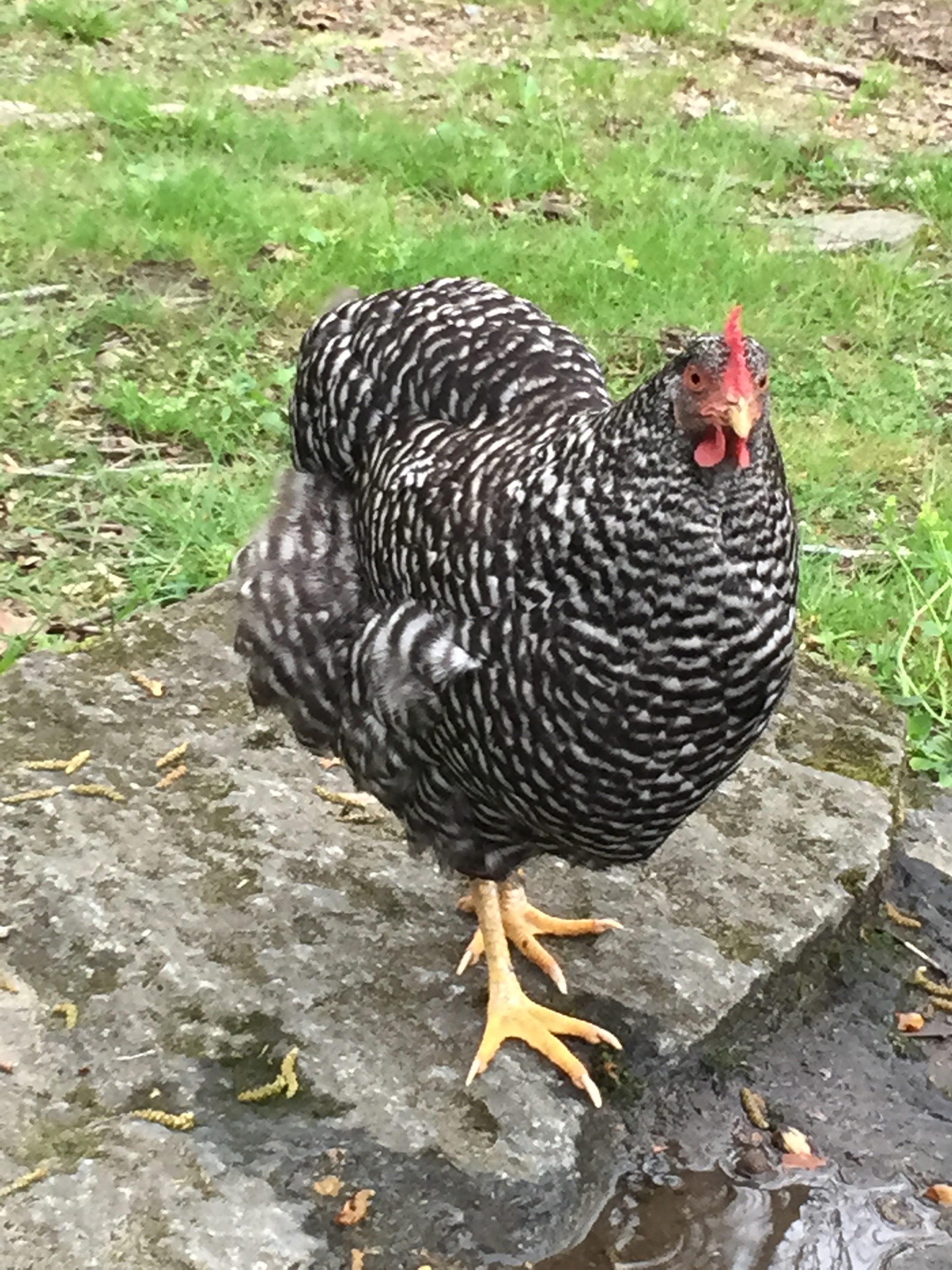
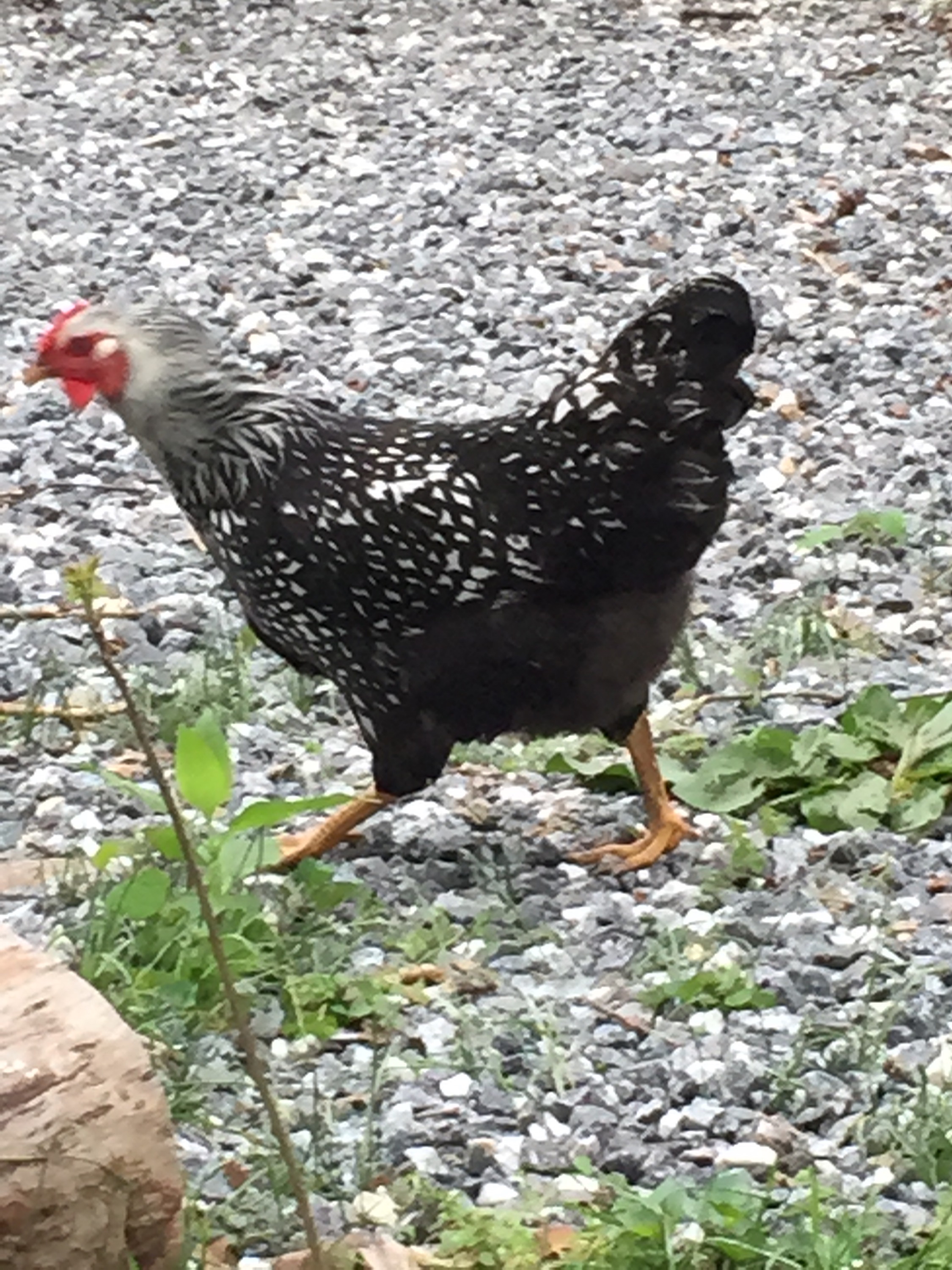
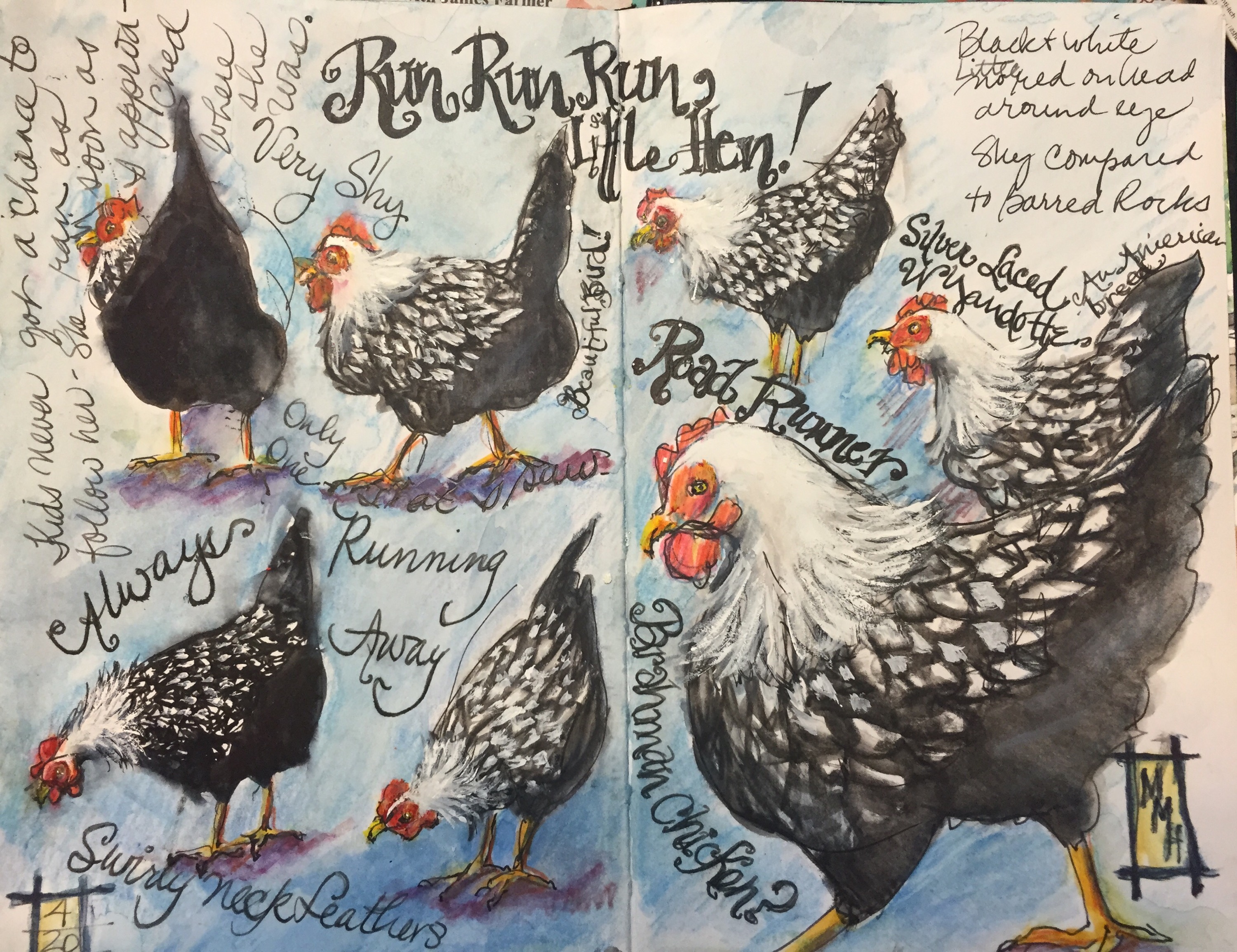
  Silver Wyandottes are interesting looking chickens. With white diamond and a swirl of light feathers streaked with black around their heads. 

 
Stillman and Birn Zeta with a Noodler Conrad Flex loaded with Lexington Grey ink. I am actually not sure if all these chickens were Silver Wyandottes but they are colored like they are. 

  The bottom left chicken was colored with a tombow pen. It’s fun to wet them and see them run. You can lift the colors. I thought it might be a good way to color these oddly colored birds. Actually I think the Tombow was a little strong for these chickens. Next I tried a black and an indigo inktense  pencil. Things were going better. The blue softened the black. I drew a diamond pattern all over the hens bodies. Then I added white gouache after the inktense dried.  The benefit of inktense is that once it dries its permanent and you can paint over it. White gouache was also used around the beaks and heads to eliminate dark grey lines I didn’t want especially on the big chicken on the right.  That defined the face and beak better. The waddles and red bits on the head where colored with watercolor pencils- red yellow and orange! The background is 2 light blue watercolor pencils and a purple one for shadows. White gouache was brushed over the neck feathers to make them look fluffier. 

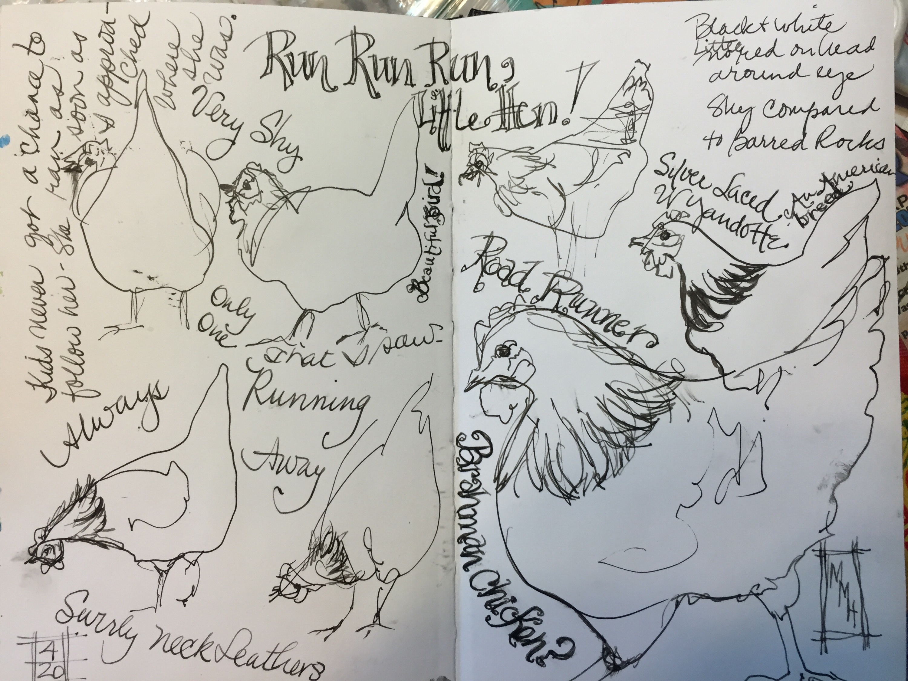
My gift to you this Sunday is these chicken picture so you can join in the chicken sketching fun. At least these aren’t running anywhere. Have fun and I would love to see what you do with them.  

Don’t forget to draw the silver Wyandotte earlier on this post. 


Drawing chickens is like drawing bumpy triangles.  The legs are two sticks with upside down trees on them. 

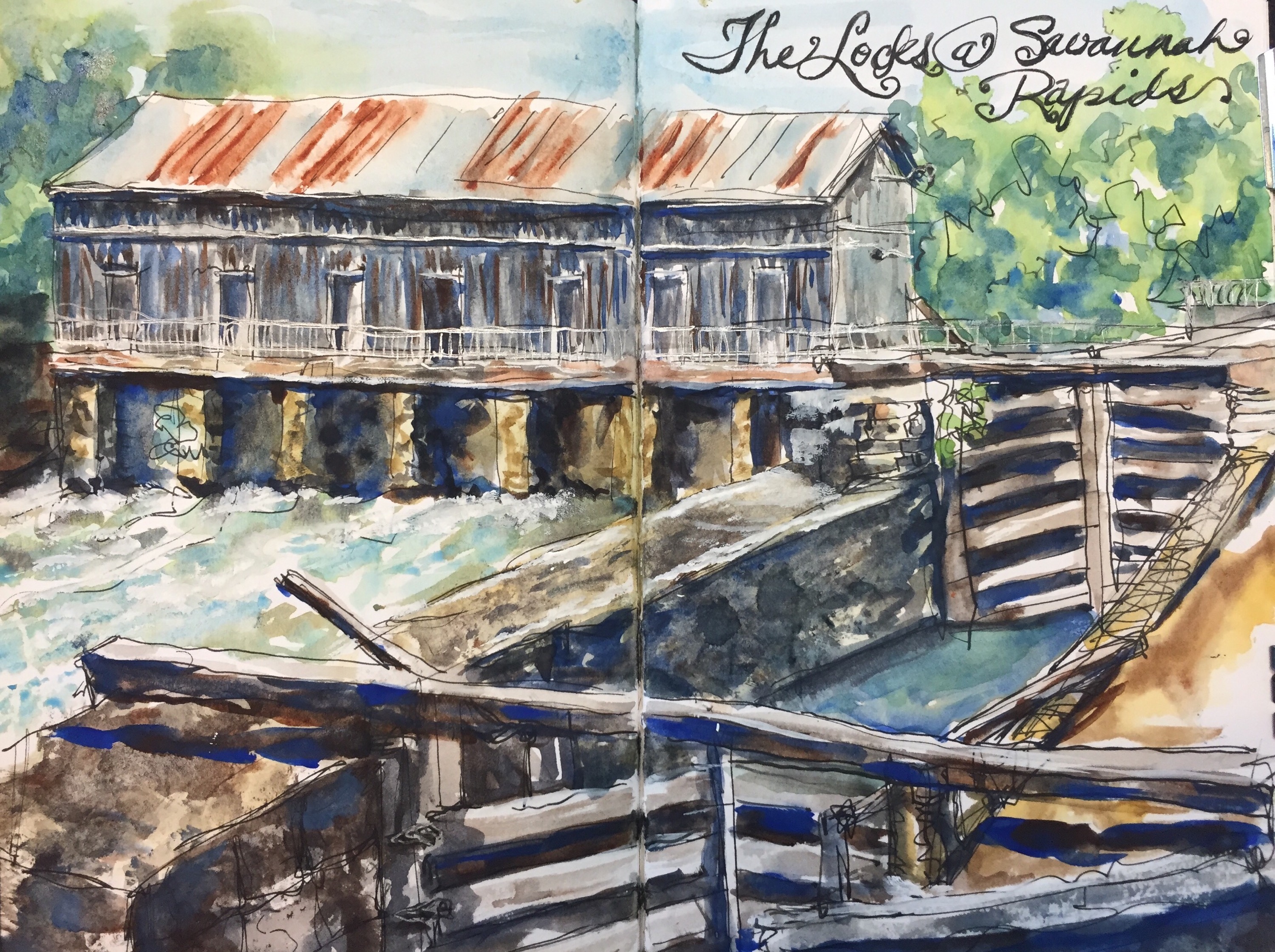
More park sketches tomorrow. 

Thanks for looking!! 

Maggie XX  


Day 298 – 70th Anniversary 

Don’t know if when you sketch you have trials and tribulations like I seem too. Do some of your drawings just not turn out like you planned? That would be me. 

  Drawn while waiting for my parents to arrive with my kuretake brush pen in my Stillman and Birn Zeta this sketch at the Park Grill is one.  Just plain boring and not very attractive. All those huge pine logs are yellow. The chairs were oddly fun the sign thru the windows very interesting but for what ever reason it wasn’t working. It did become the perfect journal page.  


Journaling added some interst to it.  At least to me it did. My parent s have been going to this restaurant for 30 plus years and where looking forward to having their 70th anniversary there. Sadly the restaurant had changed from an upscale restaurant with a piano player to screaming blue grass piped music, one inch thick fried bologna sandwiches and “naner pudding” served in pint mason jars. However my expensive grilled trout was delicious.

So how was this picture saved? Not sure it was but at least it’s worth a look. Journaling in the background helped and adding white gel pen anywhere I thought light might hit the furniture and the windows. Crosshatching on the sign made it appear to have shape. 
I think I will stick to drawing chickens and landscapes for a while. 

Thanks for reading! 

Maggie XX

Day 296 – A few Barred Rocks

you know what those are. Chickens. They were so cute and fluffy. Eating constantly. I drove all the way across the Great Smoky National Park just to draw them. Over a huge mountain.  I may be in love. There’s just something about these chickens that’s so appealing.   

  I hear you shaking your head. I used to do the same thing before I started drawing birds. If the cars were all Lapins fault the chickens are all Roz Stendahl’s fault.  I want to go to the fair and draw more in the fall!!😳

These were actually drawn as the chickens ran around me at the Oconaluftee Farm. I should have drawn them with black or grey ink but for some reason I drew them with De Artrementis Brown in my Noodler standard flex. 

It’s not a good idea to draw in the rain but I did that a lot the week I was in Gatlinburg because it rained almost daily. Thank goodness the ink dries quickly.  


They were colored with my Caran d’Ache using the side of the flat end. I decided it was easier and quicker to use them than my watercolors though thinking back I don’t supposed it mattered that much. 


I still have two more pages of chickens to color –  silver wyandottes a much shyer chicken that ran any time anyone was near it and even worse to color than the barred rocks. I will probably use my watercolor pencils. But these will take a while to color!! 

  Silver Wyandottes

I also had fun journaling stray thoughts about the chickens as I drew them and later as I colored them. 
Hope you enjoy them as much as I do. I need some chickens. 

Thanks for looking. 

Day 295 – Get Your Inner Jackson Pollock On!!

  When I ran across one of my favorite card ever the BMW Z 3 in. The Kroger parking lot  I knew I had to draw one more car. I have always convetted this car. And they were made up the road from me in Greer SC. This is painted in  my Stillman and Birn Zeta Staedler pen watercolor and gel pen. Bytw the gel pen hates this paper. Very odd. 

Chose yellow for the background because they are complimentary colors. 

  
Car #1

This is my friend Marsha’s 1995 Corvette also known as Baby. I drew her three times.  Twice before I got her right and a third time just for fun on ledger paper. 

Car #1 is obviously awful but I did find the ledger paper interesting so I fluster it again.  

I have a whole book of ledger paper. Not one of the old gorgeous books that Lapin loves but one from the 70s I think.  Does that make it vintage?!

I have used the paper quite a bit in mixed media and it always gives a fun effect so I thought I would try the corvette on it. After all she’s vintage too. 

  
Car #3

The paper wrinkles.  Strike 1. I thought about mounting it on a piece of illo board and I still might. Hopefully that would flatten it out. It also did not allow for the watercolor to be bright.  The colors are more delicate on ledger paper an effect that I do like. So will I paint some more on ledger paper. More than likely especially if I can find someone to cut the book in half. It’s a tall narrow book. The other problem with it was that it will take forever to fill it. It’s 252 pages long!! 

I did find that the gel pen loved this paper. No idea why but it would go on like butter. It’s not so fond of watercolor papers.  

 
Car #2

This is painted in my Stillman and Birn Zeta. My second attempt. It still has a few problems.  The left bumper is off. It should be square and her read end is too long which is why I drew it the third time. 

Splattering. Be sure to cover your car when you do the background. Mix up soupy cerulean and yellow ochre and sling it at the paper.  Get your inner Jackson Pollock on. So much fun to splatter paint. Just know that it will go everywhere including your phone your ipad and you!

Go forth and look for vintage cars. They are not Ez to find. 

Day 294 – homework 

I mean cars. Taking a Sketchbookskool class called stretching. This week is Lapins week. 

Lapin loves to do urban sketching drawing food people and cars. He even moved from France to Barcelona because there is such an active urban sketching group in Barcelona. How’s that for dedication!?

 He also likes to paint in old ledger books. Definitely a different look to that paper. More transparent but that’s for tomorrow. 
 

 Stuck getting my Prius first checkup yesterday I drew and painted cars in the dealership. Usually I draw on site and skulk off home to paint at leisure. I used my old Winsor newton field allege and a Cotman pallette I reloaded with all my quinacridones and a Niji water brush. I had never realized that  using a waterbrush would make the colors more delicate.  Hard to get lots of color with a waterbrush. 

The Scion.  A sporty model that was on the showroom floor. We drooled over it when I was car shopping last fall but was practical and got a Prius. 

Painted with cerulean and burnt umber greys. The windshield is a green blue. Pen is a Staedler in my Stillman and Birn. 


Still waiting. One car done so why not draw another?! A big Lincoln SUV was parked right outside the window nearest me. Have you ever tried to paint a white car that is mostly in the shade?! Careful or you get a blue car. 😁 background is cerulean and yellow ochre. 

Don’t forget to cover up your car when you splatter the background. 

Thanks for looking!

Day 293 – So many sketches 

 which should I post?!  I have been painting up a storm the last few days and I keep drawing more to paint. Sooner or later I will get them all posted. 


I drew the Locks at Savannah Rapida last Thursday when I was at the Savannah Rapids park for The Newcomers Lunch and a talk by the head of the Savannah River Keeper  (http://www.savannahriverkeeper.org https://www.facebook.com/savannahriverkeeper) who does her best to keep the Savannah from being the most polluted river in the country instead of the fifth like it is now. 

Glad I live above the pollution but both Augusta and Columbia County drink from the pollution as well as dump their waste in it so we can drink it. 😜 The things you learn at lunch. 

Drawn in my Stillman and Birn Zeta with my Noodler Creaper Ahab and Carbon Black Ink. Colors. Well just about everything on my pallette but the yellow. 

This was painted from background to foreground a cobalt sky and trees painted at one go. 

Trees. The greens are yellow ochre or sap green mixed with viridian. 

Same mix for the water with more cerulean. But the water was added LAST! Don’t forget to leave the whites. Hard to do!  

Greys are mixed with burnt sienna or burnt umber and ultramarine blue. Rust is burnt sienna but you knew that. 

Rocks I added yellow ochre to the grey mix. 

The locks were painted right before the water. 

Gel pen for hand rails. White gouache seemed like too much work! 

Thanks for looking. 

Day 292 – Inner Bean


I love go sit in the inner bean and sketch the diners but I have never drawn it from this angle before. I say in the middle of the place drawing and nobody noticed me. They were all too busy with their conversations. 

There were all kinds of coffee things to draw from this angle. So many cups!!! 

I started by drawing the bar and as people filtered in I added them to the scene. Biggest problem is the counter is so high you can’t see the moms and their worker bees fixing coffee and sandwiches and cutting the delicious cakes. 

For some strange reason a lot of people were wearing black. It’s spring and it was Friday. Where are the bright colors?! I actually changed some of the black shirts to other colors or it would have been deathly dull. 

  
Noodler creaper Ahab loaded with carbon platinum black in my Stillman and Birn Zeta. 

Colors used. Flesh DS Quin Coral and Yellow Ochre 

The black – Indigo and Ultramarine Blue With burnt umber added now and then. 

Orange or red hair is actually the Quin Coral with yellow added to it. 

Otherwise most of the colors were straight off my pallette with little mixing. 

Thanks for looking!

Day 292- Inner Bean


I love go sit in the inner bean and sketch the diners but I have never drawn it from this angle before. I say in the middle of the place drawing and nobody noticed me. They were all too busy with their conversations. 

There were all kinds of coffee things to draw from this angle. So many cups!!! 

I started by drawing the bar and as people filtered in I added them to the scene. Biggest problem is the counter is so high you can’t see the moms and their worker bees fixing coffee and sandwiches and cutting the delicious cakes. 

For some strange reason a lot of people were wearing black. It’s spring and it was Friday. Where are the bright colors?! I actually changed some of the black shirts to other colors or it would have been deathly dull. 

  
Noodler creaper Ahab loaded with carbon platinum black in my Stillman and Birn Zeta. 

Colors used. Flesh DS Quin Coral and Yellow Ochre 

The black – Indigo and Ultramarine Blue With burnt umber added now and then. 

Orange or red hair is actually the Quin Coral with yellow added to it. 

Otherwise most of the colors were straight off my pallette with little mixing. 

Thanks for looking!

Day 291 – Saturday in Aiken 

always fun sketching at Al Beyers studio at USC Aiken. Our band of intrepid artists slogged thru the torrential rains for fun and painting in Aiken this morning.  Our model was the lovely Alexendra.


  Had a tough time drawing her.  No idea why because I can accurately knock out quick sketches in minutes.

I also think she needs a good crop but can’t decide quite how. 

She’s been through several revisions. This is the current version. 


In this one her forearm left arm is too thin. The breast is too flat so I enlarged the breast hoping to make it rounder and raised the upper arm and widened the forearm. I also rounded the hip a bit. 


My favorite part of the painting is her right hand. I made it pop forward using negative painting using cerulean and burnt umber. 


This is one of the crops I tried. Not loving it.  

Painting is done on #140 cheap joes kilimanjaro. I used DS Quin coral with Holbein yellow ochre for the skin tone. Cerulean and burnt sienna make up most of the shadows. The very dark lines delineating the body parts are burnt umber and ultramarine blue. 

 TIP:  One thing I like to do is convert the finished painting to black and white to compare it to the shadows on my original photo also converted to black and white of the model or person I am painting. Converting the original picture allows you to see the darks and lights easily and to not worry about the colors in color photo. The darks and lights are more important than if the eyes are blue or the hair is brown. Most people don’t get the darks dark enough. This way you can. 

The darks after I left the life modeling session this morning. 

  
The darks as they are now. Can you tell the difference?!  

Thanks for looking. 

Day 290 – A Special! 

Only ten more days to go til I have posted 300 days in a row.  Who would have thought I would get this far. Not me!
You all know I like to draw my lunch breakfast dinner desert.  I like to draw food especially if it’s colorful.

 The inner bean special
 So today I drew my lunch.  The inner bean special which I highly recommend. A boarshead turkey blt topped with their homemade ranch dressing on oatmeal bread with a spring green salad and balsamic dressing.  Yum I even liked the purple onion and ranch dressing – two things I normally don’t eat. 

Drawn in my stillman and Birn Zeta with my Noodler Creaper Ahab with Carbon platinum black Ink. The Noodler flex nib pens are such fun because you can get such a great variety of line with them. They are inexpensive and my favorite pen. 

About the painting

Colors used. Every color on my pallette except viridian and phthalo green. 

The sand which was done by brushing it first with a mix of pale yellow ochre and raw Sienna with a tiny bit of indigo. I let it dry and sponged it with a darker version of the same mix at least twice.  The edge of the bread is burnt sienna burnt umber and ultramarine blue.  

First I washed the salad with a pale green made with sap green and a bit of cobalt. I let that dry and mixed the same colors making  a darker green. Last I added cobalt and ultramarine for the dark shadows. 

The red in the salad is vermilion. The darker red are done by adding cobalt to the mix. 

The walnuts are the same colors as the bread starting light and going darker with each wash adding ultramarine and burnt umber at the last to make the lights pop. 

Salad dressing is vermilion with bits of cobalt. 

Tea is burnt sienna cobalt and a bit of vermilion to make the purples. 

Napkin –  burnt sienna and cerulean. One of my favorite greys. 

The darkest greys and blacks are made with indigo and burnt umber sometimes with a dash of vermilion. 

Vermilion also makes a great purple onion. 

I did most of the shadowing with  burnt umber and ultramarine blue.  


TIP:  Shadows are important. The dark shadows serve to make the lights pop.  


 Can you see where I went back in and added the darker colors in this painting. I think it looks a lot better now.  What do you think? 

Thanks for looking!