A few more scribbles

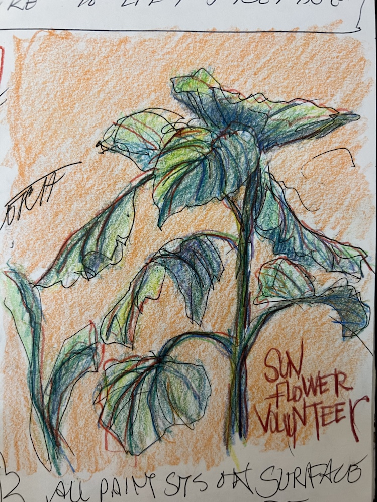
Not what i meant to post today. have another painting to pour half way done but got sidetracked spring cleaning. Exhausted i noticed a sunflower volunteering from the bird seed out the den window and drew it.
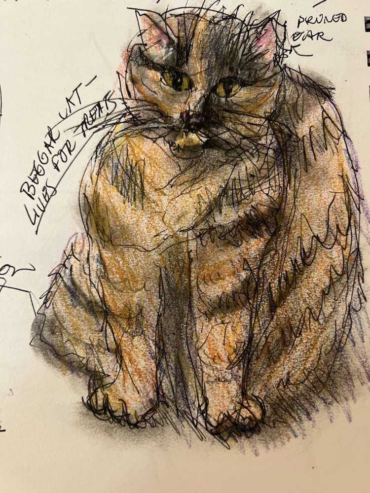
My silly tortie kept begging for kitty snacks instead of letting me take a nap when i was slowing down. She was below me on the floor so this is a wonky drawing.
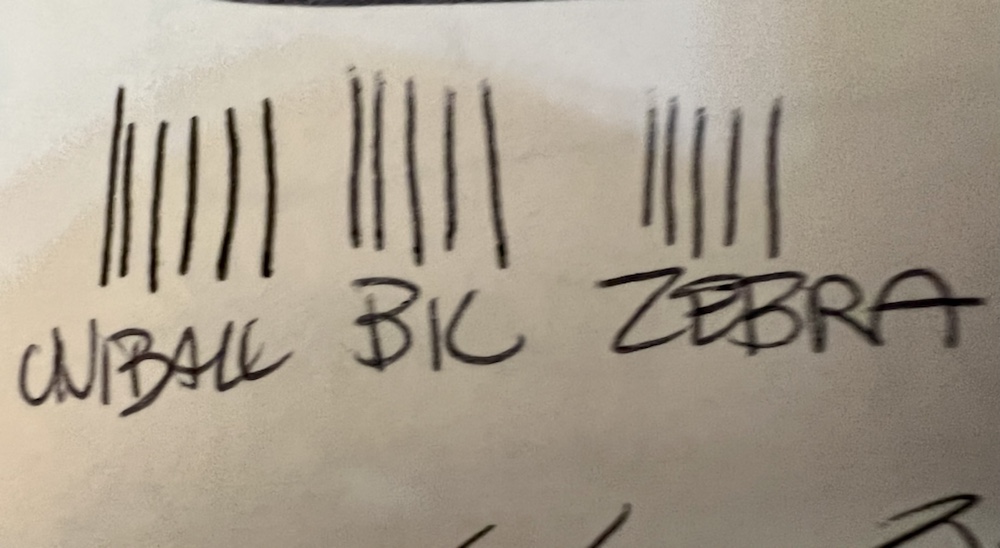
Tried out two new pens today that some people recommend for sketching. All are supposedly waterproof. I just felt odd drawing and writing w the bic and the zebra. I dont think the lines are thinner so will stick w my fav uniball micro pens.

Interesting recommendations for your ig feed to improve it from a woman who has a zillion followers. Thinking abt taking her class at the end of the april. Obviously she knows something i don’t know.

From Dina Brodsky! Her Ig is @ dinabrodsky and she has 772000 plus followers! So she must know what she’s talking about!!

Today, a few thoughts on your bio.

Why your bio is important and how to optimize it

  • Instagram is the platform of choice for the art world, and most galleries, collectors and critics will look at your instagram account before they look at your website or CV. Most people’s first impressions are formed instantly, so the first thing to do is to make sure your account is the best possible impression of you as an artist.
  • Your name/handle: make sure this is what you want to be known by in the art world. I would suggest sticking to your actual name, or, if that’s already taken, Yourname_artist, yourname_paintings, etc. Since this is your professional account, keep it professional, rather than charming/whimsical/clever. 

Your Profile Photo

  • Since most people are looking at instagram on their phone, your profile photo might be too small for them to make out. That being said, make sure its a photo of your art, you, or you and your art.

Your Bio

  • This is a place to say a few words about yourself as a person and as an artist. Also, a place to direct people to what’s happening in the link in your bio, which is the most important part of your profile 

Link in bio/website 

Why it’s important:

  • This is the only place on Instagram you can place a live link. This should be the place you direct people to the most important thing happening in your career at the moment  – your next exhibition, a write-up in a major publication, or something actionable like a workshop you’re trying to fill or a studio sale.


Why it’s really important:

  • Did you know that the Instagram algorithm puts a disproportionate weight on whether people click on your link in bio? This means that if you direct people to the link in your post/reel, and they click on it, that post will get prioritized by the algorithm and become visible to more people. 
  • DON’T put lots of links in your bio with tools like Linktree. Less than 1% of your audience will click your link–send them to the ONE place that’s most important to you. 
  • Pro tip: if you do want your link in bio to direct people to several places, don’t do it via Linktree, Lnk.bio or other third party apps. Instead make a Links page on your website, like this: https://www.dinabrodsky.com/links

    That way you are driving people to your website instead of a third party app.

Dina
Insights For Artists

Dina Brodsky, Boston, MA
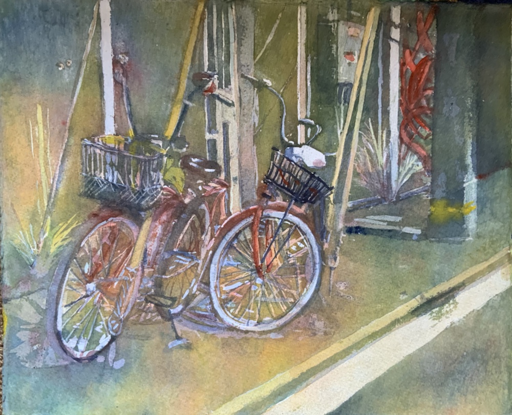
31?! Key West Cycles

Pouring after watching a Linda Baker segment on Watercolor live 2023 which has been worth every penny. You really should consider this. Finally finishing it up. We got a 60 day extension which cost $200 more. Cheaper to sign up now than wait. Price increases. So glad Mike talked me into it. U can hit the pause button and do it at your leisure. If u do tell them i sent you. I don’t get a thing i just want them to know i am doing it. Truly a bargain at $297 right now.


I think i love pouring. May make a bigger one of these tomorrow. This is a quarter sheet of fabriano cp artistico. 300#.
The photo i took in Key West. Sucker for bike pics. I have abt 255 of them.
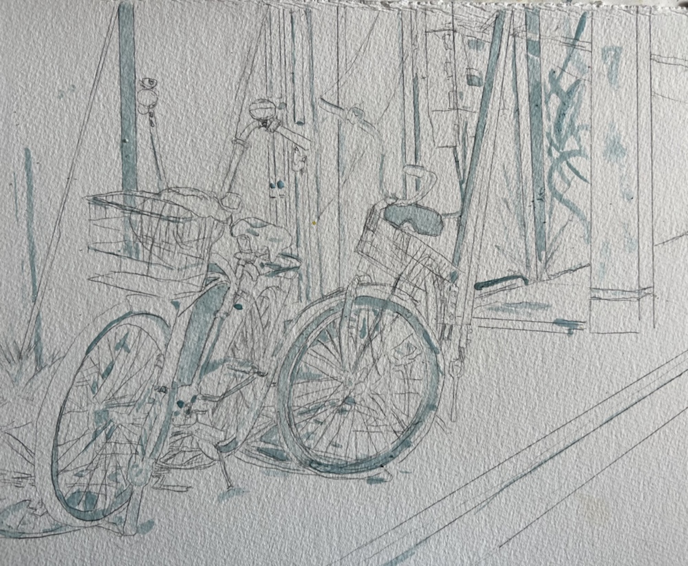
First mask
First pour. Cobalt Yellow ochre raw sienna
Second pour Yellow red and antwerp blue
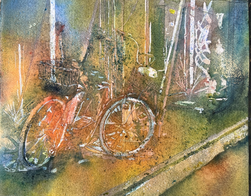
Pouring indigo. I may have gotten carried away. You add masking before each pour.
I also added a grinder of salt all over it. The small bottle is soap to wash out the masking in the brush. It survived.
Oops getting a little too dark aka too much indigo
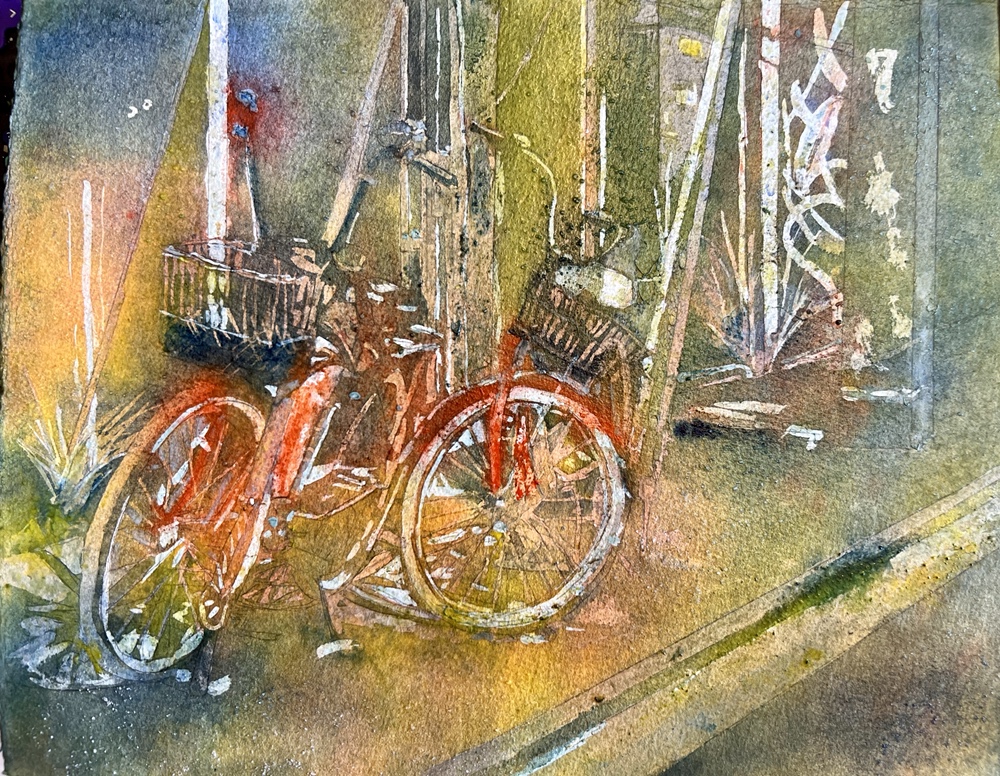
The masking off was not a pretty site. I guess i should have take A pic anyway. Adding paint w a brush to get rid of the hard edges left by the masking.
Quitting for now. This is the color it is now. No idea why my iPad pro takes accurate color like this and my iPad phone 13 does not. The phone is so much newer than the ipad. Maybe two years newer?!

Now to do a bigger one. But first the grocery store

Also made a jar Martha Stewarts sweet red onion pickles today. They are pretty even if they don’t taste good aren’t they? will have to try them shortly.

Margaret worn out exhausted w an unmade bed. Sigh. Xoxoxo

#30 Bluebonnet time

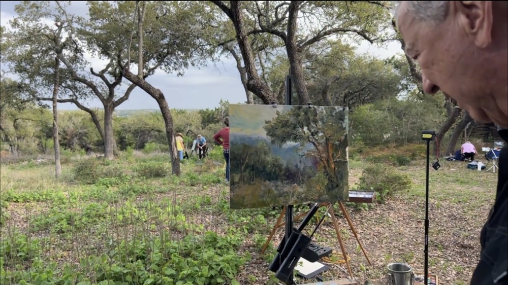
Somewhere in the Texas hill country the bluebonnets are blooming. 11×15 fluid cp
The image. Swiped from @ericrhoads who held the worldwide pleinair last Thursday. That was so much fun they are doing it again. 4300 people showed up for it. There was even a group in England staying up late to join in. Somehow i dont think he will mind. Hmm somehow i lost the glow in the foreground. Oh well. I nailed it on the big trees.
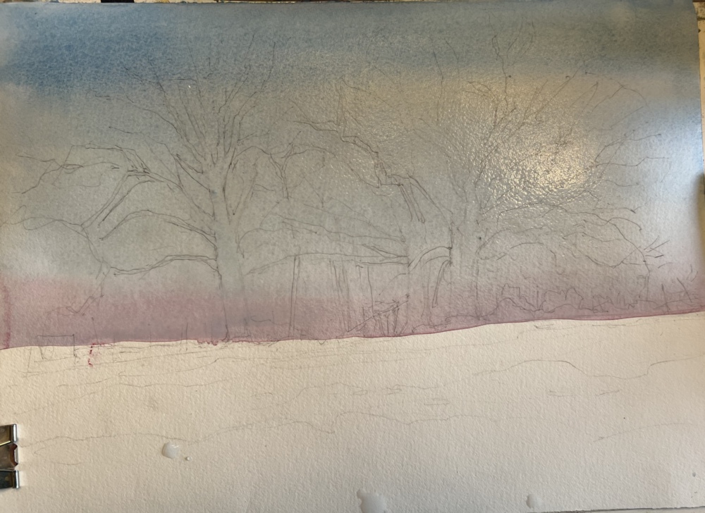
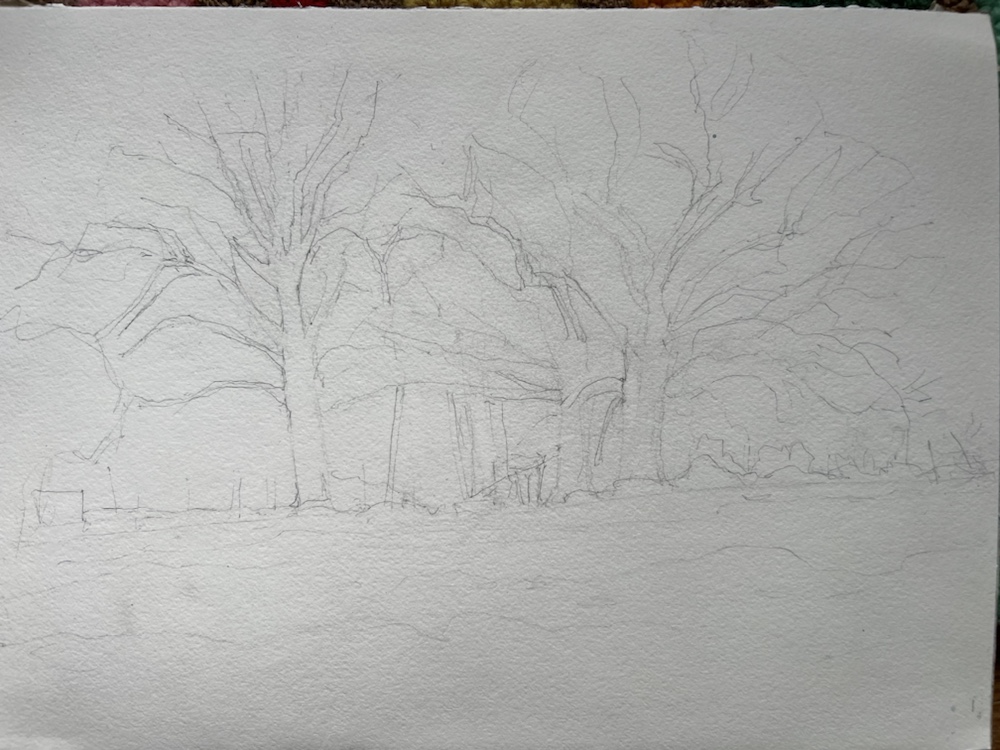
The sketch.
First wash. This is a graded wash. You wet the area to be washed aka the sky in this one. Start at the top with thalo blue and cerulean and don’t add more color til the bottom when i added a shot of quin rose. Gives a really nice sky that lightens toward the bottom.
Here it is loosing its sheen. I forgot to take one of it dry sorry.
When i ran out of steam last night. as usual the colors are OFF. Does not matter where or how i take it they are off. Hmm maybe i should try my big camera. Its much darker and has lost alot of transparency.

Kind of handy you can see how i painted the trees to start. I used quin gold and quin rose for them. adding in transparent blues -cobalt ultramarine and thalo for shadows. The greens were made using chrome green and same w the same blues and cad yw med. Bluebonnets only bloom in spring aka right now so greens have to be springy greens.

Done for now though i have noticed a few things i might change.

I finally added some burnt sienna and some mixed orange to the trees as well as purples in the tree tops.

Bluebonnets done w the same colors. I tried splattering them w variety of brushes. I tried the chinese brush. None of them made me happy not the effect i was looking for.

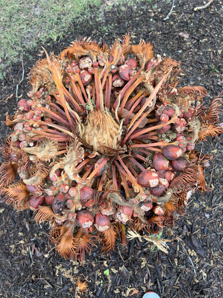
I am so intrigued by the sago palms that have had their frozen dead leaves pruned off. I think CBS Sunday Morning show can use this for one if their suns don’t you?!!

Margaret ready for a nap xoxoxox

#28

Done. Painting #28 done since January.
Quitting. I like this one. A little too realistic because of the hard edges would be my only critique. The roses went well. Did them with alot of wet on wet to keep the edges soft. I seem to be painting alot of leaves lately. Ready to NOT paint leaves. Lol.
Half sheet fluid 140# which performed so well I wonder why I ever use anything else. Lifted like a champ.
The photo
Johannes Vloothuis did a free class on artist network today. While he was doing oil i painted watercolor. Really not painted in the same way at all but i enjoyed. He runs a very well organized class. his prices are so reasonable as to be ridiculous. $25 for three upcoming classes. I may take them although i really need to be doing my own work but i am a sucker for a deal.
He provides a very easy to print sketch for the class. On the pay classes he even provides a how to transfer it if u don’t want to draw it.
Ready to rock and roll. Used masking to save preserve my whites for the flowers.
The roses were done by saturating them with water and dropping buts of color in til I was happy with them. Probably the most successful roses i have ever done. The wood was done with my chinese brush flattened and then dry brushed. I should have used some of my old acrylic brushes that are splayed from paint drying in the ferrules.

Leaves were painted with blue and yellow i have and then i added some white gouache to a few. i used thalo blue ultramarine joes turquoise colbalt green gold cad yellow light aureolin yellow ochre to name a few. Oh and chrome green and thalo green. I tried them all. I should gave tried my beloved winsor newton filbert. Super painting for leaves.

See ya in one of Johannes classes. Margaret who is tahred xoxoxox

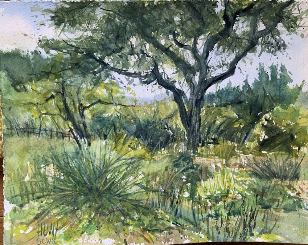
Texas Hill Country

Updated the photo using my ipad pro. Now snows better than it did. Course now i see other things to fix. Enough.

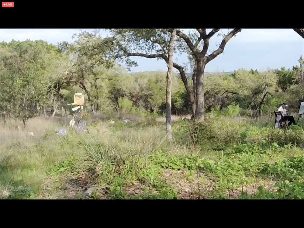
Think it needs more work but like most of it. Eric Rhoads back yard near Austin. He held the first Global Online Paint Out. You can watch the replay here. It really was alot of fun. More than 2000 artists attended. Leave it to Eric to make it a really BIG event.

Should add. Parts of this painting i really like alot. Love the big cottonwood. Love most of the long grass but not the big thing on the bottom left. And i really dont like the small tree on the left. Just looks weird and way toooo black. Competes w the big tree. More work required. Right?

The photo he gave us. His backyard
My sketch fabriano cp 300#
Sky wash cobalt and yellow ochre lots of water.
Eric painting and of course talking. Lol
Mine. Think i may lift some things tomorrow. And the colors off. Why is that. Silly iphone. used the Mary Whyte palette plus indian lake and charles Reids chrome green.
Tonights sunset margaret who is now tired. Been a day Xoxoxo

Springtime in Paris

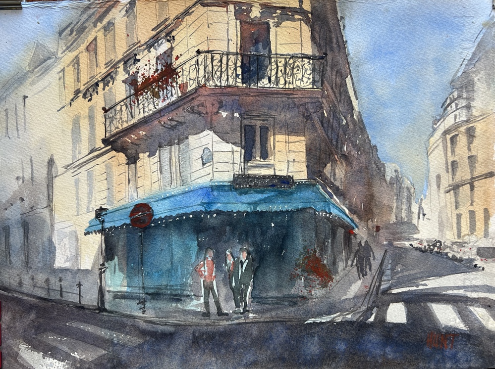
Springtime in Paris 15×20” Fabriano cp 300

Just realized i have painted TWENTY FIVE paintings in the last two months. I think i needs a nap. And an art show. Lol.

The drawing. Needs some tweaking.
First wash. Soaked the oage the. Added a cobalt sky, ultramarine and burnt sienna grey with a touch of alizarin for spring warmth according to Alex Hillkurtz leading the paint along. Raw Sienna and Burnt Sienna on the buildings
Thalo blue awning and windows. Funny how that bright blue disappears as the painting develops.
Adding darker greys same combo Building details that grey adding orange for reflections.
Lots of details added. Loved doing the balcony. And i always love drawing the lines on the buildings. really like these people. And could not resist the urge to add flowers on pots. Always in for a bit of splattering. Something liberating abt splattering.
Have to say that Alex Hillkurtz is a thoughtful teacher who loves Paris so much he moved there eight years ago. Have to agree its a magical spot. if u want to take a class from him he teaches on Domestika. Reasonable prices $10-15. Also does. Painting tours in other spots. He does great explanations leaving out nothing.

Have to say he tickled me. Didn’t know the names for the architectural details like cornices. Said he was not an architect. Most of the guys who teach classes like this are. However he is an urbandsketcher and loves drawing buildings, urbans spaces, and the people who inhabit them.

Margaret who is tired. No wonder 25 paintings should do it. xoxoxox

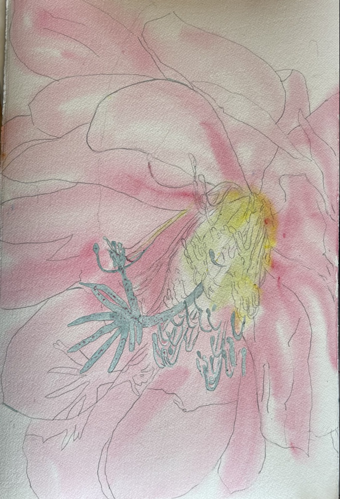
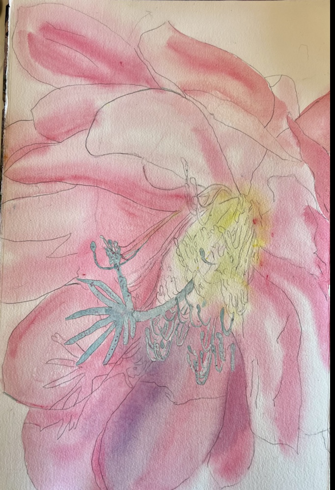
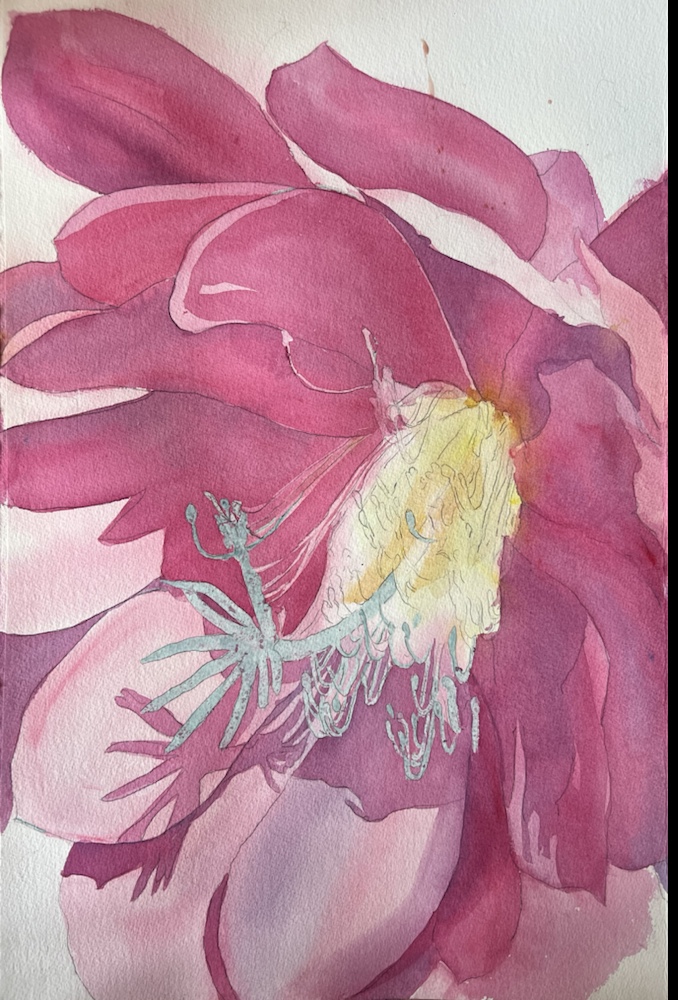
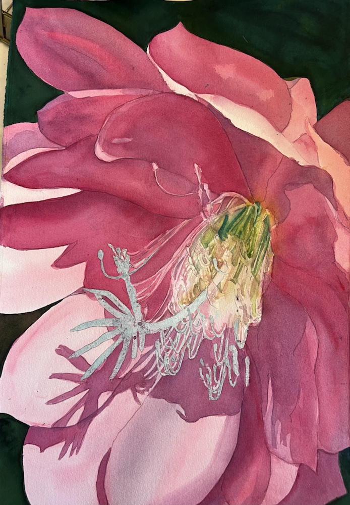
Mexican Cactus Flower

Knocking my socks off still. This is huge. 15×20” it went so well maybe i should try it on a full sheet-20×30” or wait for it on an elephant sheet – 30”x40”😳😵‍💫😍

Would i change anything?? Yes that thalo green in the center. Too green. Havent used thalo green in years for that readon. Why did i use it this time?? Thalo blue and aureolin yellow makes Thalo green. Duh.

First wash w pebeo masking. Wet the whole page w a big hake brush then quickly brush in quin rode and quin magenta.
Starting to add some purple which was made by adding thalo blue to the first two quins. Also adding some green in the middle. Thalo blue and aureolin yellow of course.
Zipping along adding more dark pink and the purple. Keeping the washes smooth by mixing alot at one time.
Adding yellow to the middle. Toned down w the quin.
Moh green. Stop now before u go too far.
Oops there it is. TOO MUCH THALO GREEN. And you can NOT lift thalo green. 🥲🥲🥲🥲🥲 Negative painting going on in the stamens. Background is indogo quin gold and aureolin for a diff green. Wish i had varied a little. Oh well. Not messing with it.

A detail
And its done now. I guess i should sign it. Shading the pistol and stamens. Margaret who is tahred. Xoxoxox

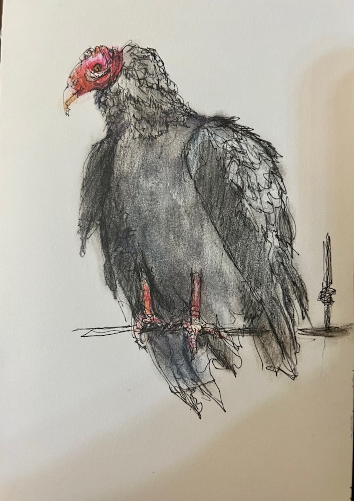
A Birdie kind of Day

Still not finished but clueless what to do to finish him. It will come sooner or later. He kept me awake last night thinking about him. Still no answers but thoughts if a bigger one on wc paper instead of in my journal. Delft Blue Derwent watercolor w Black Inktense and indanthrine, red, yellow and orange faber Castell watercolor pencils.
So while i was thinking about number 1 number two came to visit. Pitt pen , Black Inktense pencil and red, yellow and orange faber Castell watercolor pencils. Guess I need to finish the fence hes standing on.
When i left the neighborhood this am two random geese were crossing the road in front of me. Since i drive a prius they couldn’t hear me and they were oh so pokey i finally beeped at them.
I could head one say to the other RUN BABY RUN! Did u know geese are mated for life pairs?!

Margaret xoxoxo

Finally Done

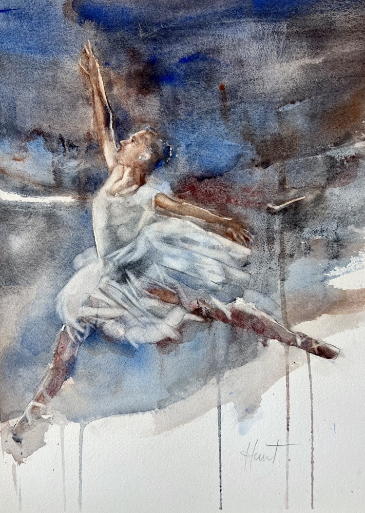
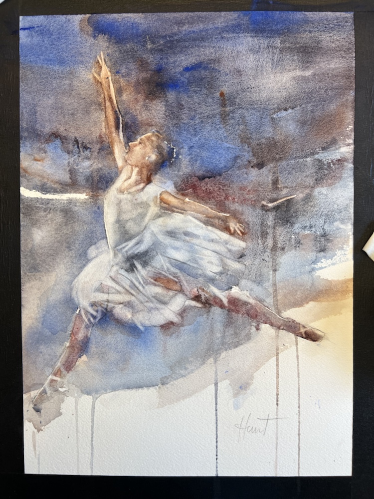
Ballerina Aches 140 cp Shes finally done. Had to lift her fingers on her right hand. They were so bad. Still not quite perfect but close enough. Quite and interesting technique since most of the painting is done by lifting paint not painting it.
The fingers were way too short especially her thumb. Really rather amazing you can lift a figure out when u use arches. Not sure how this technique would work on any other paper but arches.

I did run across an interesting website that has a great list on which watercolors can be substituted for other watercolors like quin pink -alizarin or rose madder. I saved a copy. You probably should to.

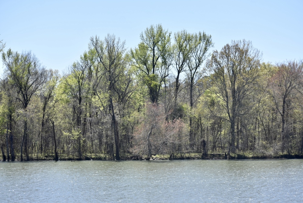
Gorgeous day today . Spent a while outside looking for the bald eagles which according to the guys were hunting out back. Camera in hand. NO bald eagles.

Margaret xoxoxox