Day 572 – the Latest Painting


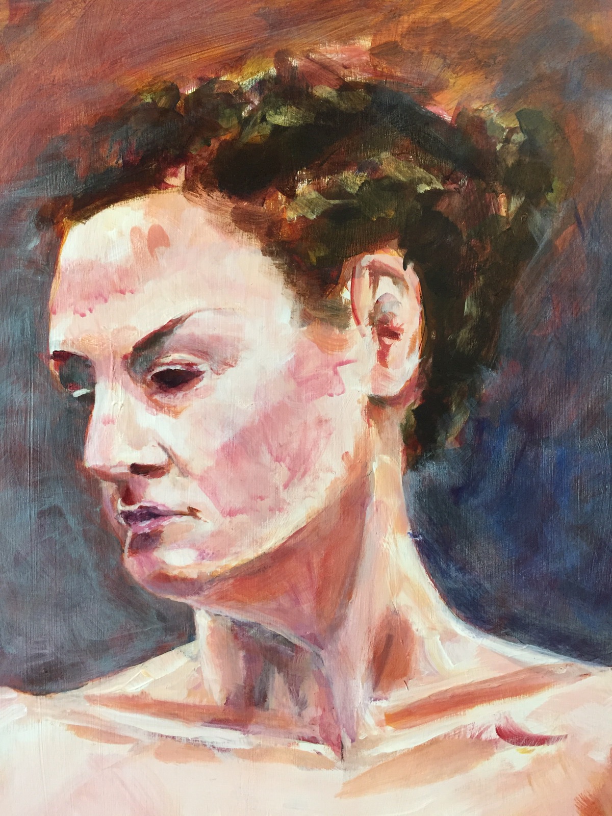
Approximately 20″x 30″ Acrylic 

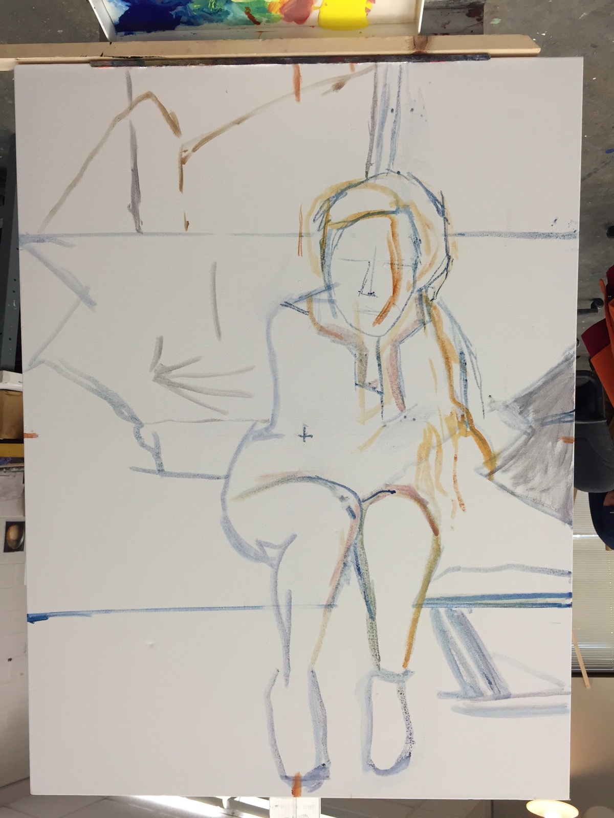
Drawing this was tough to say the least – getting the proportions right. 

  
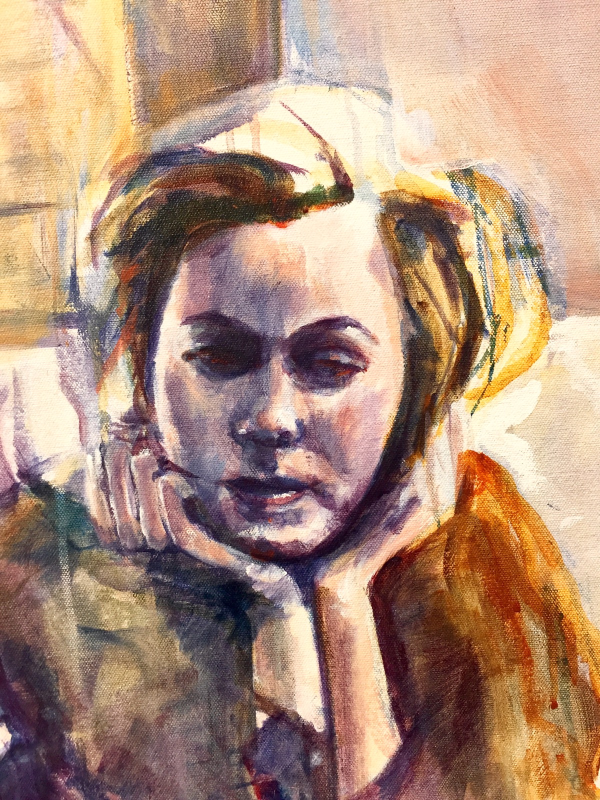
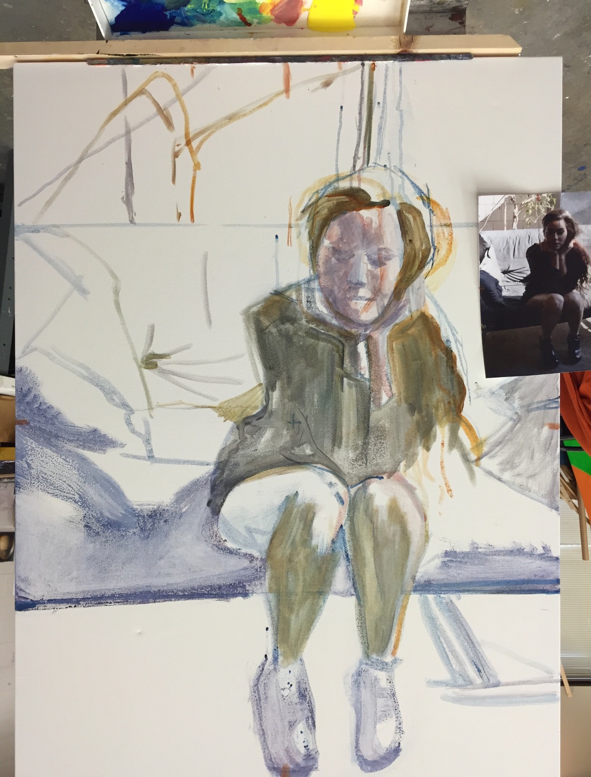
Here she is roughed in. 

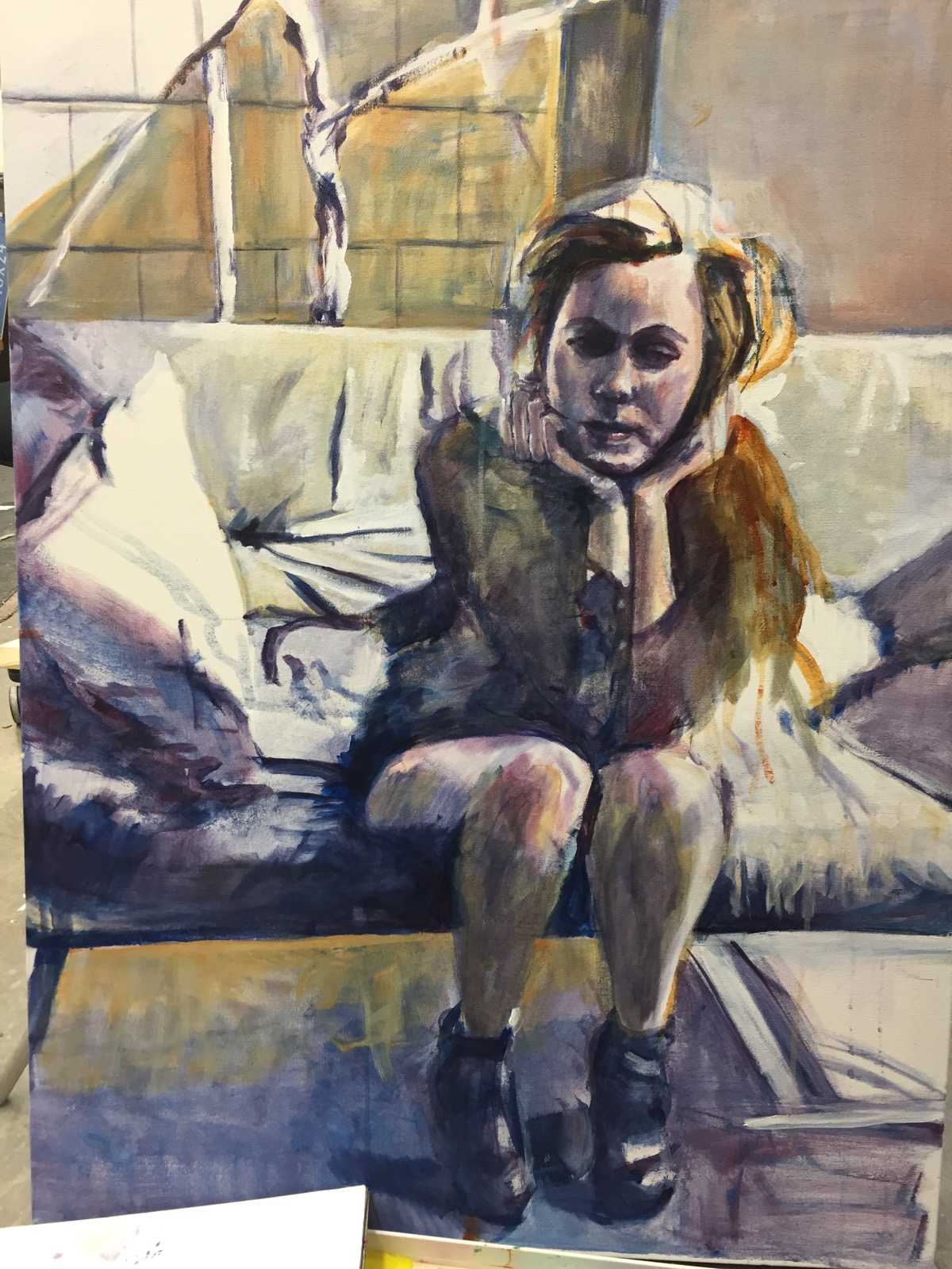
She’s gone thru a lot more tweaking since then. I spent hours trying to get her right before I started the painting.  You can see in this photo her nose and mouth are off. 

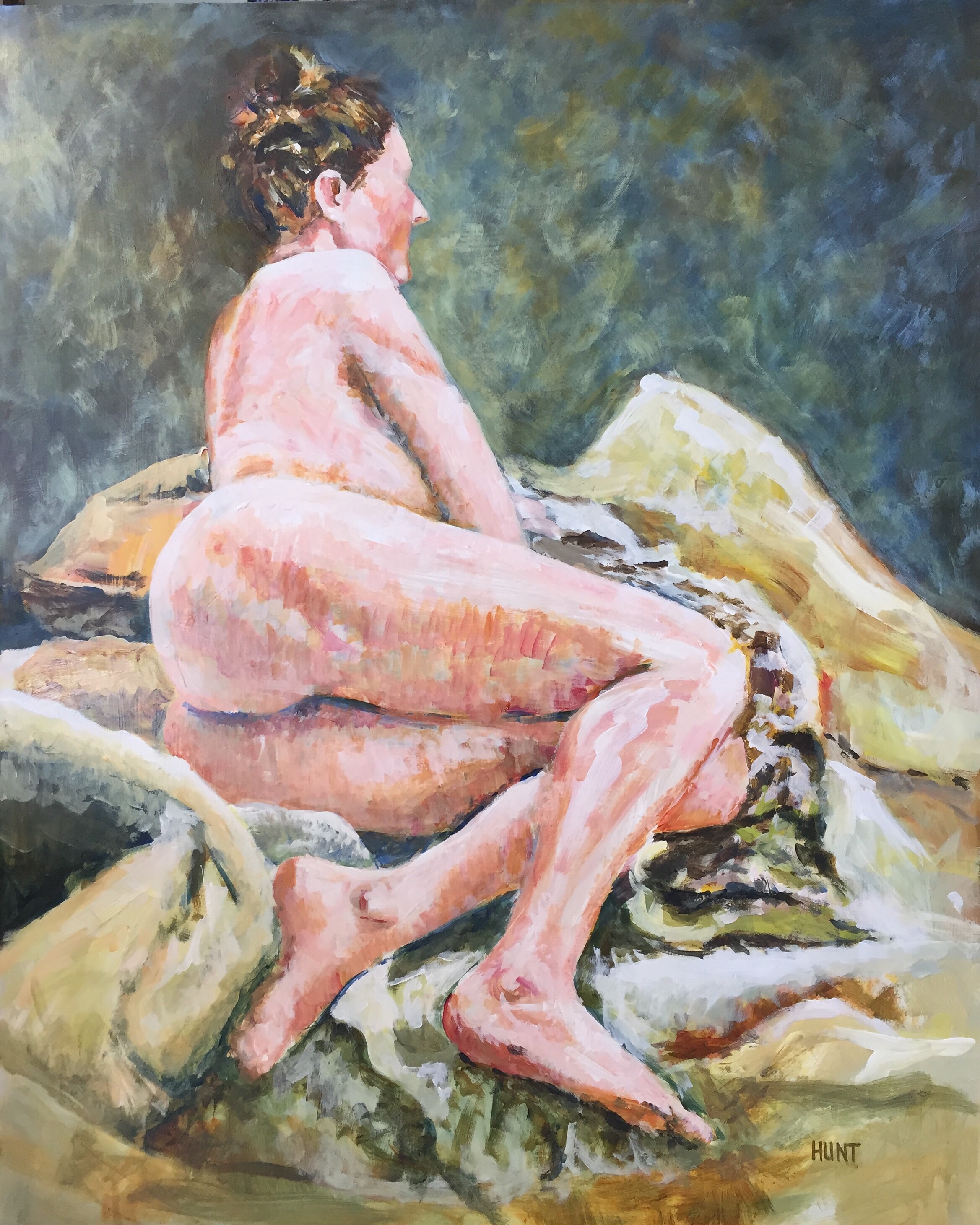
There were hash marks on the half way points on the edge of the canvas along each side. I also marked the mid point on the canvas and then tripled her. Measuring measuring which I hate to do but I think it was worth it in this case. 

 Can u see the hash mark on her face for the center and the two center ones on the bottom and right side?  
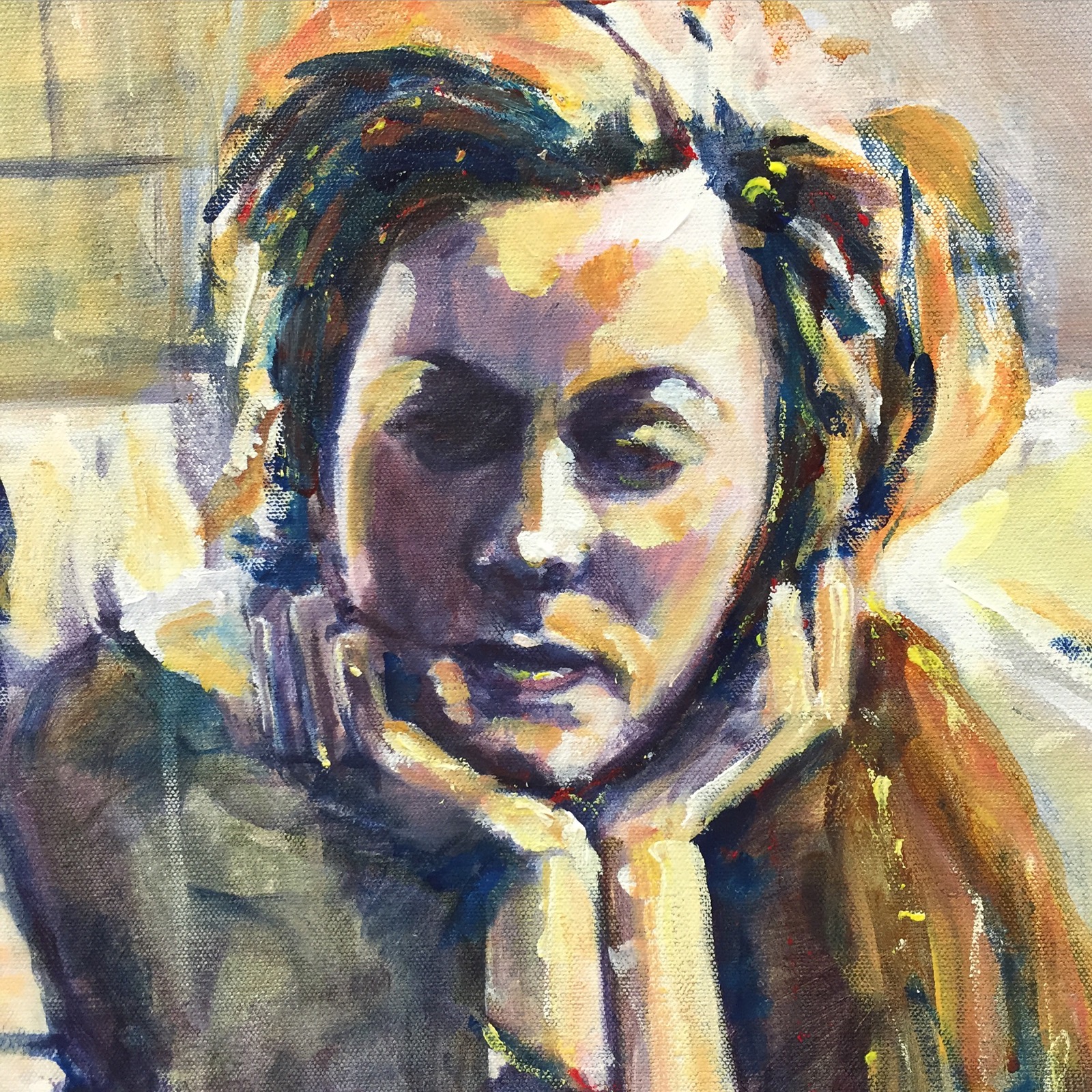
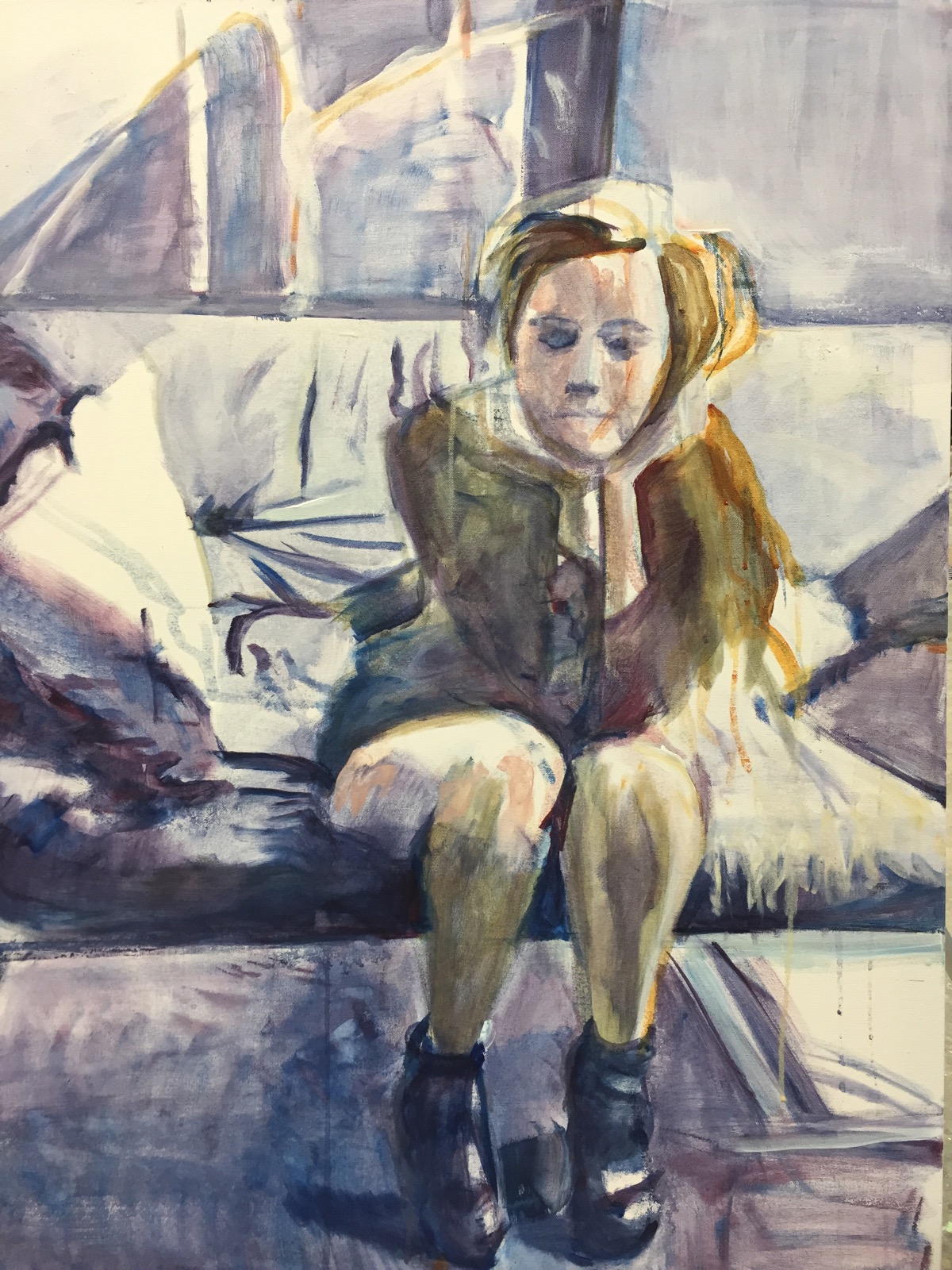
 One hand/arm is huge and foreshortened the other is just the opposite. Skinny and delicate. And tough to get in the right proportions. Thought I would never get them right but I persevered. 
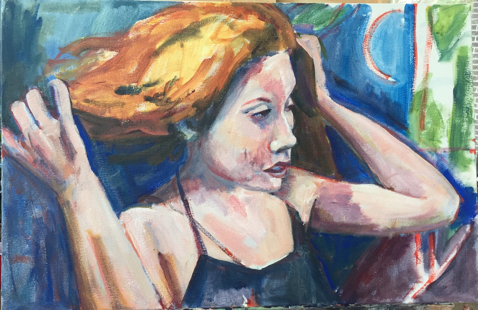
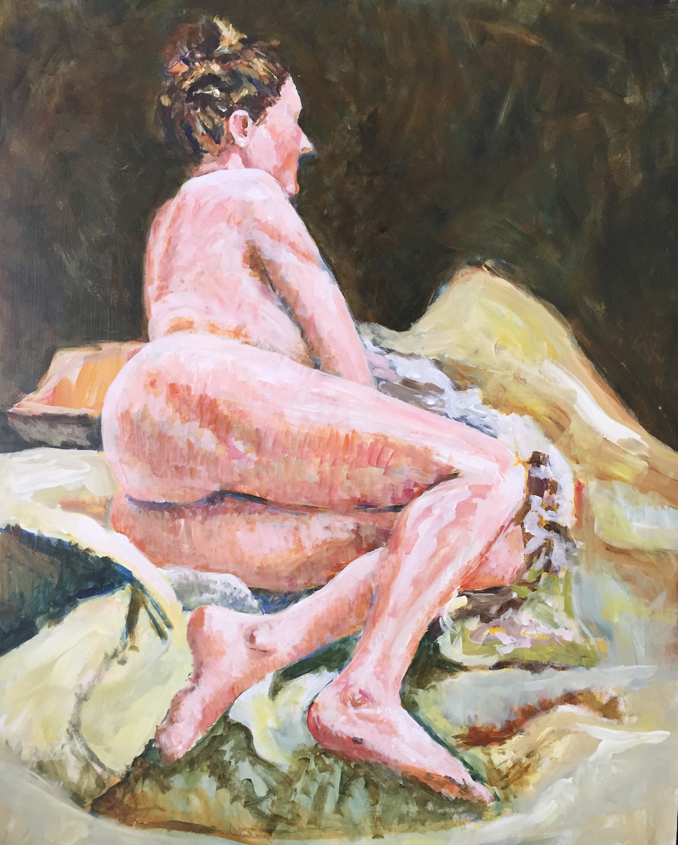
  
Progress. 


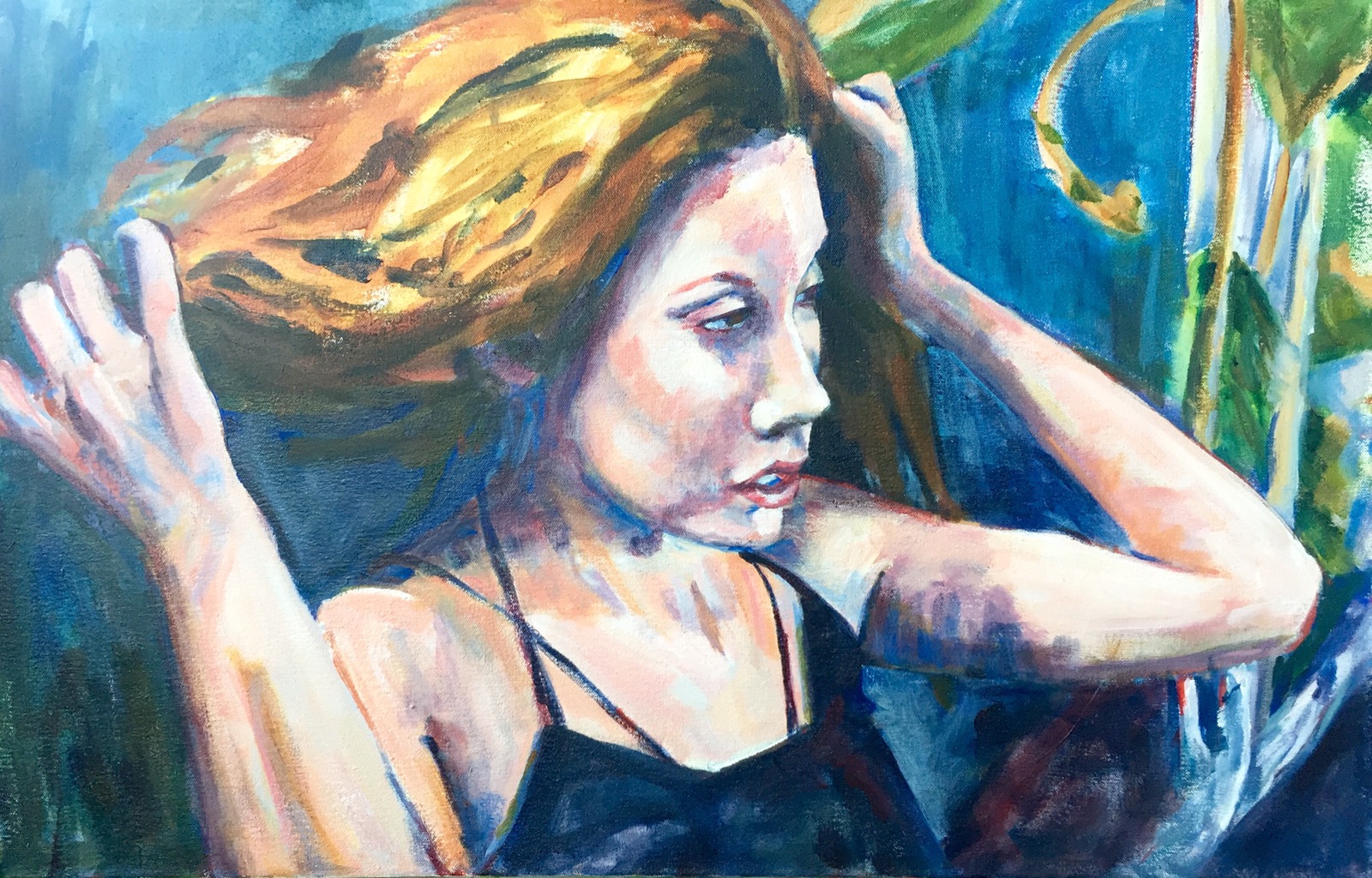
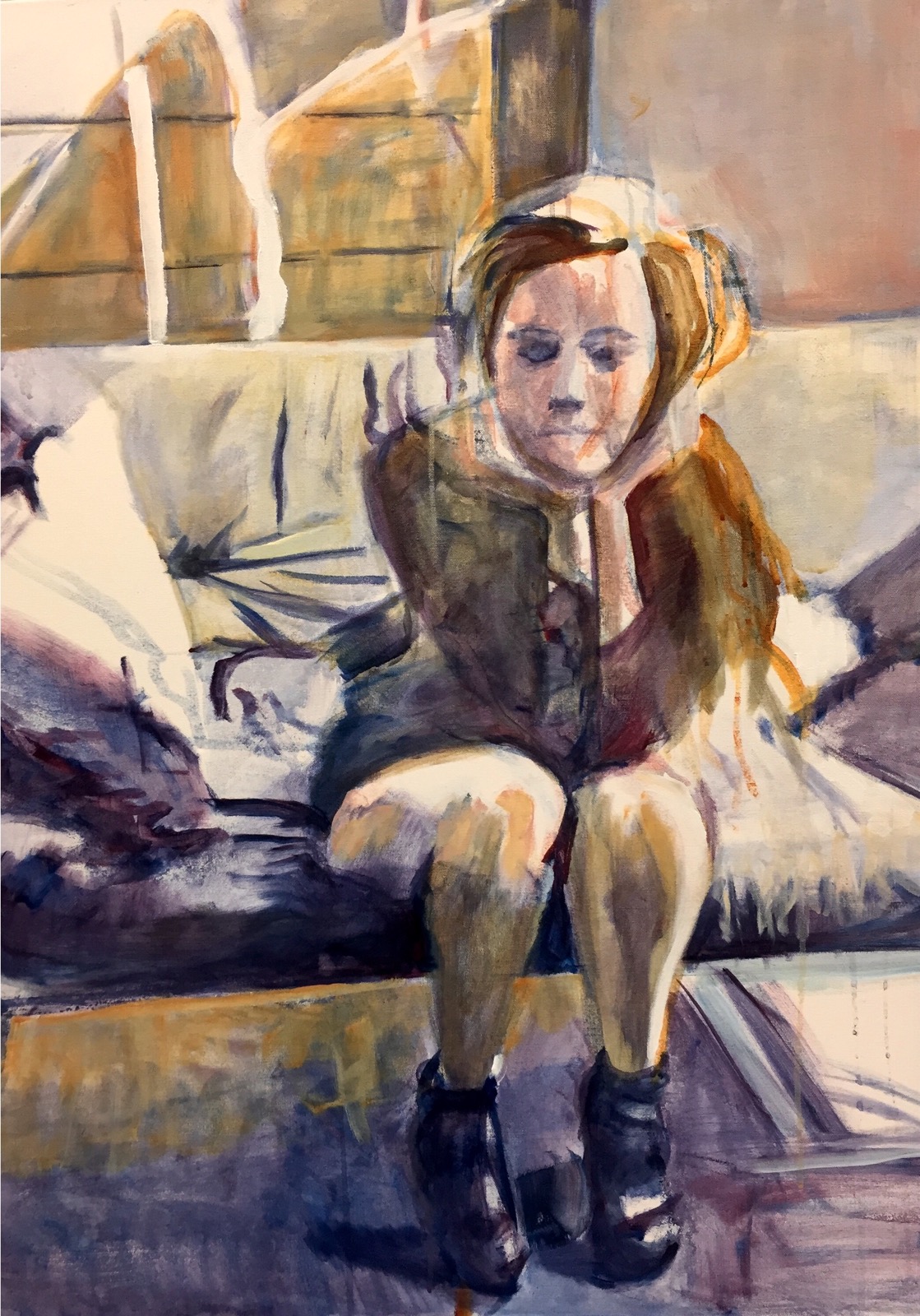
And here she is again now.  I may work on her hair a bit more and lift the heavy shadow on her right arm but I think she’s done. Now she needs a name. 

Thanks for reading. 

Margaret xxx

Day 564 A -Ilenia part deux

    
Uses a one inch and an one and a half inch hog bristle to lighten the offending darks. I also added white and cobalt blue to the background using sheer layers. Lightened a lot of the face shadows with a watered white. 

No beards on Ilenia!! 

Of course I lightened the background w a dry white and cobalt blue. It helps soften some of her edges. Probably could do more but I am leaving her alone for now. 

Thanks for checking in!! 

Margaret who is off to knit and contemplate another painting. Xxx

Day 564 – Ilenia time!

  
After forty minutes work. Other than her eyes were a little close together I think I like this one better than the more finished product. Like the immediacy and the brush strokes – the looseness of it. 

This was painted with three colors. Goldens Nickel ago gold, alizarin Crimson and titanium white. I did add ultramarine and burnt umber to the hair. 

  Here she is now. Looking a little too old and what’s with the stripe on her tummy!? And the neck. An old lady chicken neck. Not good on a thirty year old. Too many hard edges. 

 That’s ALL got to go. No more small brushes!  If it’s not a big hog bristle I can’t use it. Lol. 
Back to the easel!!

Repost her when she gets better!! 

Thanks for reading. 

Margaret xxx 


Day 558 – Which do you like? 

  
Background 1

I spent most of yesterday repainting the Ilenia’s background. This is the current background and my favorite so far.  I also did a lot of work on the bottom background adding alizarin here and there to tie it to the background. Trying to loose some edges and get rid of the pasted on look of the figure bits of the purpley dark was added to her hair to blend it into the background.  I had to completely paint out the blue background 2 with titanium white to get rid of the blue and paint the background as it is in the first picture. 

The background colors are burnt umber, alizarin and ultramarine blue. I also added touches of burnt sienna and yellow ochre. It always seems that I scumble backgrounds a lot. And of course some of it was just painted with a sable paint brush which gives a smoother finish than the hog bristle that I used for scumbling. 

 
Background 2 

I thought I would like this color better than I did.  It’s cerulean, nickel azo and titanium painted over background 3 which is really the first background I tried out and another I usually like. I thought it was too over powering. 

  
Background 3 

Burnt umber and ultramarine blue with some nickel azo over brushed or scumbled over the darker colors. 

TIP: if you get tired of getting up and walking back from your painting to look at it you cab use your home.   

  
 Here are a few other versions of background 1.

So my question dear readers is WHICH do you like? As I said so far background 1 is my favorite. 

Thanks for reading!

Margaret who is off to class to make great art tomorrow. Xxx

Day 472 – She was too pretty!!😳

  
She was too pretty 30×40″ ??? acrylic 

At critique today the class loved the way she looked but the boss aka professor said she was too pretty so I spent today trying to make her less pretty. It’s hard to make a pretty girl not pretty. This is what she looks like now.  I should have known better than to use any pink. . 

  
I decided to use contrasting colors adding a lot of orange with cad yellow light for highlights. I also added some pure phtalo blue for darks. And bits of cad yellow light for  sparkles.  

I also like the area of carpet under the sofa. All the busy stuff. Fun!  

  
This is what she looked like earlier today. A lot of white on the sofa. I do like the sofa with more cad yellow light on it. The yellow in this photo is nickel Azo gold a rusty gold. 

 Thought u might want to see her pretty face that wuz up close. I do actually like her better now. Now to get her a little wilder and crazier. 

Thanks for reading. 

Margaret xxx

Day 466- The Girl

  Gets blocked in. This is how she looked after about four hours of work. 

Blocking in is the start of a painting. Why he direction it will go gets started. It’s a thin layer of acrylic paint and it’s done for either a finished acrylic or oil painting. I thought you might like to see the process.  

  
First four hash marks are placed along the edge of the canvas dividing it into quarters. The same thing is done to the photograph. This helps in more accurate placement on the canvas. 

 
Next thin layers of color are painted in.  I was having a hard time with of all things CONTRAST. duh. I was using Phtalo Blue and Alzarin Crimson and not much else. A little flesh on the face. 


Still more Phthalo blue and Alizarin Crimson. A lot of it was applied with foam brushes. They were a lot of fun and I may use them more. They also do a great arrow straight line. 

  
 It’s not really as dark as this but it will be. I added alot of Goldens Nickel Azo one of my favorite acrylic colors. It’s a sheer transparent color. All I had to do was add some water to it and brush it over the color already on the canvas. It was like magic making the painting pop. Somewhere I had forgotten about using contrasting colors.  Duhhh. Probably this cold that came back with a vengeance when I was in the mountains or more likely the fact that I did not review my painting notes- use a work of complimentary colors. In this case it could have been gold on one end and violet blue on the other. 

It takes practice. The more you do the more you remember and do it right the next time. 

Thanks for reading.  

Margaret xxx

Day 456 -Inktober continues

  
Sometimes you need a do over. I actually drew this street cafe in Aiken twice. This is number two. I started drawing the horse first with my Lamy vista fine point but it would not draw.  Which is why it looks so scratchy. The ink would not flow. I threw in the towel and used the Noodler Konrad loaded with Platinum Carbon black ink. 

  It was going well till I smeared the eyes of the lady on the right.  Oops.  I used a white gel pen to try to fix them. I also could have used gouache and painted the scene but have not had time. It might help if I stayed home.  


Actually the first drawing.  So why else did I redraw?! Terrible eyes. And things in the wrong places.   I ran out of room for the horse.  Ooops!! 


Here is the photo the sketch is based on. That’s it for today from the river where the water is still muddy but behaving staying in its banks.  Something to be thankful for in the state or South Carolina- a river that does not flood.  

Thanks for reading. 
Margaret xxx