I actually drew a sketch of her today but it’s back on my table in Cheap Joes studio. Wonderful teacher. So thorough so accessible and so thoughtful.
We started off the day with breakfast at our hotel with 6 or 7 classmates and our lovely teacher Fealing. The day was off to an auspicious start.
Then back to Cheap Joes to work. Mike and I worked till 6. And this is what I did.
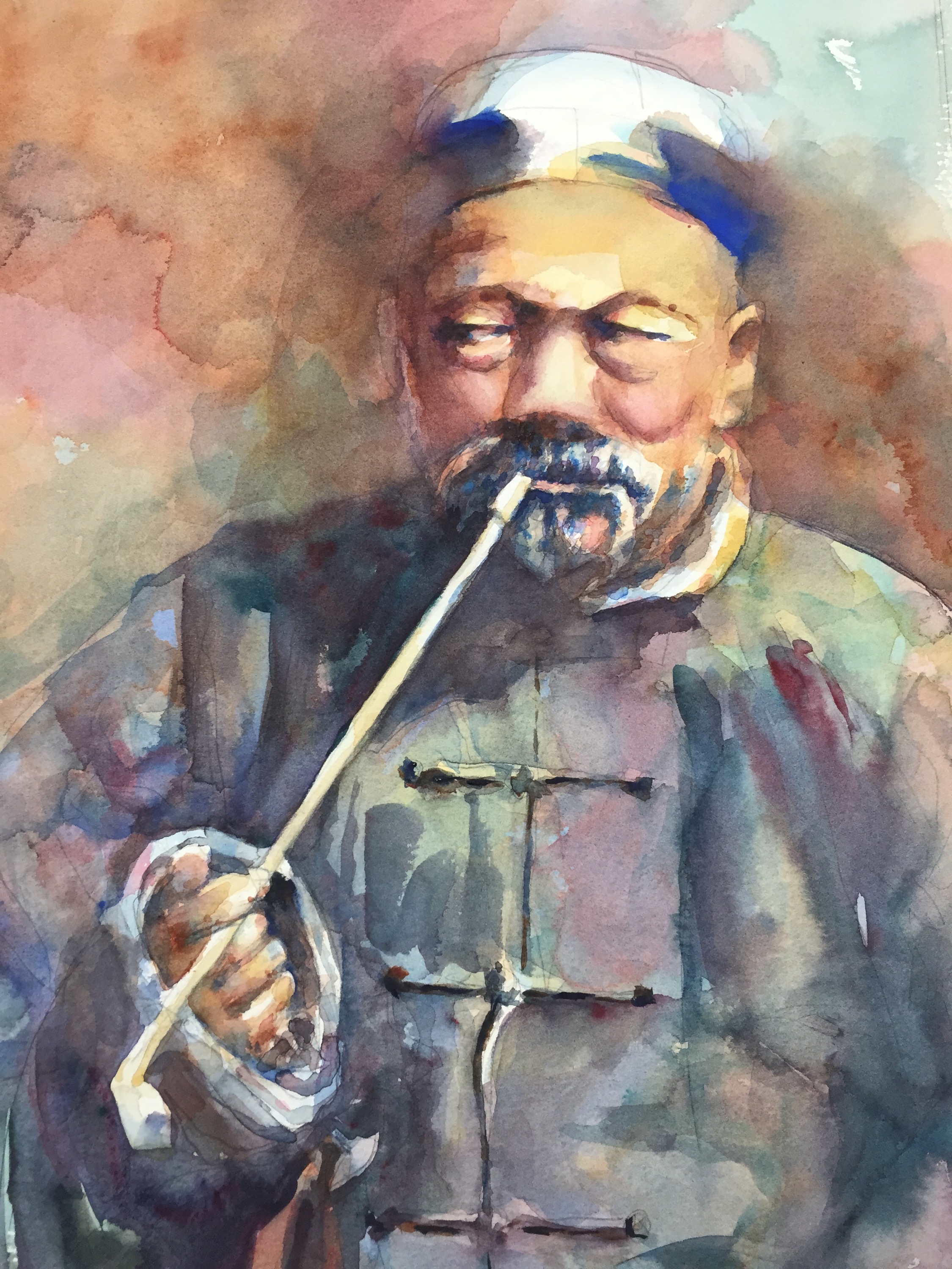
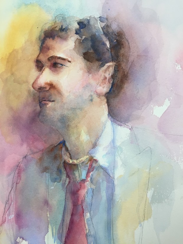
The paintings are done in layers of washes.
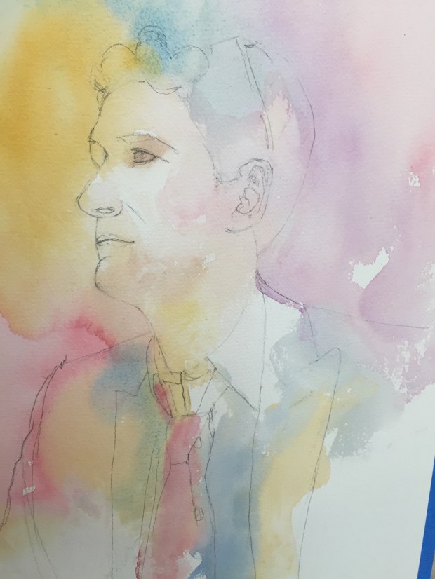
Ben
Layer 1 should have started at the top and been colors. Blended softly together. Got in a hurry because the teacher called us to class. Pesky bubbles from painting wet into partially drying wet…groan!
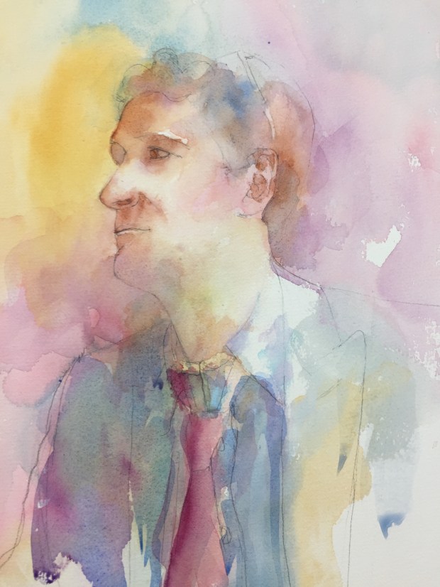
Ben
Layer 2 Linking shadows softening edges.

Ben
Layer 2/3 adding more darks softening edges
Ben
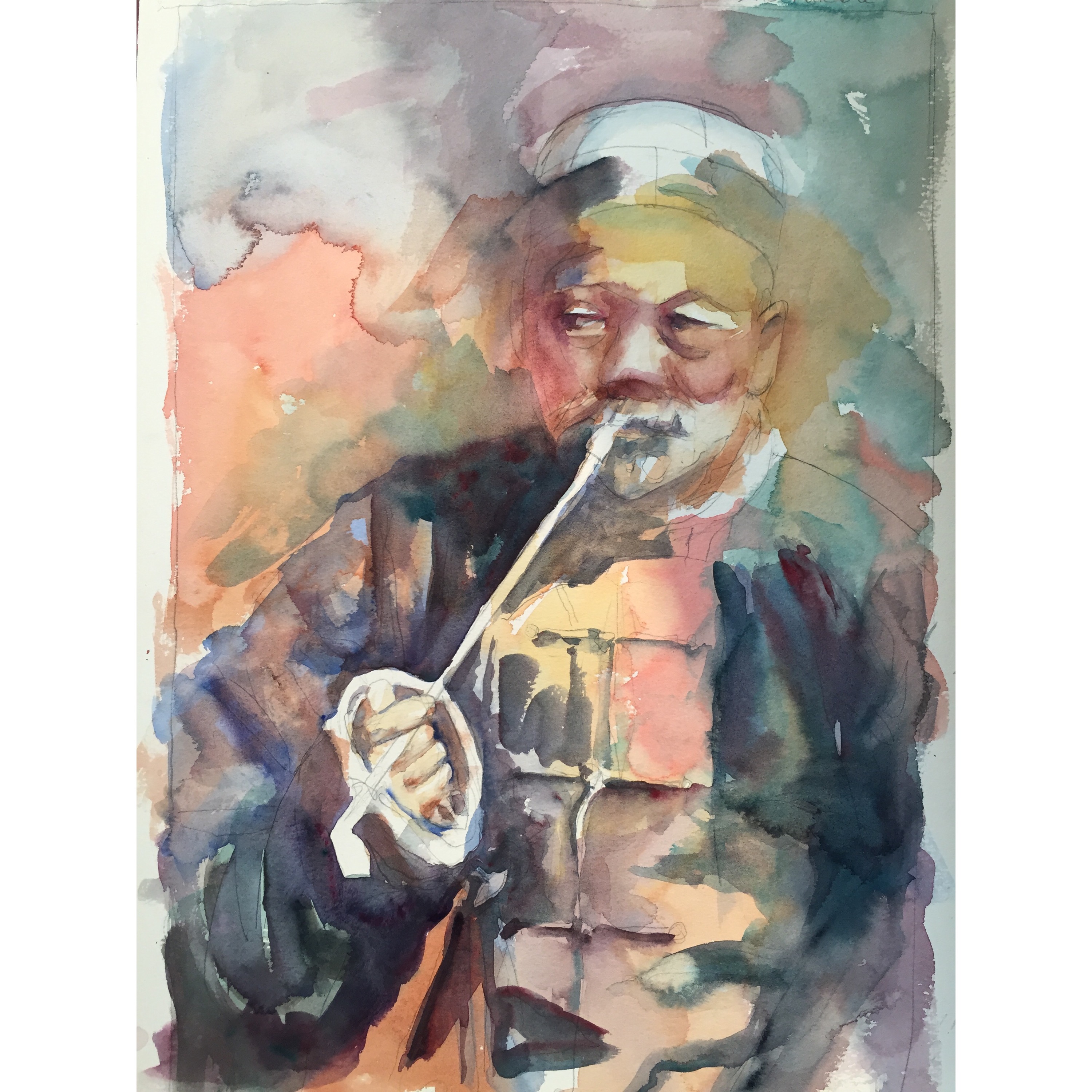
Layer 3 Adding more darks and color and trying to keep it soft but focused!! Still more to do but that’s all I have done as of now. Think I am find to lift some of the dark blue on his eye. The beard was done with a wash of cerulean. It was magic the way a beard just popped off the page!! Ultramarine blue and burnt umber In the hair. Keeping the edges soft.
Boy does his mouth need work…hopefully sooner or later it will work!!

The Chinese Man
15×22 300# Stephen Quiller cold press
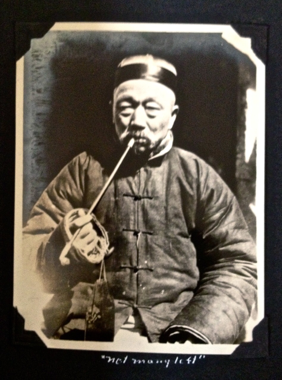
I call him Inscrutable. Dads photo album called him “Not Many Left.” This is how he looked this morning.

The Chinese Man
More Layer 3 – I added a lot of darks. Can you find them!? And some reds. Darkened the hands, the eyes. Added some reds. Killed some of the whites. Added darks to the frog closures on the jacket and under the right collar. Added blue to the hat.

If you want to try painting him feel free to save this photo.
Thanks for reading !!
Margaret XX

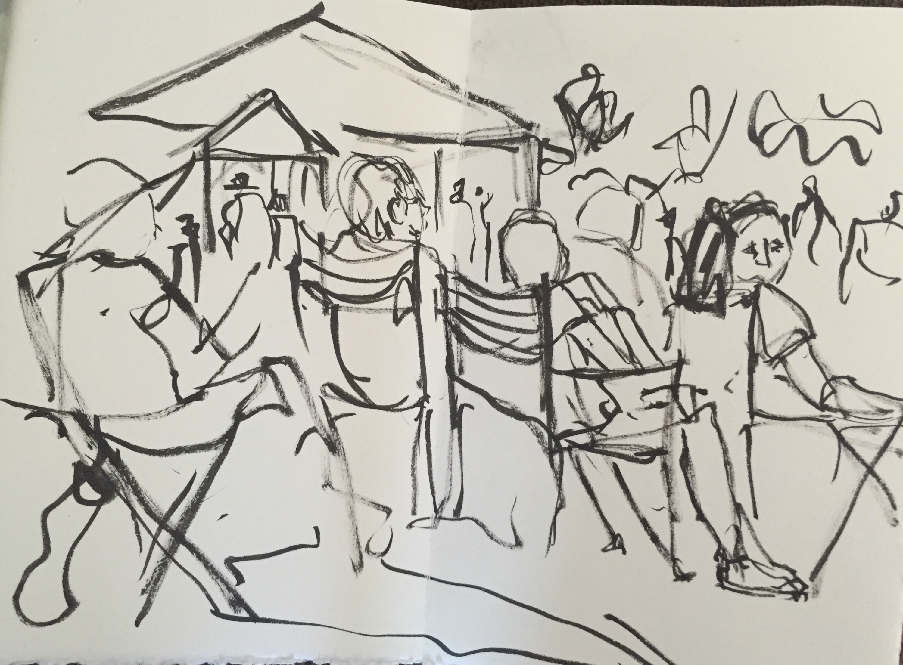
 Sketching the orchestra warming up!!
 More Sketching the orchestra warming up
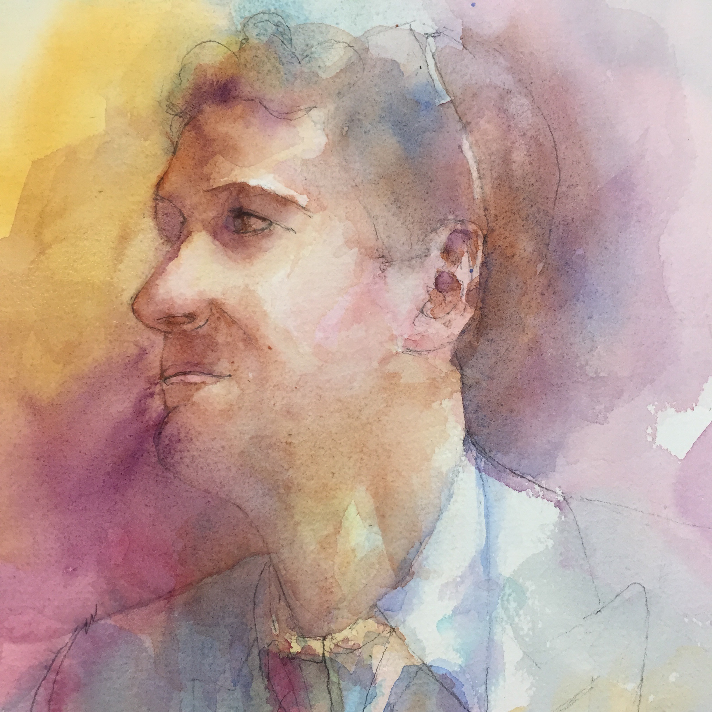
 One of my favorite sketches. Lee Anne.